Алі Назар — Creative Director
Алі Ніна — Strategist
Лукавенко Світлана — Analyst
CLIENT
A group of like-minded friends specializing in brewing approached us with a dream—to brew real, quality beer.
“The idea was born out of love for the craft,” they emphasized. We believe that’s what matters most. And with the same passion, we approached their product.
CHALLENGE
To complement their love for brewing with a strong marketing strategy and create a competitive brand. We needed to research the market and uncover unique insights—something truly distinctive, as the beer segment is already vibrant and saturated. Then, we had to transform these insights into meaningful messaging to present to the world.
RESEARCH
To uncover all the secrets of competitors, explore international trends, and discover that one key insight, we launched an in-depth study.

QUALITATIVE RESEARCH
This allowed us to understand individual consumer experiences and gather interesting perspectives. We explored perceptions of craft and local beer, built hypotheses, and formulated conclusions and recommendations.
- Consumption situations
- Places where beer is consumed and purchased
- Consumer profiles and their purchase drivers
- Preferred volume, packaging, and price
- Most importantly—taste! Our client is a small producer who doesn’t want to spread themselves thin across dozens of varieties.
QUANTITATIVE RESEARCH
Confirmed the theories and numbers derived from qualitative research and monitoring, providing a stronger foundation for final decisions.
- Beer consumption practices and scenarios
- Preferred beer styles and varieties
- Price sensitivity
- Target audience
- Brand perception and image characteristics
DEVELOPMENT
Having uncovered all the nuances, it was time to create and develop the brand!

INSIGHT
Consumers frequently mentioned enjoying beer in a peaceful setting at home alone, yet this scenario was almost never used in positioning or advertising by other beer brands.
This meant we had the opportunity to be the first to establish a strong connection between the product and the culture of spending time with oneself.
POSITIONING
This is a drink for moments of solitude. It helps you relax, dream, and take time for yourself. And the brand? It will build a new culture of solo relaxation!
Key words:
– Calmness
– Ritual
– Tradition
NAMING
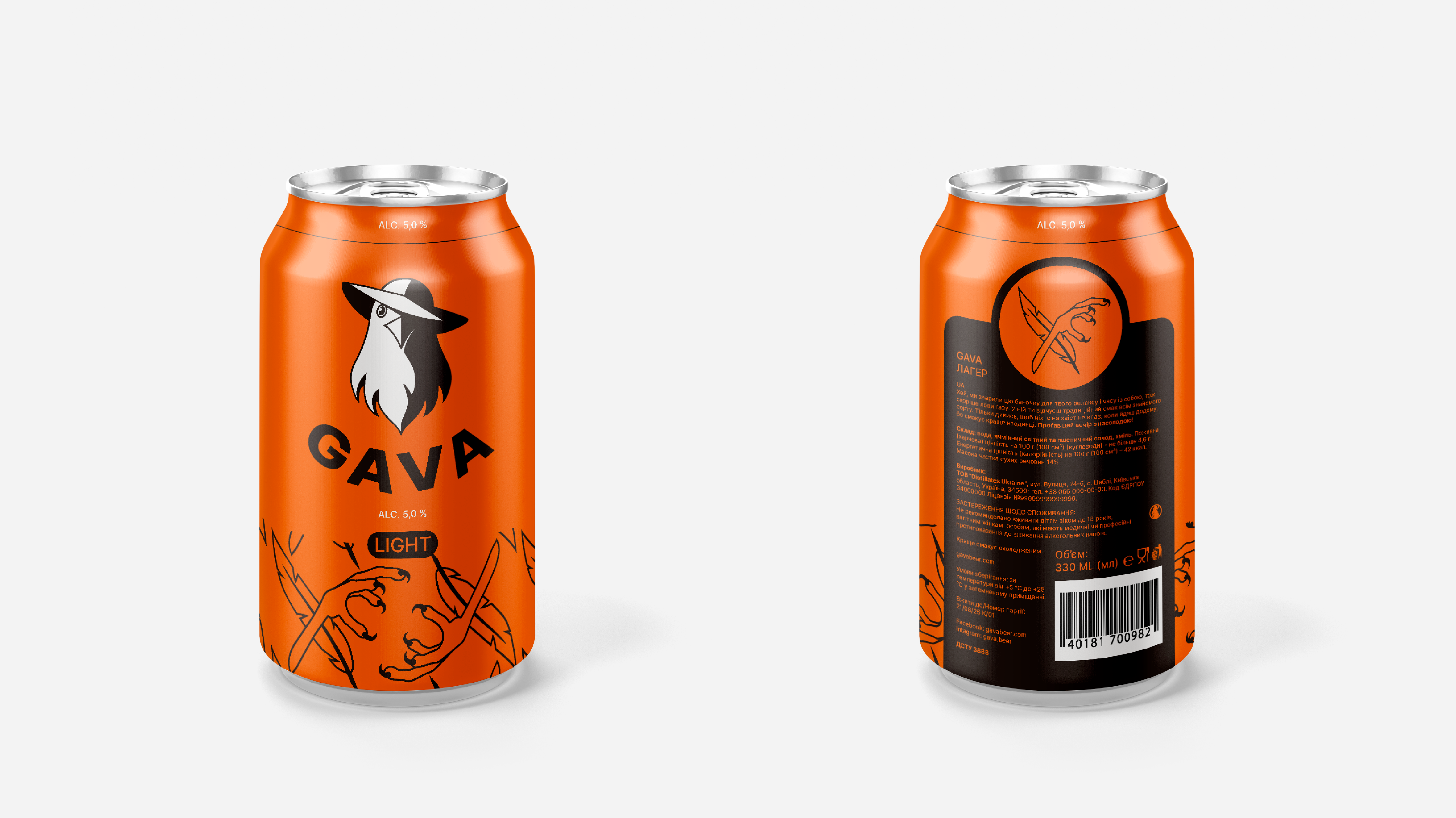
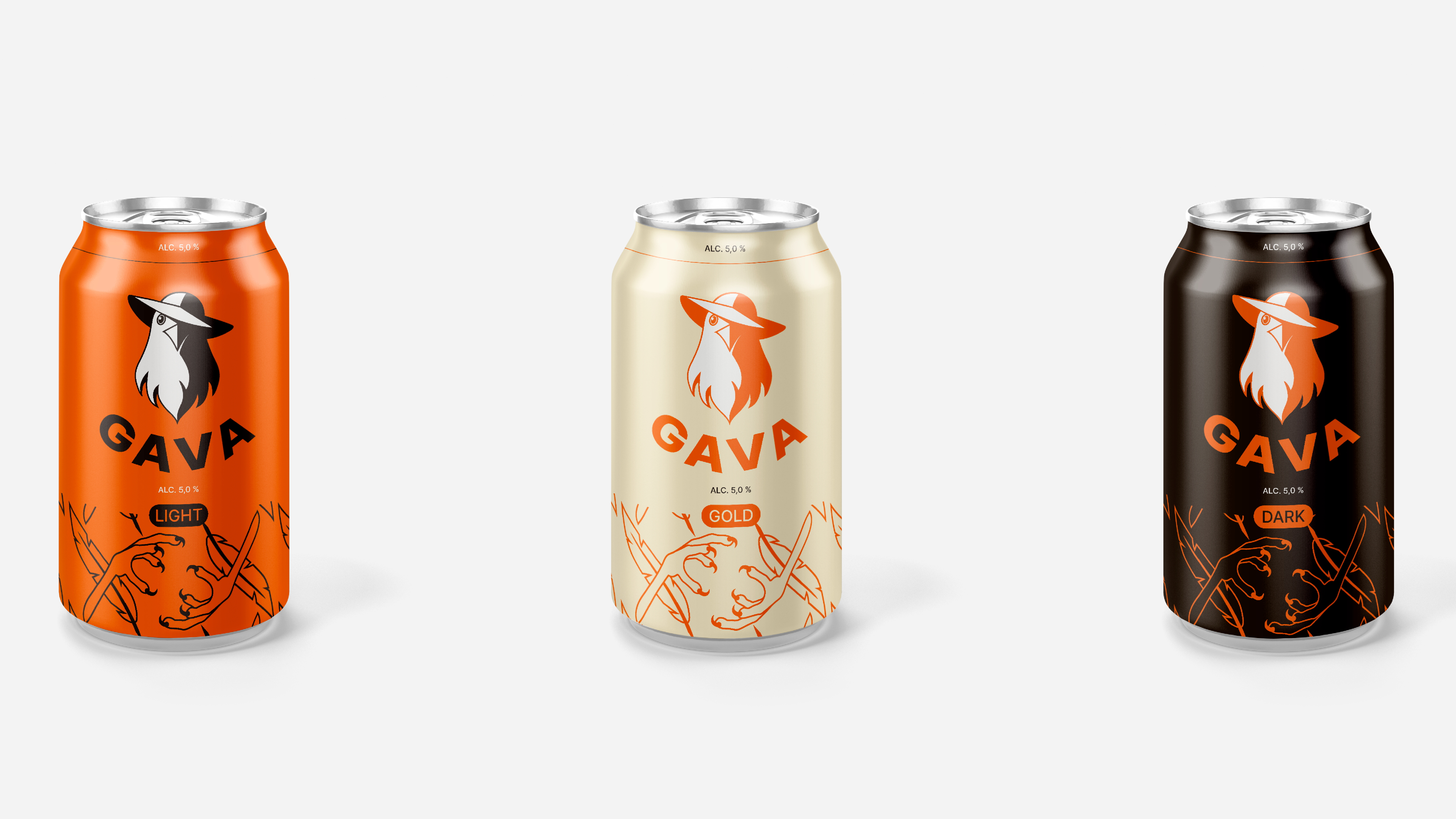
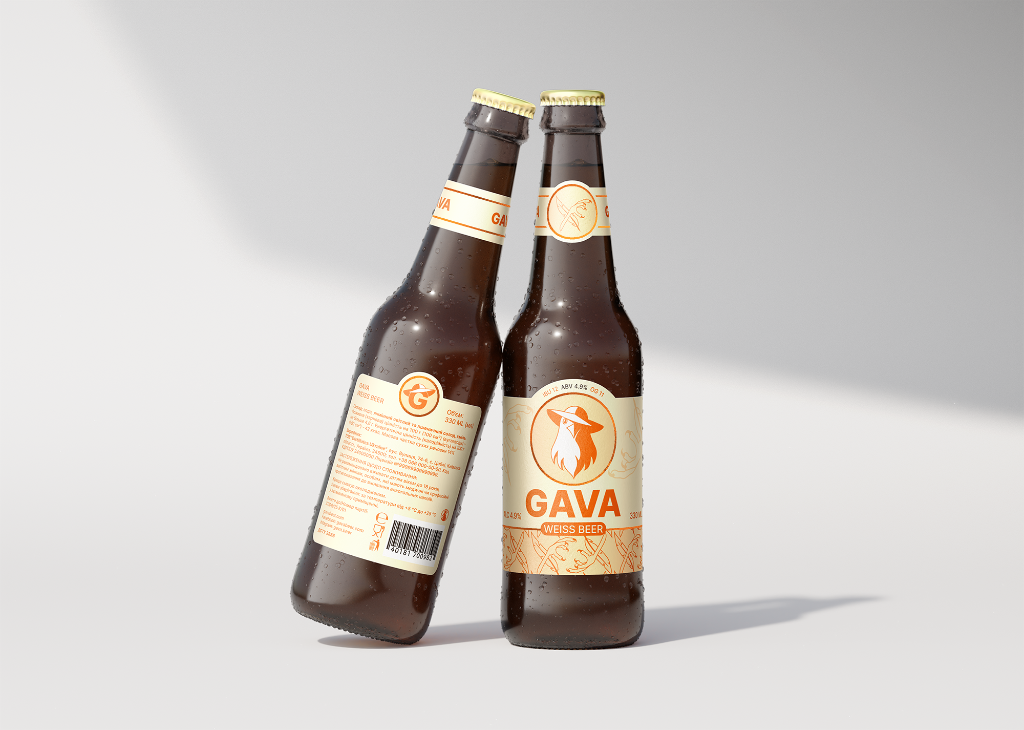
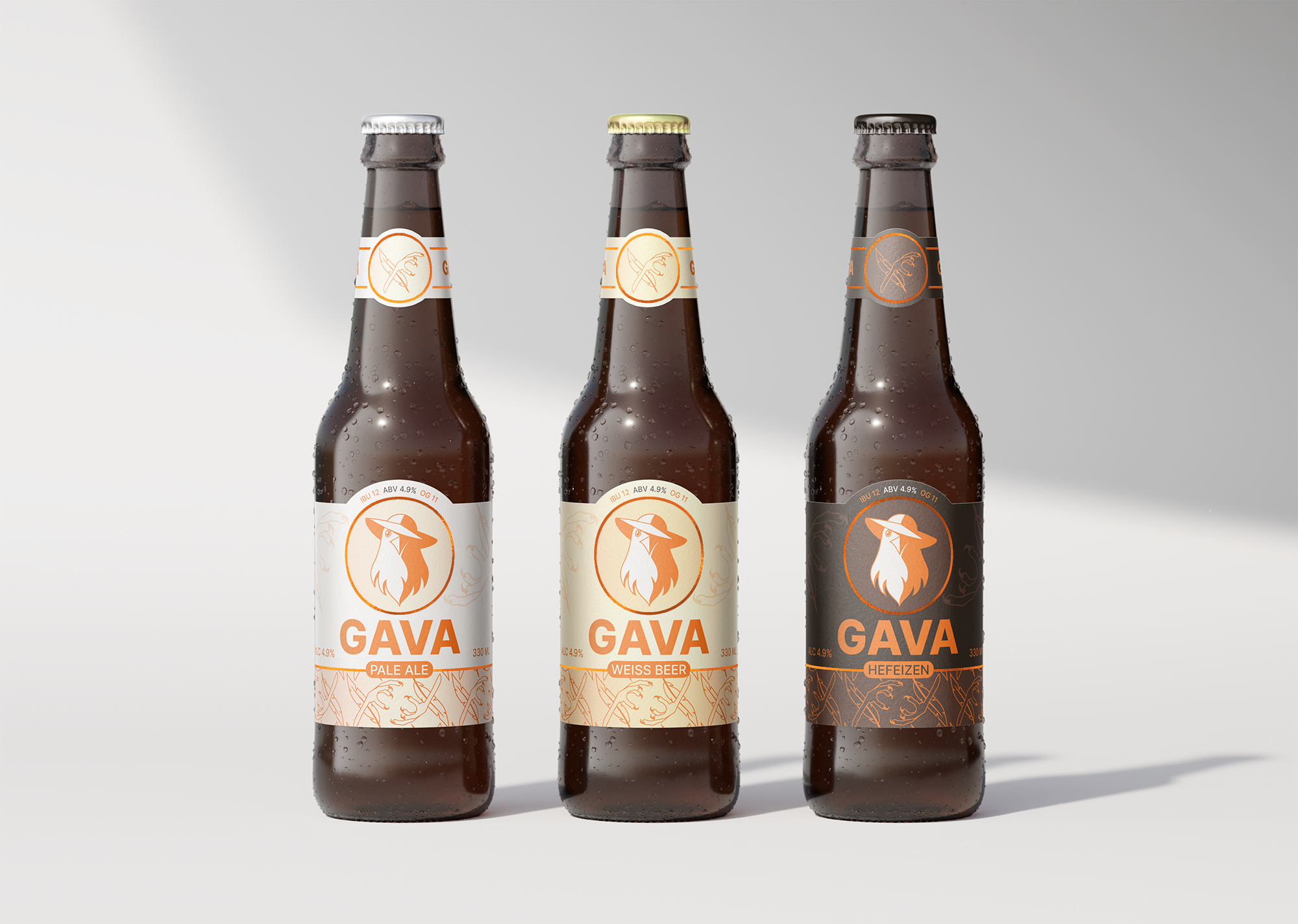
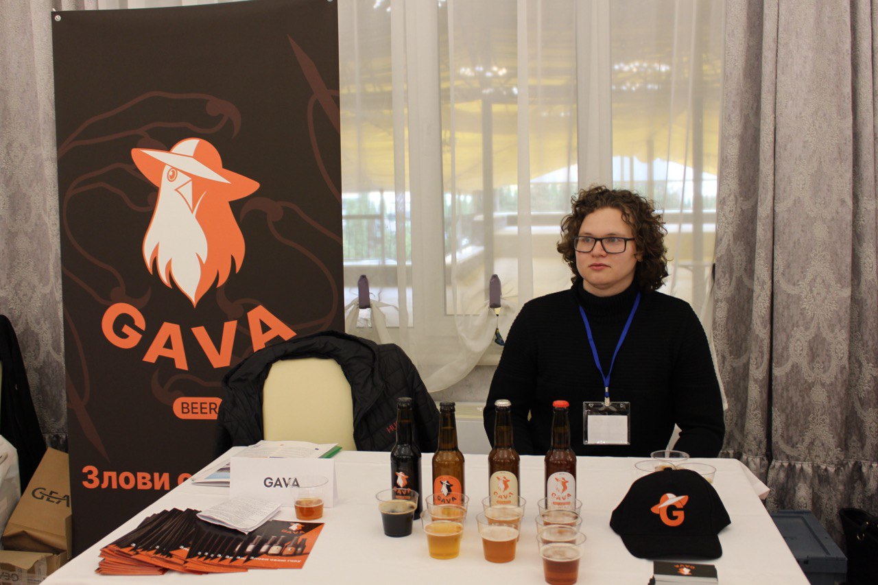
GAVA
The name GAVA is inspired by the Ukrainian phrase “Ловити ґав”, which means to daydream, zone out, or be lost in thought. But who says that’s a bad thing?
Sometimes, it’s perfectly fine to “not be here,” to take a passive break. We all need moments when we just stare at the wall, do absolutely nothing, get lost in our thoughts—without guilt.
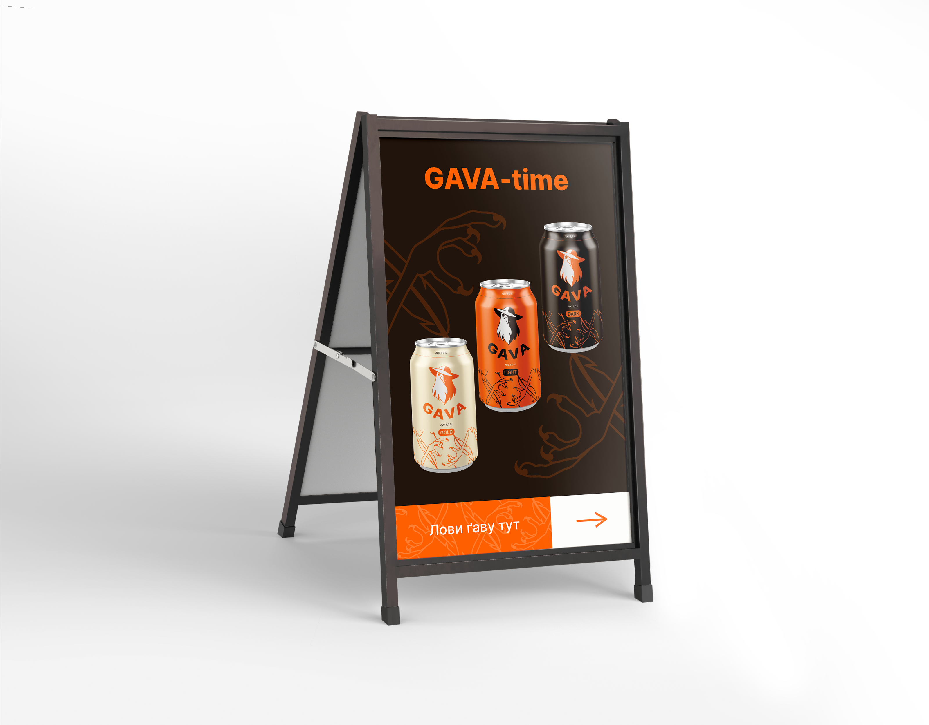
SLOGAN: “Catch your GAVA”
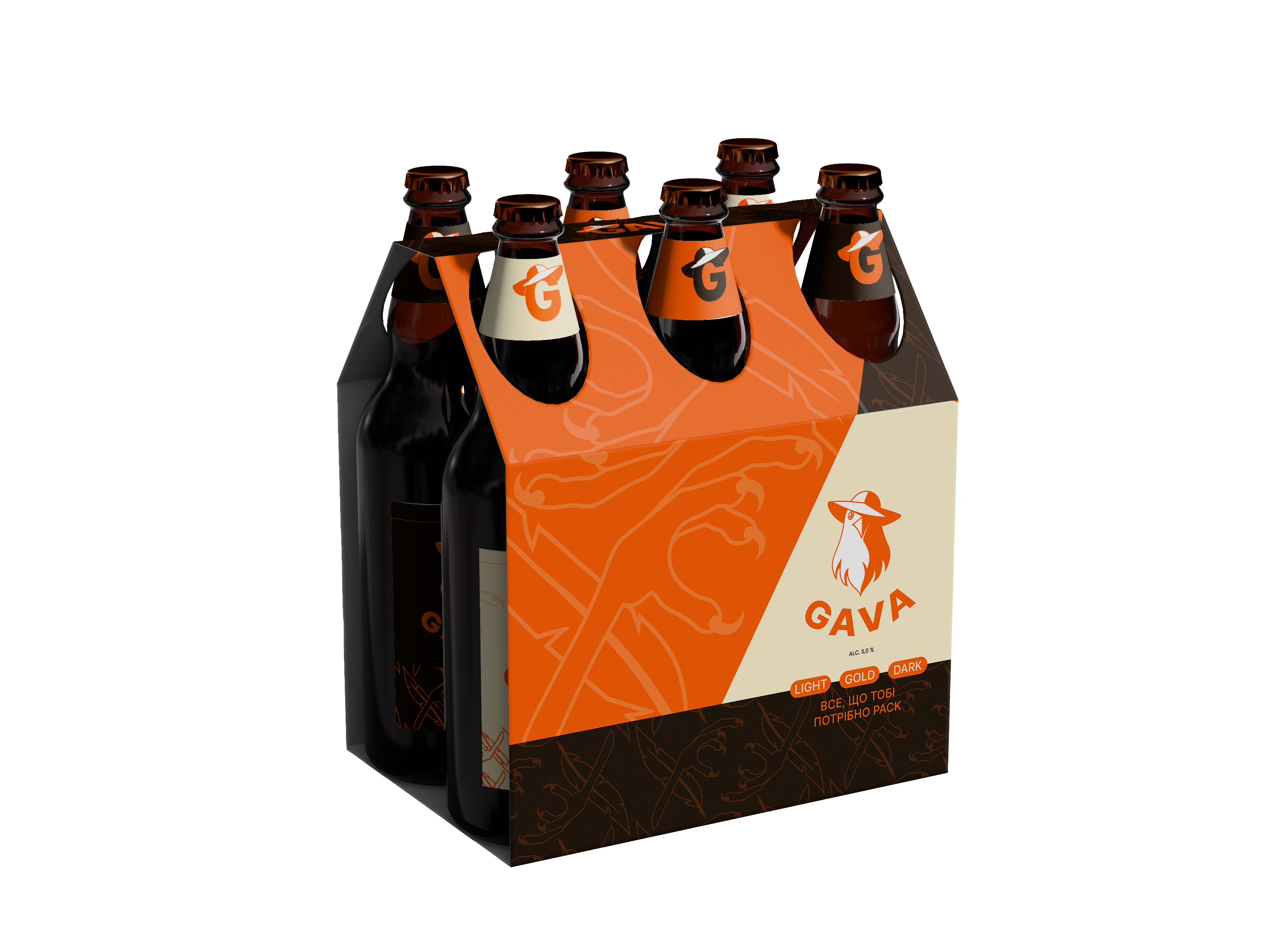
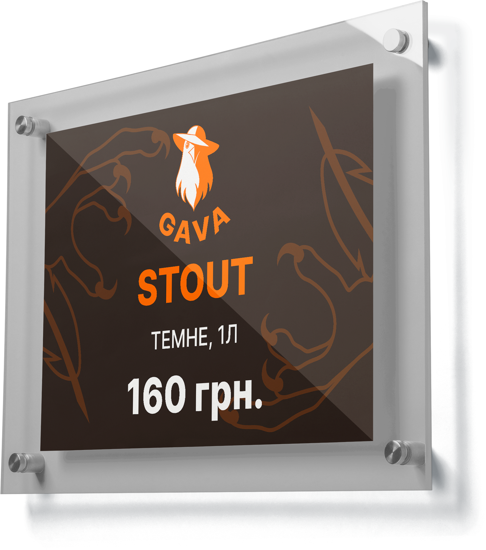
PRODUCT
A Ukrainian beer made from traditional, time-tested varieties. The taste is always high-quality and consistent, so you don’t even have to think twice when making your choice.
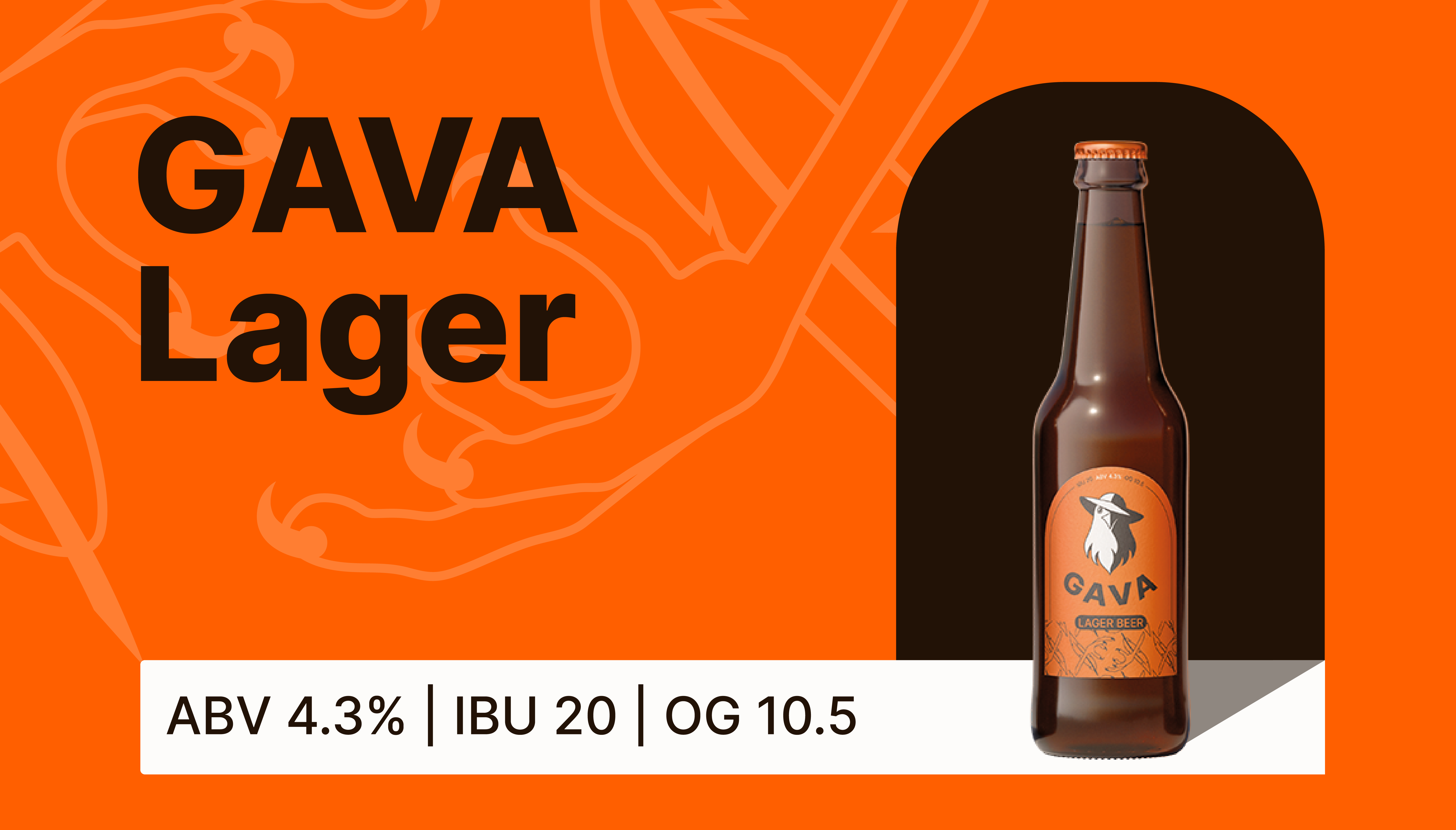
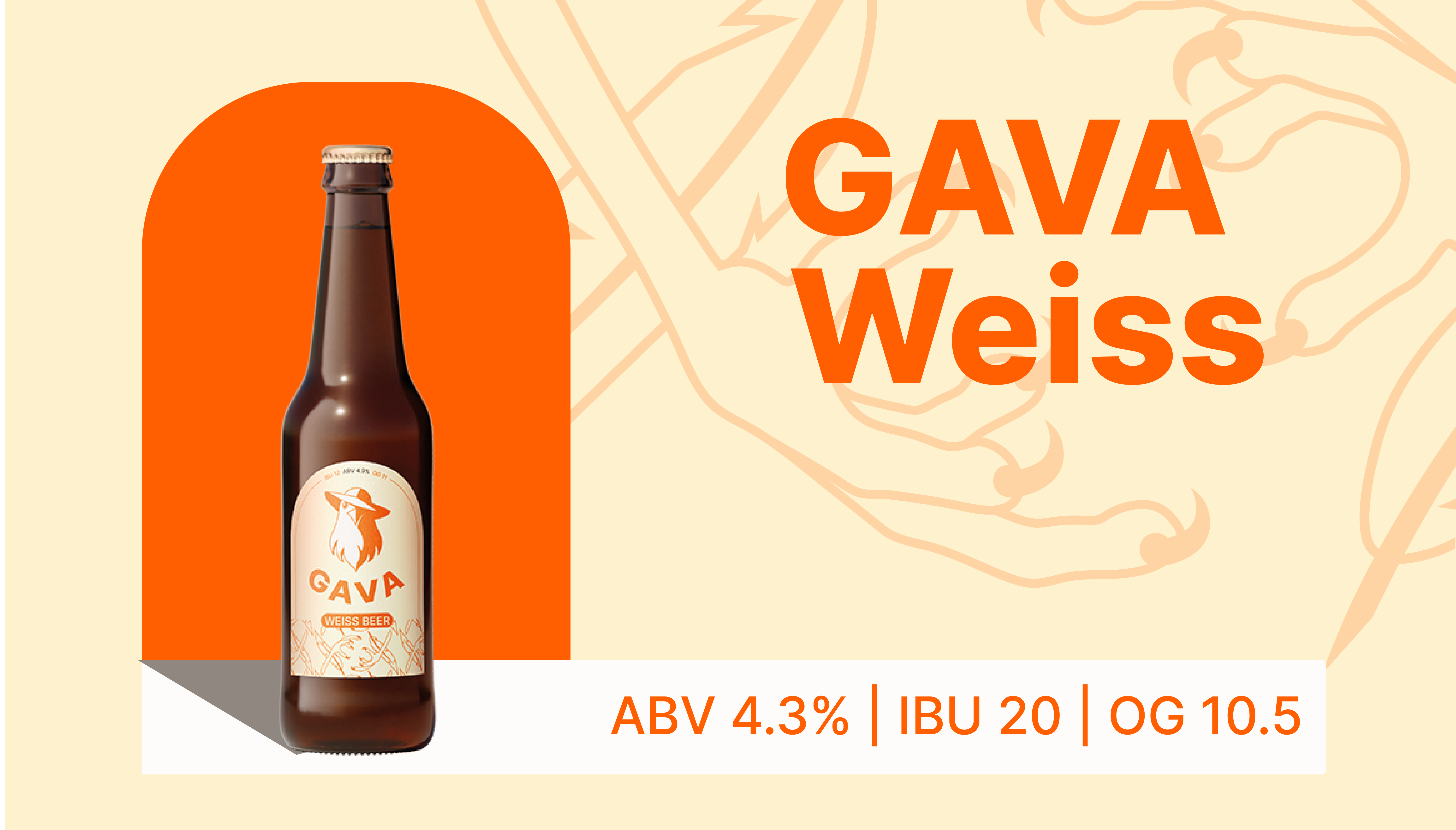
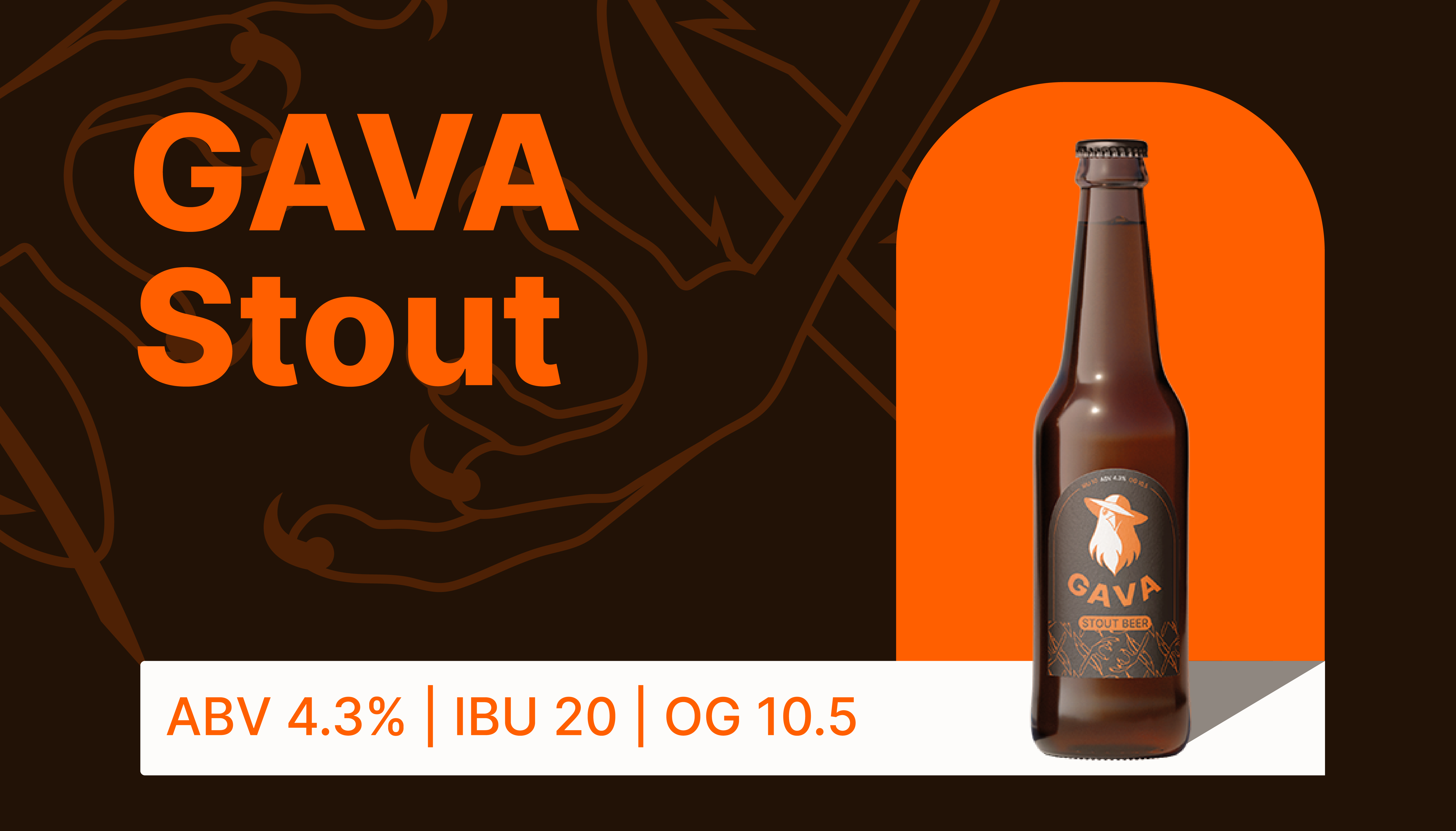
Category Features
Our strategic decision for GAVA was not to position it explicitly as a craft or local beer. These labels carry a significant meaning, which would be unnecessary in this context.
Need We Fulfill
We help people enjoy the taste of beer and take time for themselves.
DESIGN SYSTEM
We dressed the brand according to its positioning—to stand out on the shelves and appeal to our target audience. 🙂
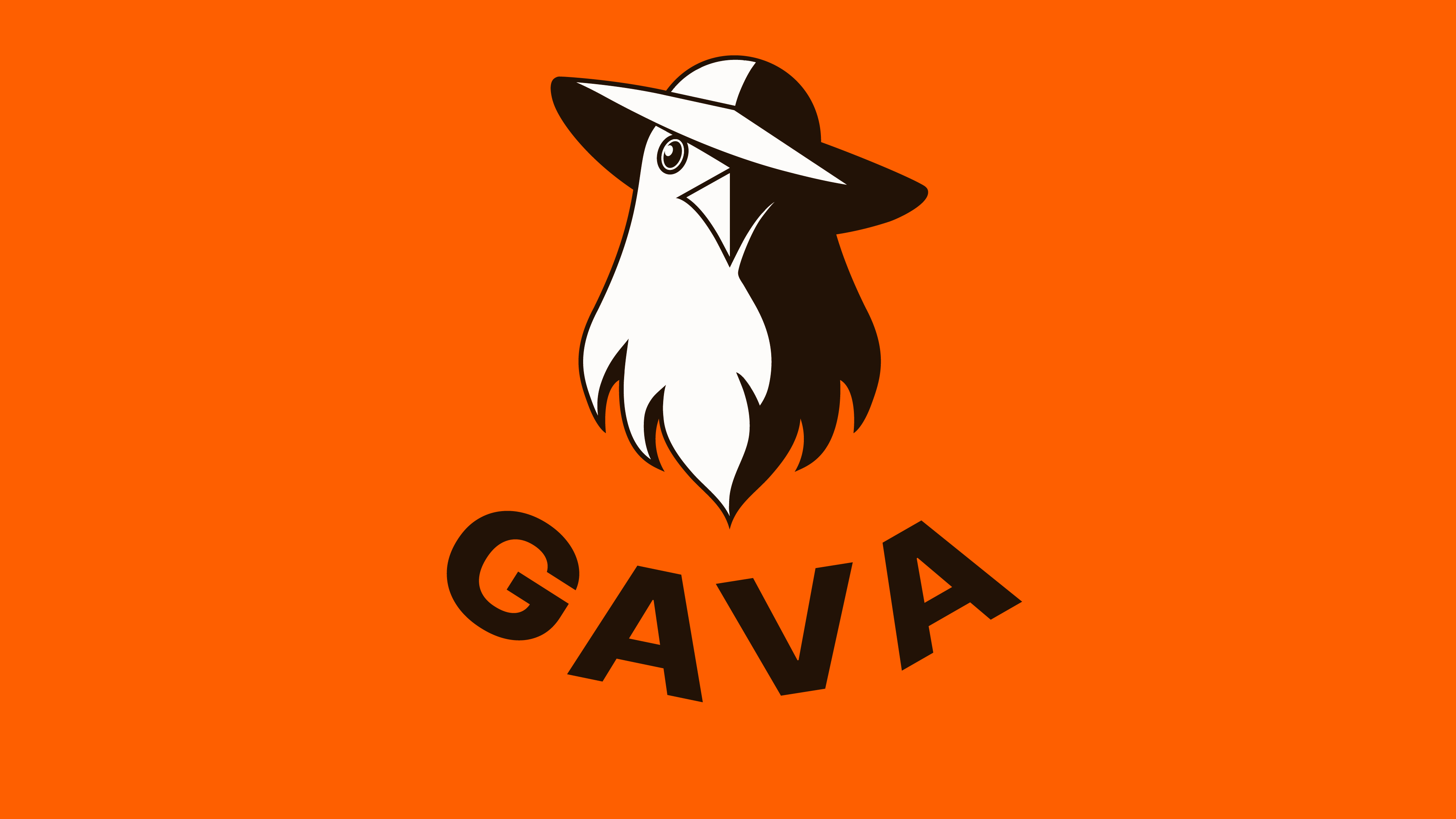
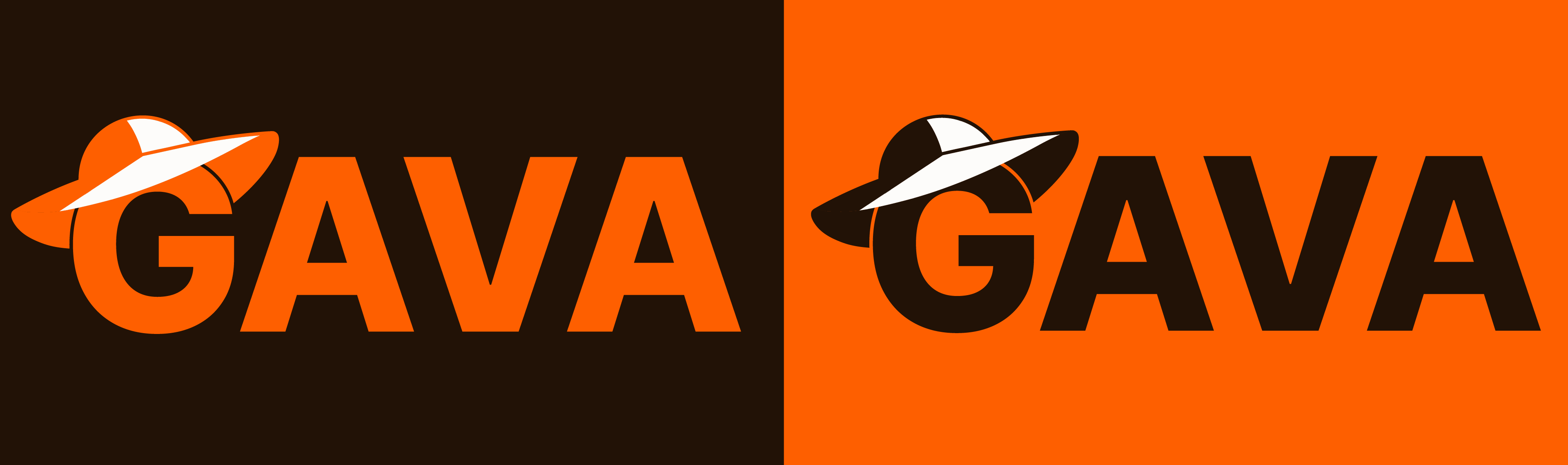
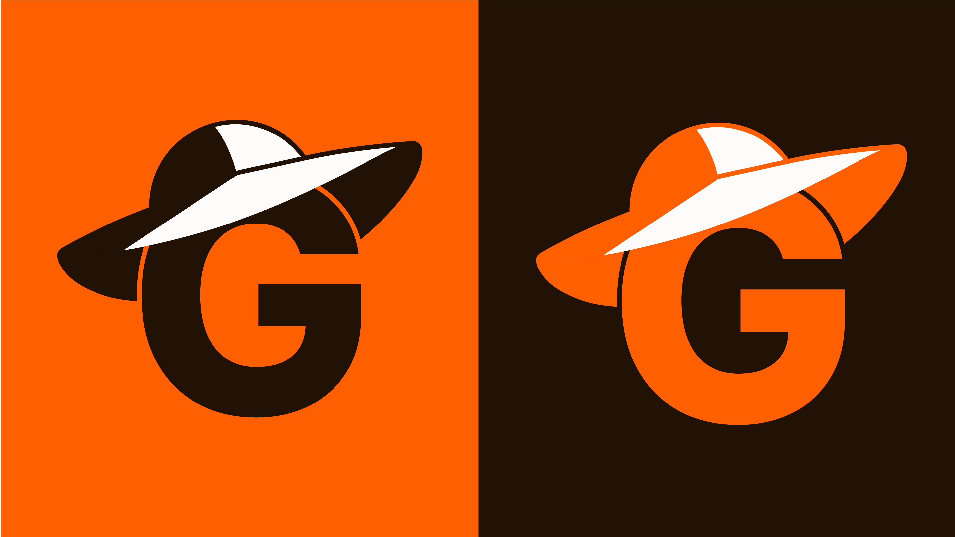
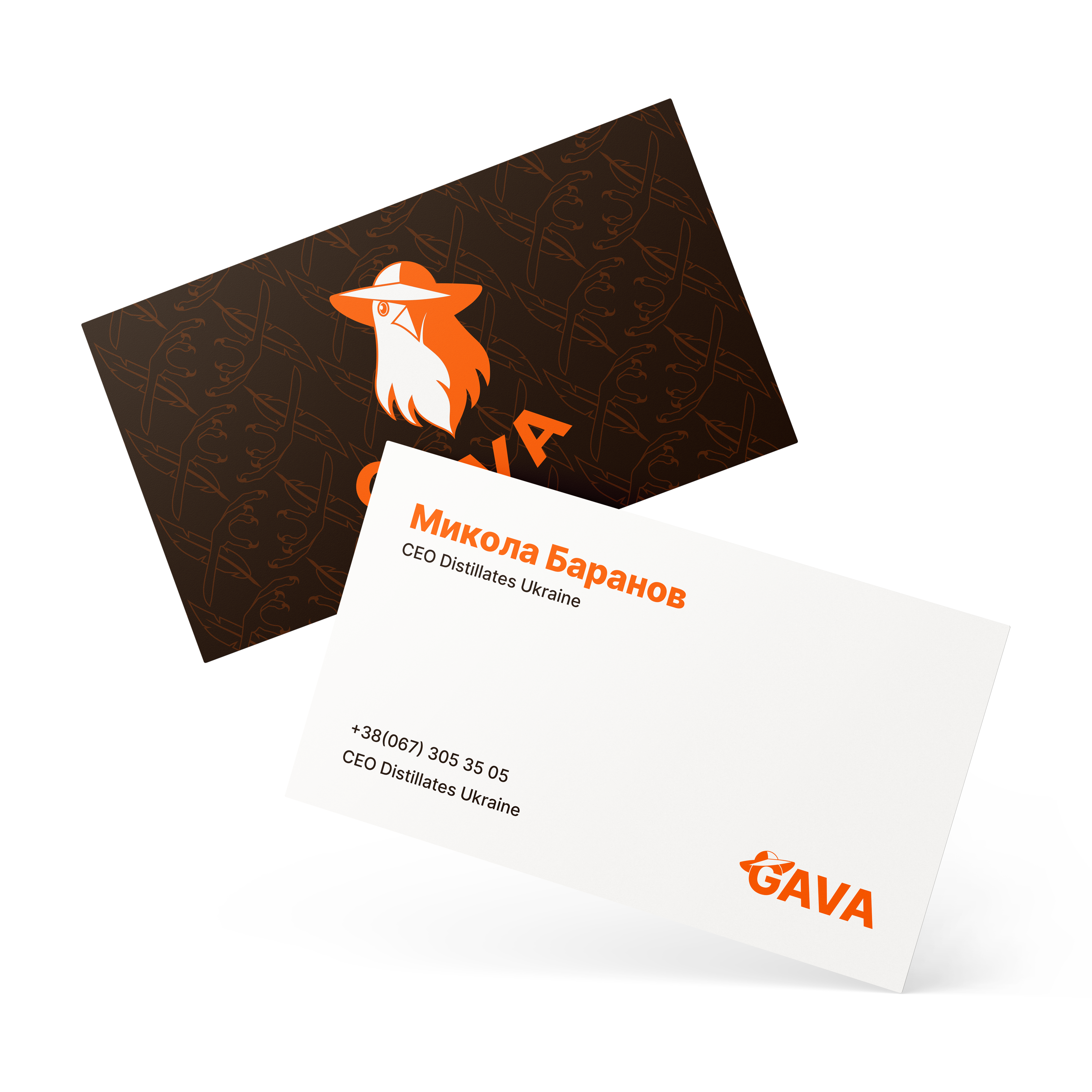
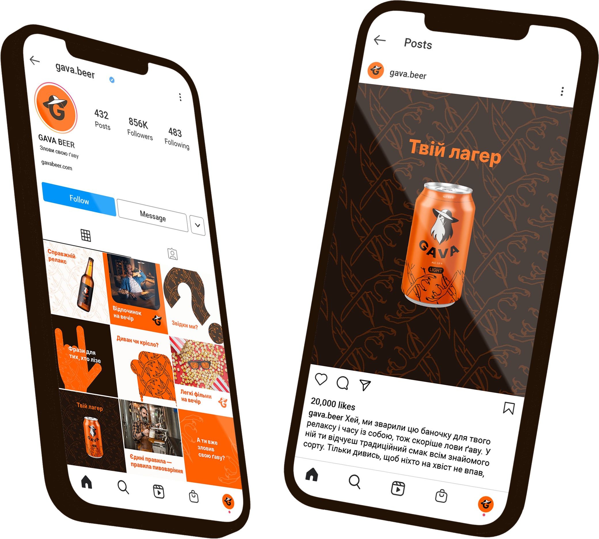
LOGO
GAVA features a classic combined logo, consisting of a symbol and a typographic inscription.
The symbolic emblem represents a bird wearing a hat, conveying the brand’s values, rebellious spirit, and emotions.
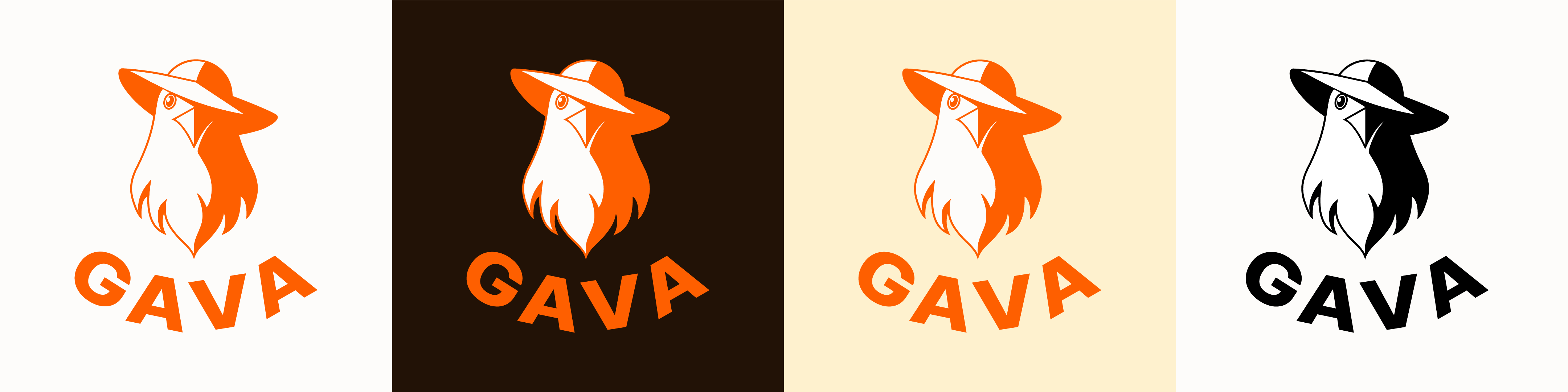
The logo has multiple configurations, making it easier to use across different surfaces and formats.
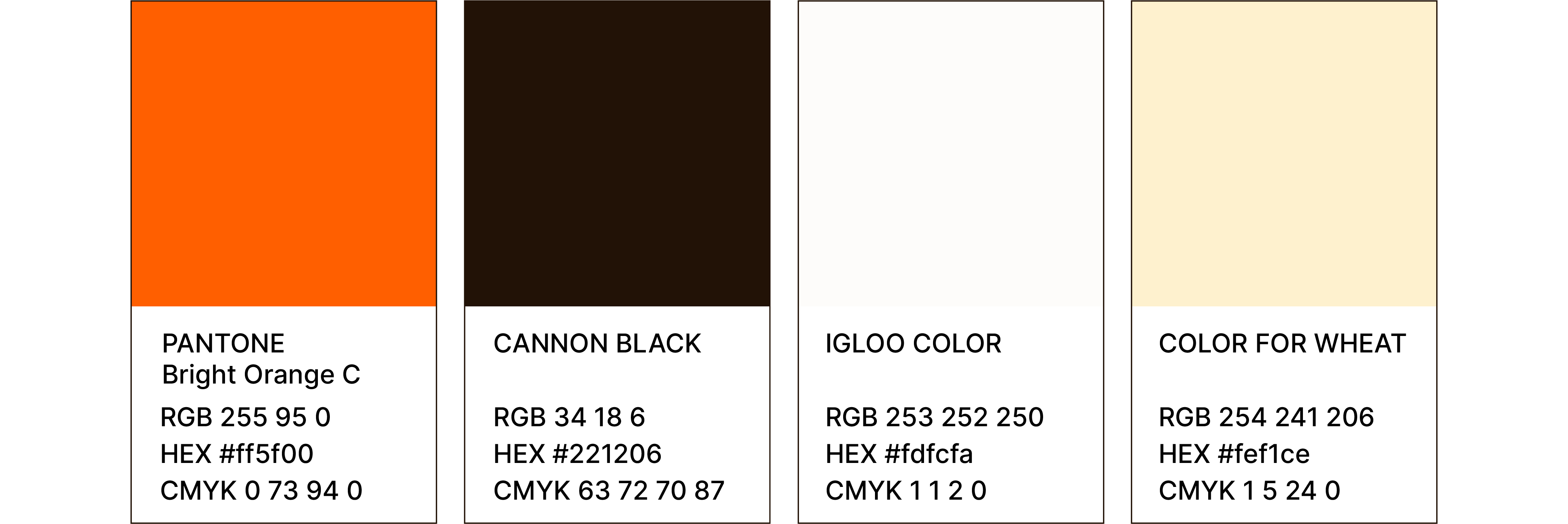
COLOR PALETTE
The key accent color is Bright Orange C, which dominates most layouts and the colored logo variation, ensuring strong brand visibility.
TYPOGRAPHY
We chose Inter, a modern sans-serif typeface optimized for screen readability. Its neutral character makes it highly adaptable and easy to read.
SIGNATURE ELEMENT
The main stylistic feature is an illustration of a paw and feather forming a cross, symbolizing balance and ease.


PATTERN
This signature element seamlessly transforms into scalable patterns, allowing flexible use in branding materials. The pattern can also be applied in silhouette fills for added depth and texture.
IDENTITY
BIG THANKS!
Дашенко Дар'я — Copywriter&Team Lead
Ремезовська Олена — Designer
Макс-Амадор Лопес — Designer
Доллежаль Анастасія — Designer
Do you like it?
See more
Branding for YOUR dentistry ;)
TVOYA dental studio
Branding that gives clarity!
PerioCenter
