Алі Назар
— Creative Director
Алі Ніна
— Strategу & PR Director
Домченко Влада
— Senior Designer
Ковтун Влад
— Copywriter
Кулібаба Світлана
— Client manager
CLIENT
We met our client in September 2020. They were bringing to life not just a business but a personal dream—a comfortable suburban sports complex. However, there were already plenty of competitors specializing in tennis outside Kyiv. So, the main question and our challenge became:
We assured them there was no need to worry—because we were on the job. We thought it through and realized that the key was to create a brand that would captivate everyone with its idea. And that’s how our playful story began!
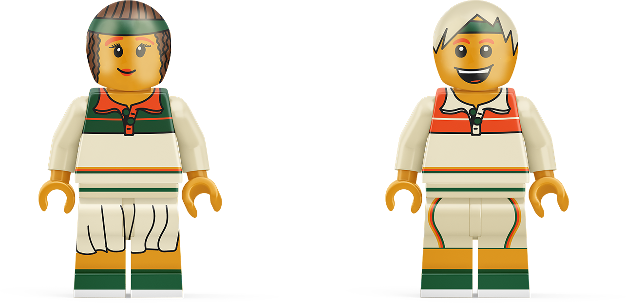
Our comprehensive project began with an in-depth study of the location, market, and personal interviews with professional trainers as well as clients of fitness and tennis clubs.
TRAFFIC ANALYSIS
For traffic analysis, we identified three key segments:
— Kyiv
— The suburban area
— The vicinity of our new sports club’s location (Vyshhorod, Khotianivka)
COMPETITOR ANALYSIS
We identified competitors based on location and services offered. We also conducted research on price sensitivity, positioning, strengths and weaknesses, and emotional advantages.
Our research team gathered insights from legendary suburban sports locations to apply the best practices in creating a superior sports complex.
SOCIAL MEDIA RESEARCH
We conducted open-source research and social media listening. This helped us collect and organize effective communication strategies, content approaches, and methods for page management and moderation.
PERSONAL INTERVIEWS & CUSTOMER EXPERIENCE ANALYSIS
And, of course, our favorite type of research—personal interviews. Why favorite? Because this is where the most valuable observations and insights emerge, forming the foundation for our strategy.
Through these interviews, we uncovered a key insight that was confirmed across all research methods. Based on this, we developed the positioning for our suburban sports club.
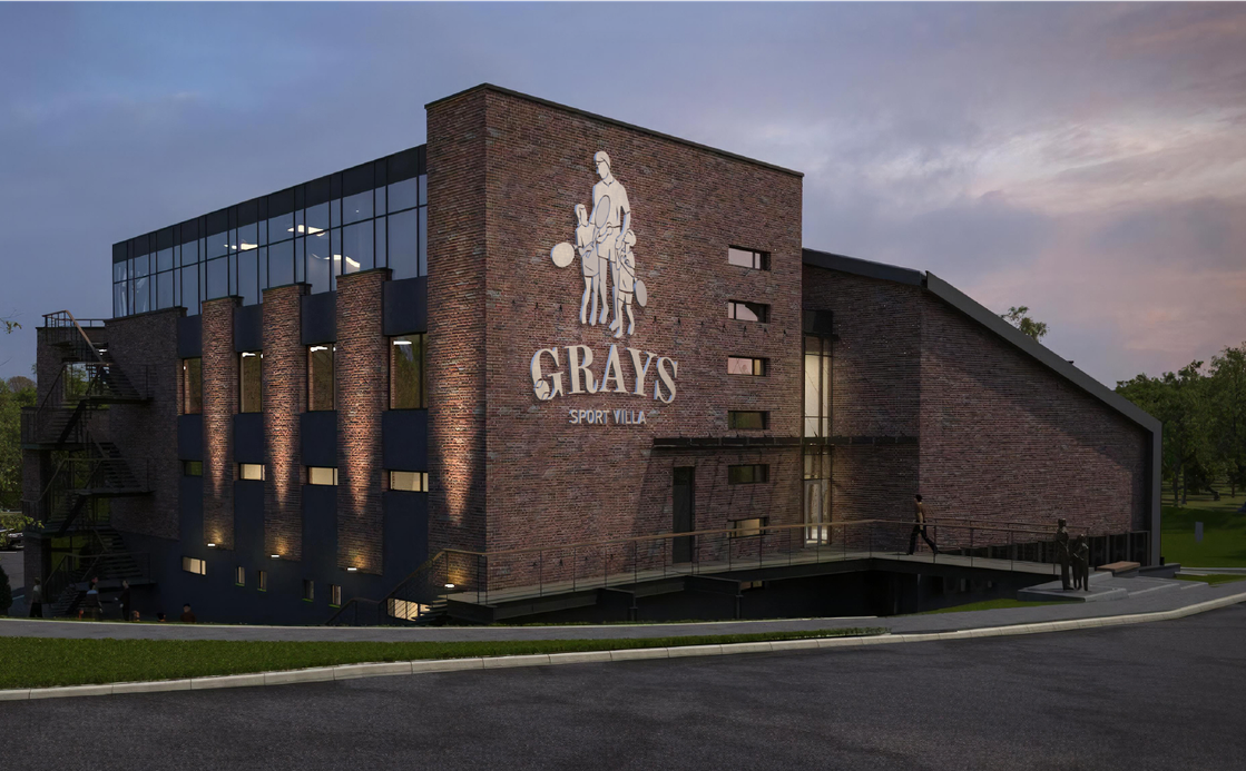
POSITIONING
We position ourselves as a family sports villa, fostering strong family bonds. Every detail is designed to ensure that spending time together as a family is active, engaging, and diverse. Our offerings include:
— Children’s sports groups
— Tennis academy
— A restaurant with a kids’ menu
— Chill-out zones
— A private waterfront
INSIGHT
There’s a common stereotype that gyms and tennis courts are for individual training only. Because of this, few people consider whether these spaces are comfortable for the entire family. As a result, when choosing weekend activities, sports often take a backseat to more family-friendly options.
With us, you don’t have to worry about keeping your child engaged while finding time for yourself.
Our residents are an integral part of the sports villa. Beyond sports and relaxation, we create a space for a strong community. In our villa, there is no traditional concept of a “membership.” Instead, we offer exclusive club cards for our residents.
We are the most sports-oriented compared to our nearest competitors, such as Sobi Club/Navi. We provide premium sports experiences combined with nature-driven relaxation—something urban fitness clubs simply cannot offer.
Kyiv’s boundaries continue to expand, gradually incorporating satellite cities. Our primary audience consists of Vyshhorod residents, for whom our complex is far from being a “remote getaway.”
Yet, like a welcoming host, it remains in the background. This ensures we do not alienate the fitness-oriented audience or limit our appeal exclusively to tennis players.
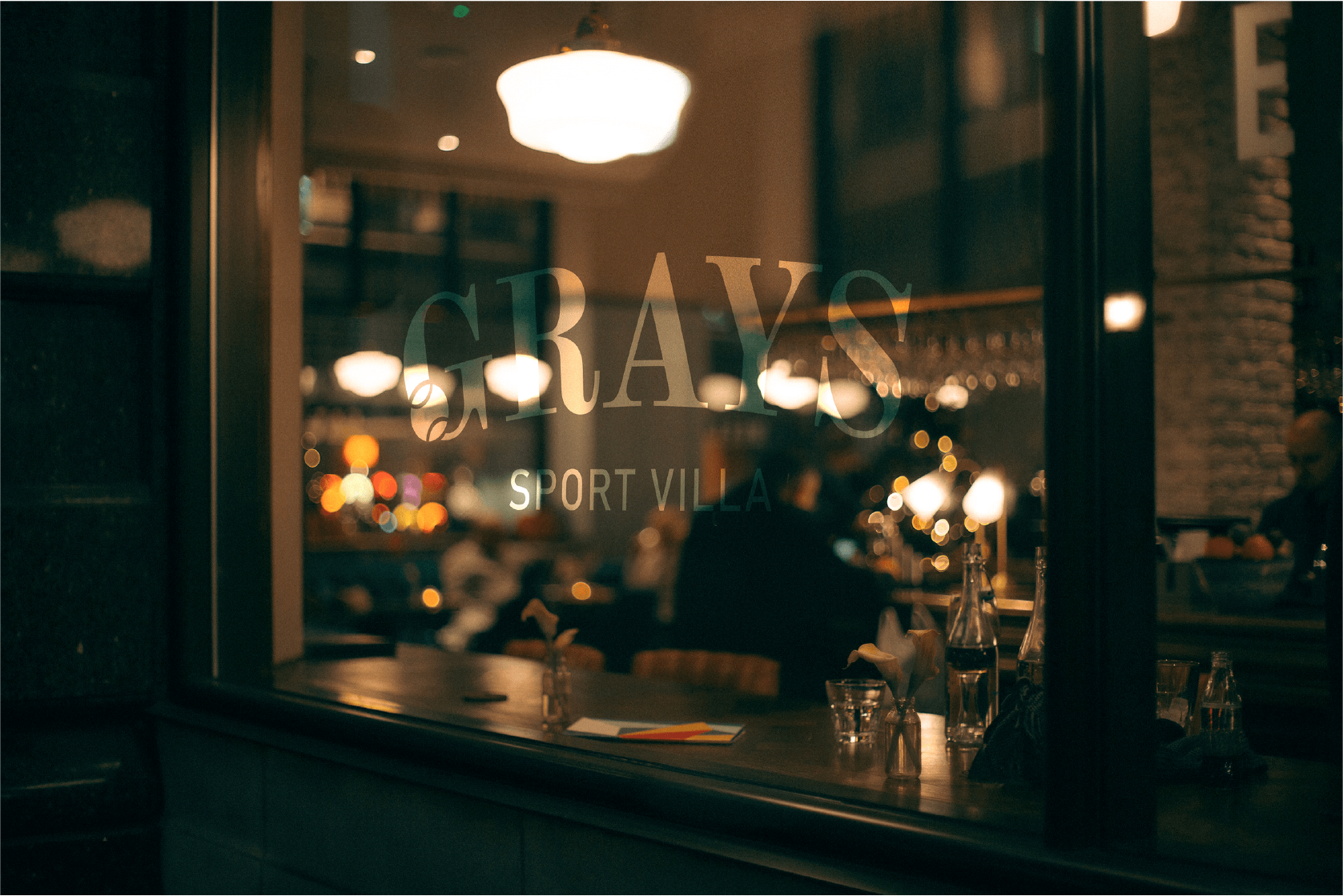
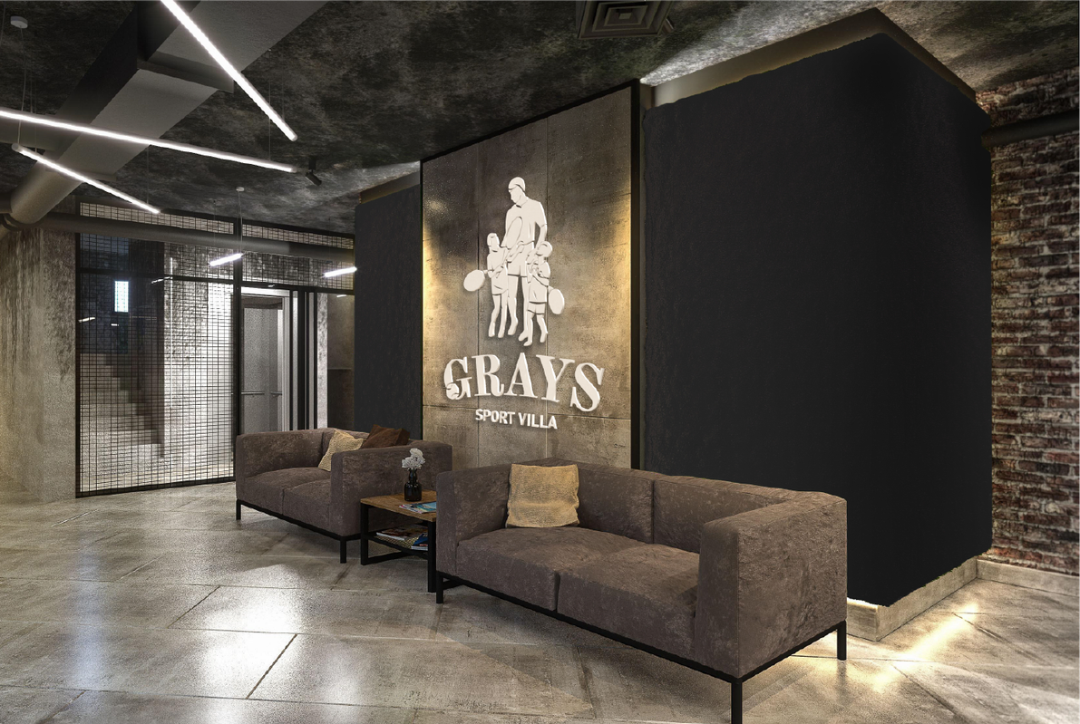
The Sport Villa Grays logo is a combination mark, meaning it consists of both a text element and a symbolic illustration.
The symbol depicts a family dynasty of tennis players, aligning with the core values of the Grays brand and setting the right tone. It clearly communicates the brand’s primary focus—a sports villa with a strong emphasis on tennis activities.
The illustration transforms into a standalone symbol, which is used on icons and complements the text in a horizontal configuration.

PATTERNS
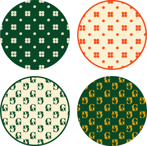
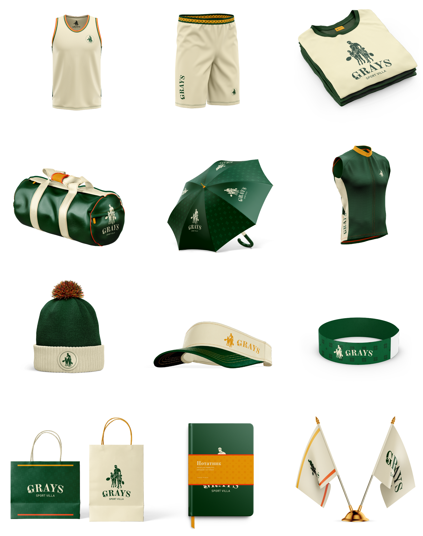
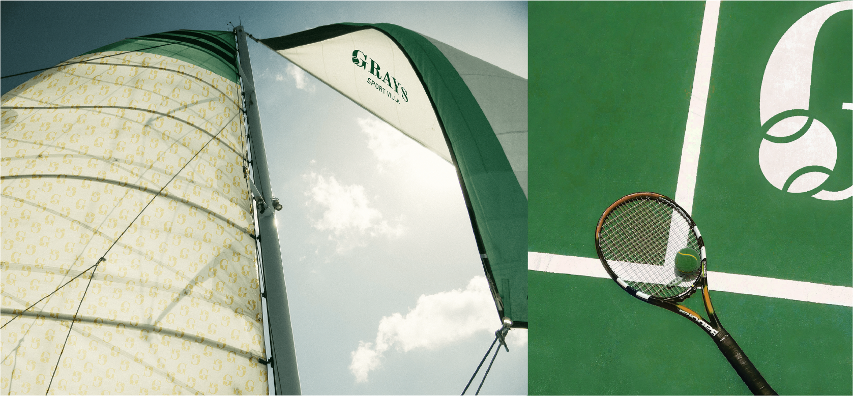
The adaptive elements of the logo seamlessly transform into scalable patterns, which can be applied to textiles and various brand identity materials.
The pattern is primarily used as a background element, subtly blending into the design. It closely matches the background color, appearing just one shade lighter to maintain a refined and elegant look.
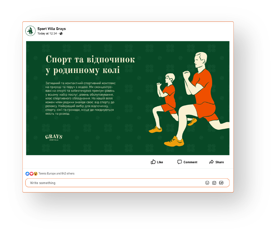
A distinctive illustration style enhances the sports identity of the brand.
These illustrations are primarily used in social media, adding a dynamic and engaging visual touch to the brand’s communication.
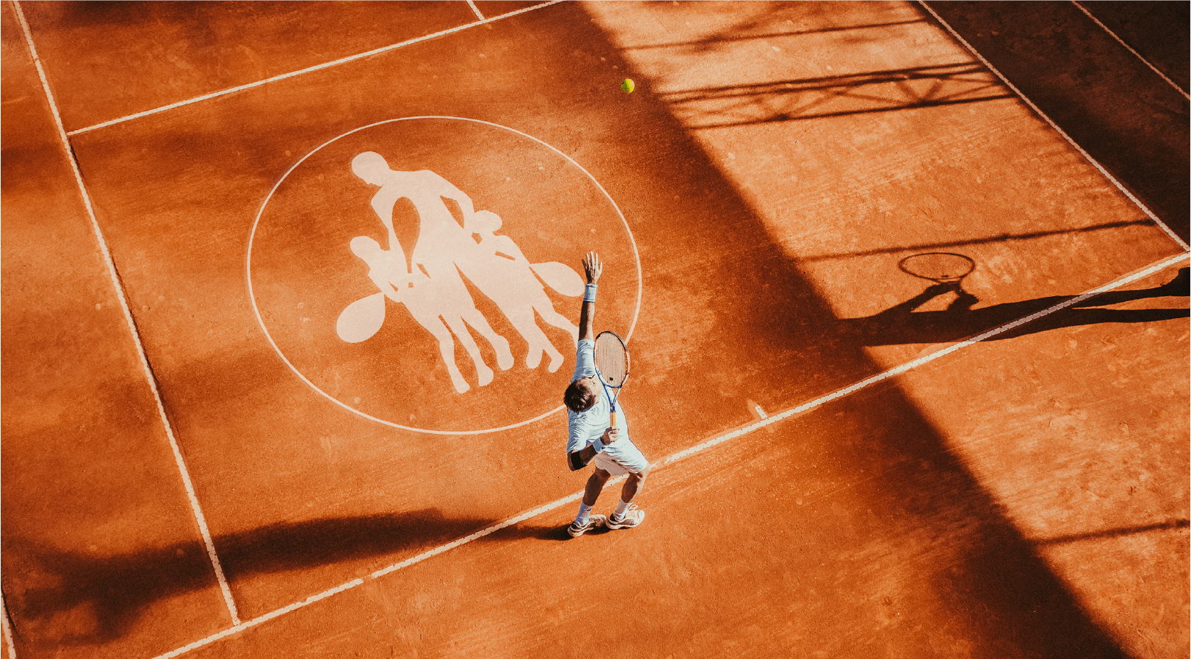
Today, the Grays brand is respected for its attention to detail and personalized approach. It creates the feeling that everything matters and is carefully overseen by the villa’s host.
Sport Villa Grays proves that combining sports with family relaxation is not just a concept—it’s a reality that resonates with its audience.
And we prove that bold and unconventional marketing strategies are even more effective!
Алі Назар
— Creative Director
Алі Ніна
— Strategу & PR Director
Домченко Влада
— Senior Designer
Ковтун Влад
— Copywriter
Кулібаба Світлана
— Client manager
Кузьменко Поліна
— Designer
Мартиненко Анастасія
— Client Director
Поп Сабіна
— Designer
Посад Влад
— Art-Director
Терещенко Олена
— PR-manager