Назар Алі
— Creative Director
Ніна Алі
— Strategist
Світлана Кулібаба
— Client Director
Влад Ковтун
— Creative Team Leader
CLIENT
PerioCenter is a specialized treatment center that deals with gums. All doctors are experts in periodontics. The main problem is how to convey to the client the importance of treatment. After all, we are all used to paying attention to our teeth, going for regular checkups, and buying expensive toothpastes. But few dentists’ clients think that the disease lies below.
TASK
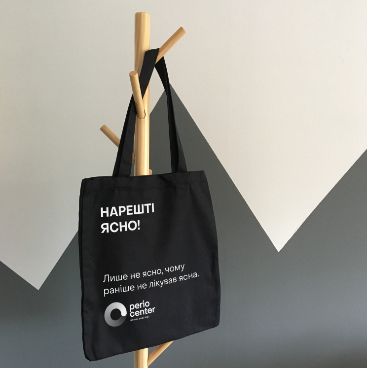
The rebranding had to convey to the target audience that their problem is solved here! And the communication had to be gentle, because the patient came to them with an advanced case and a lot of complexes. Develop an advertising campaign that would turn on a light bulb overhead – “I have a problem with my gums, so I need to go to PerioCenter. There is nothing to be ashamed of.”
RESEARCH
We analyzed the market situation, the factors that influence it, and assessed the risks. We also conducted an excursion into the minds of dental service customers and found out where they look for specialists and what principle they use to choose a doctor. And with this map, they found not treasures, but the competitive field of PerioCenter.
INSIGHT
People come to us with a problem and will continue to come. Preventive procedures take up a smaller percentage. So we focus on treatment rather than hygiene. We are abandoning small branches and becoming a large comprehensive clinic that can solve all problems related to the gums. So that you can finally taste life, not disease.
POSITIONING
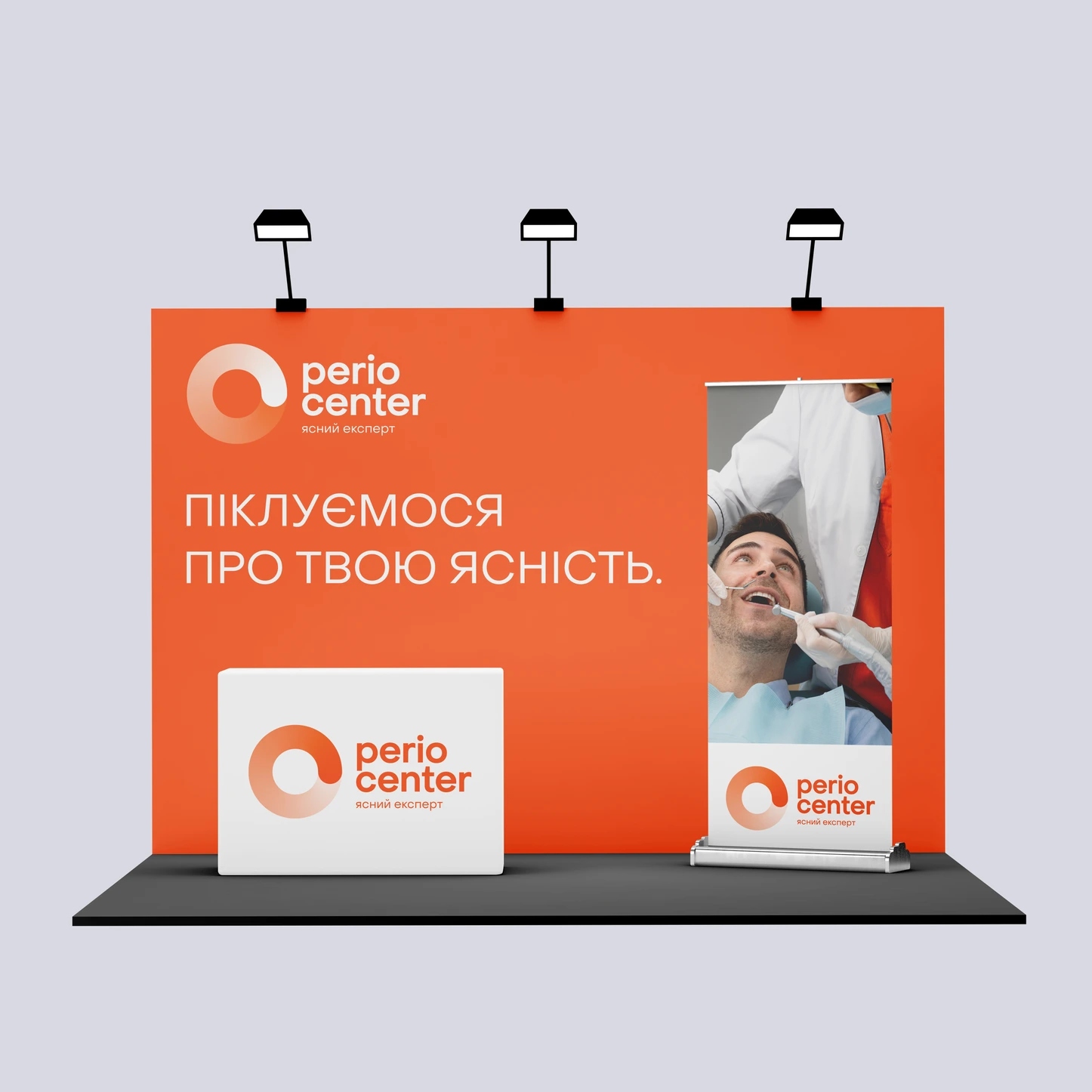
Perio Center is the only highly specialized center that guarantees to solve any problems with your gums. We will make you healthy, confident and happy again.
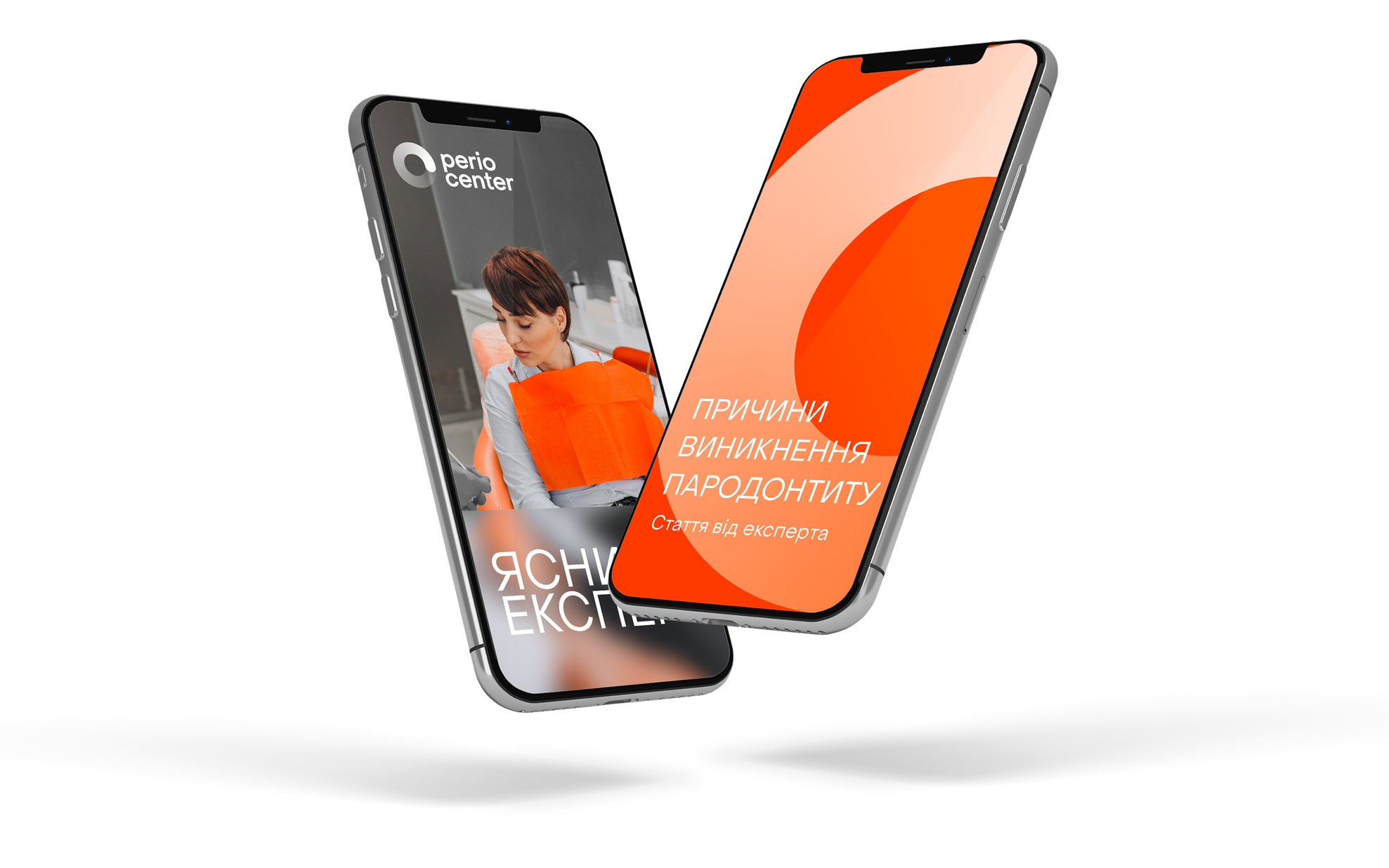
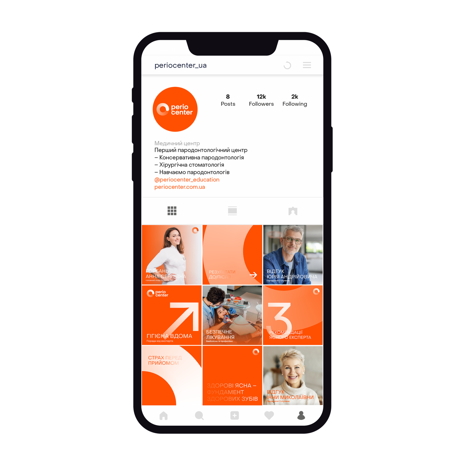
PERIO CENTER — CLEAR EXPERT
We are the only center that boasts recognized expertise, trains others, maintains a fair partnership, and has its own unique protocols. And most importantly, we never give up on even the most difficult cases.
REBRANDING
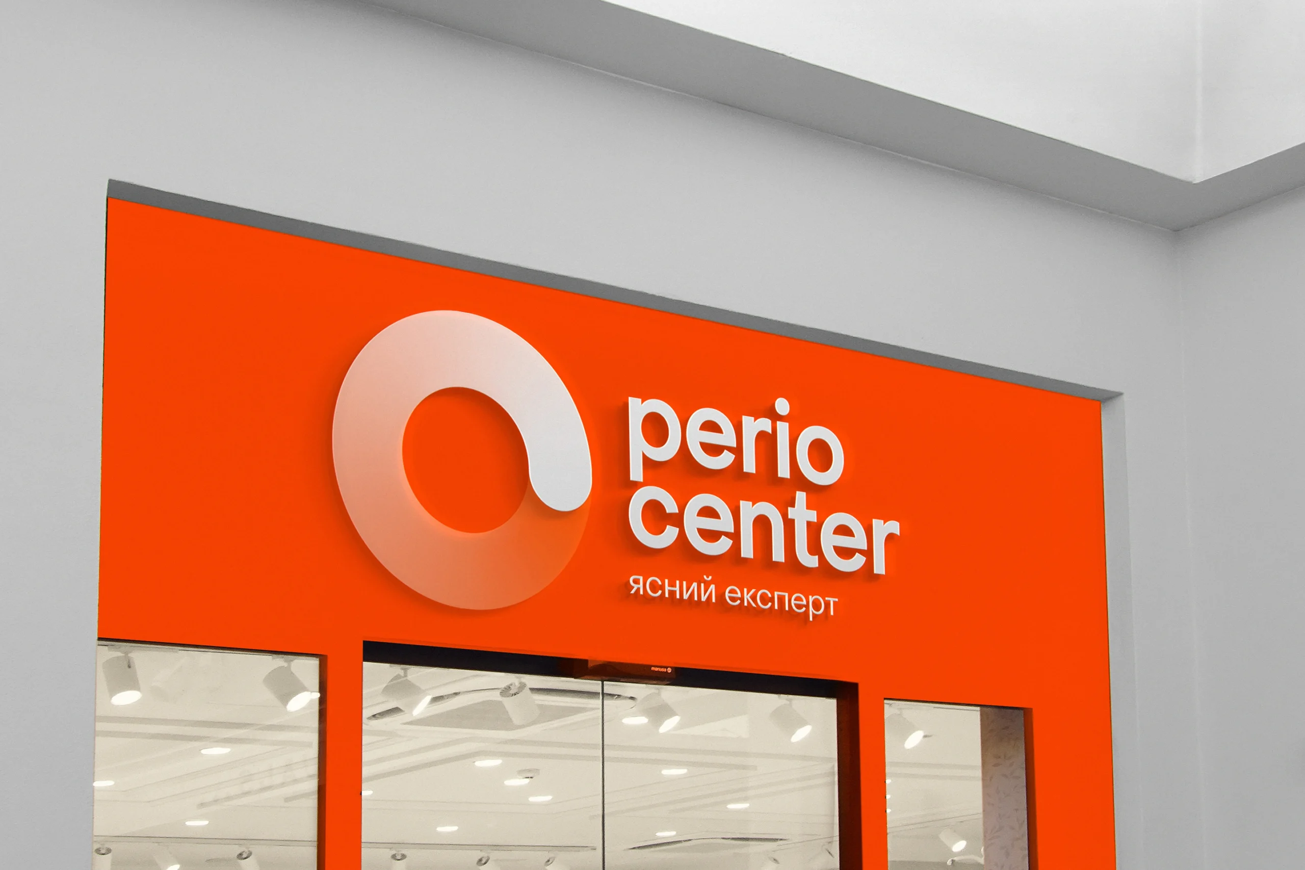
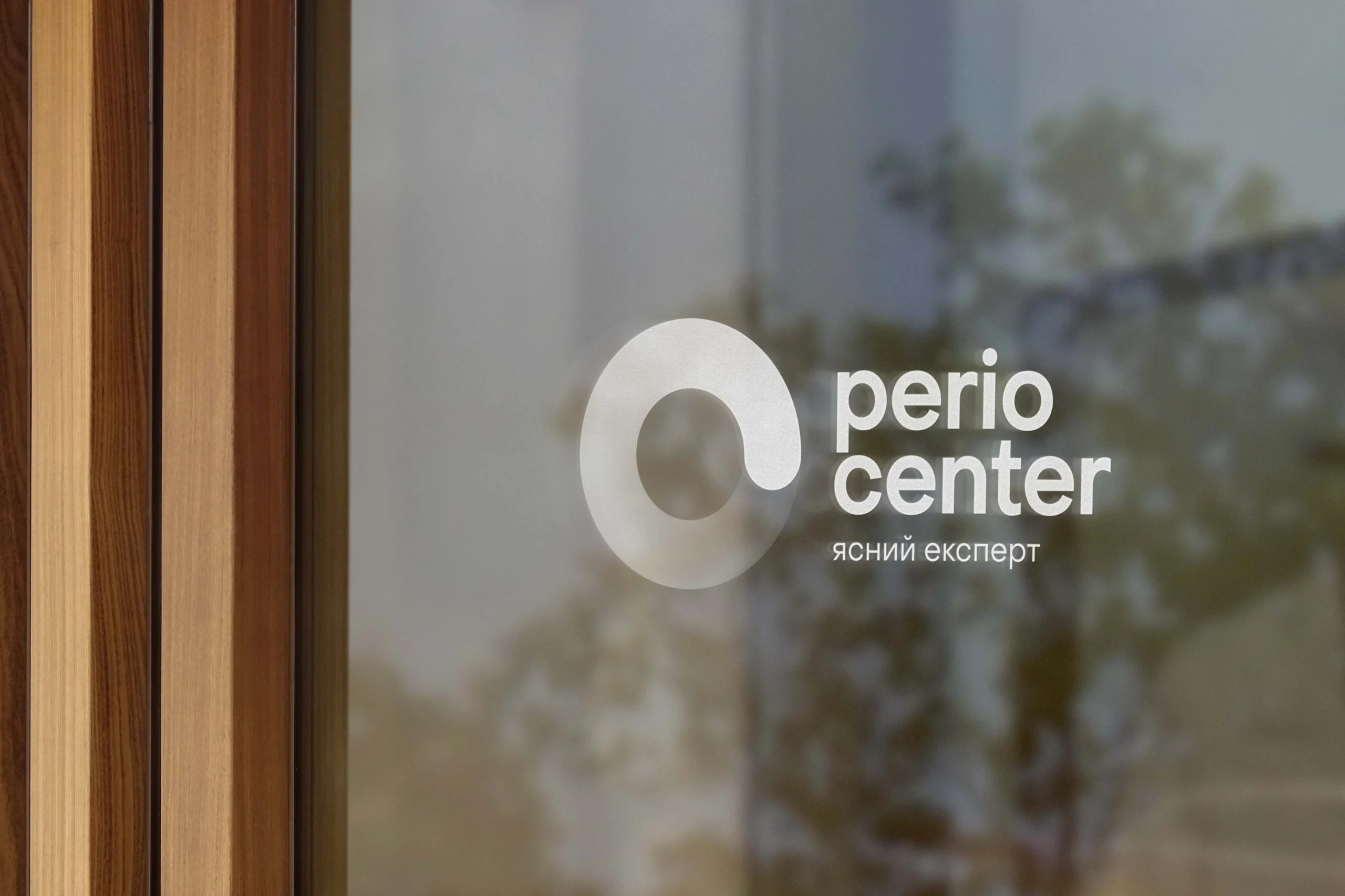
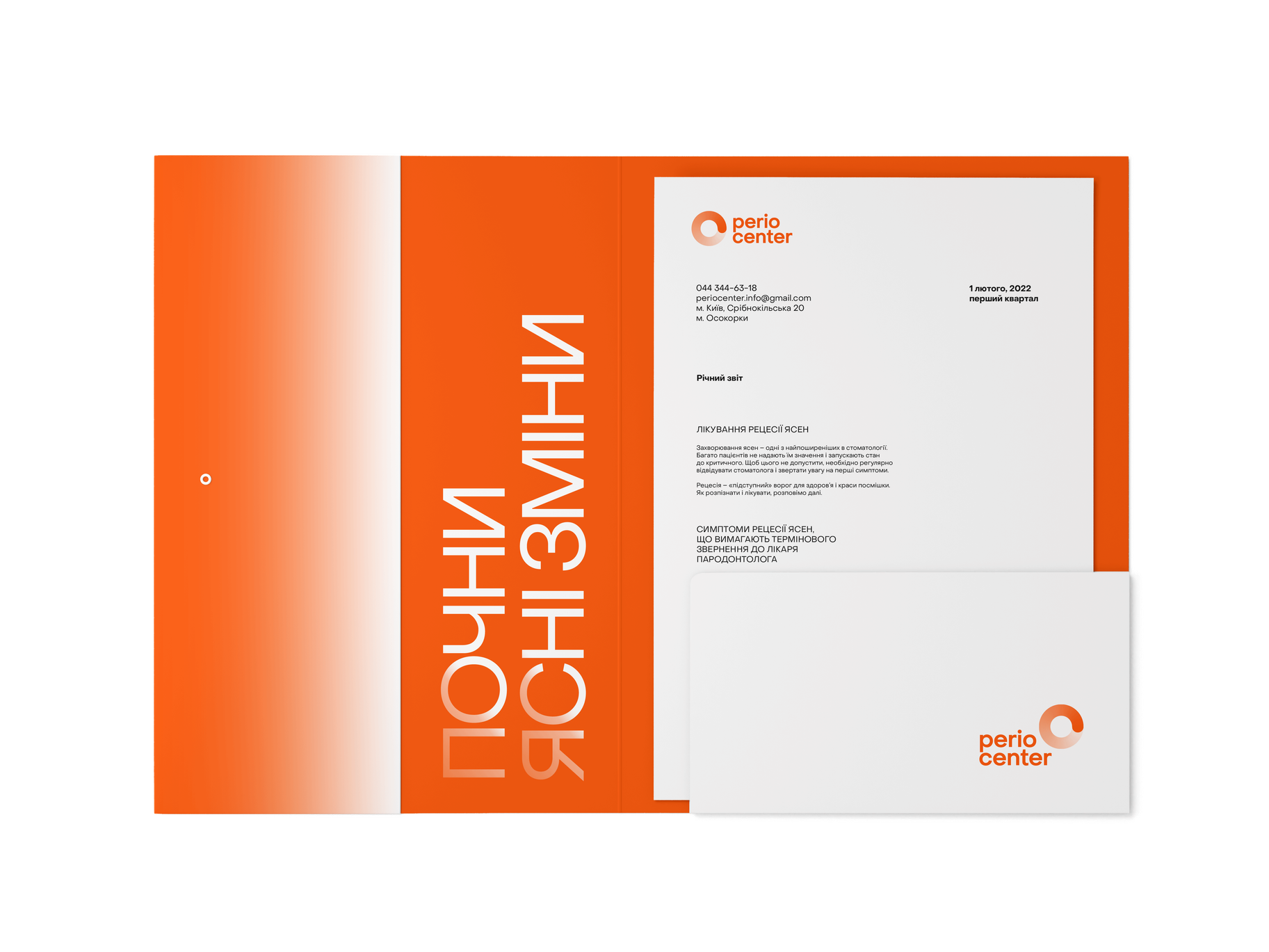
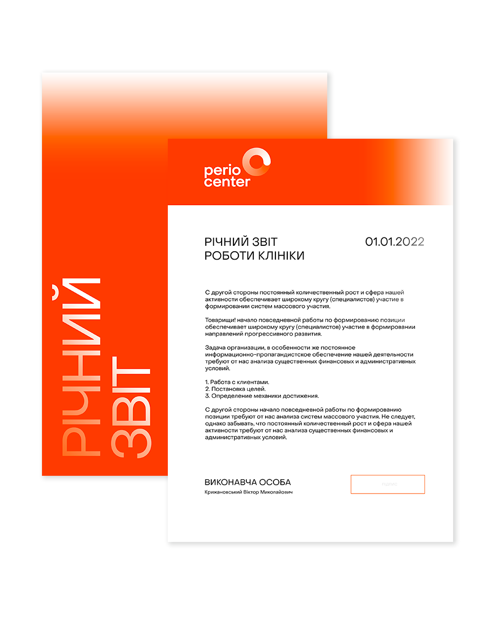
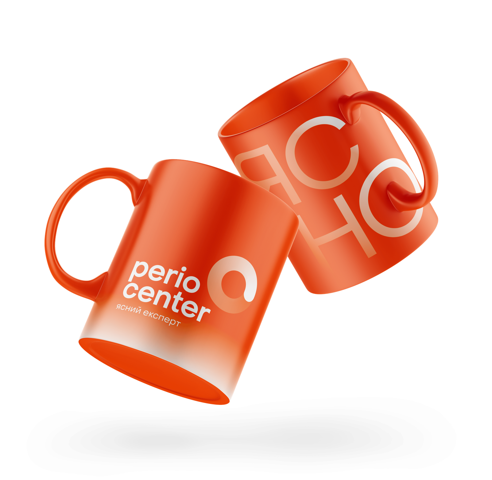
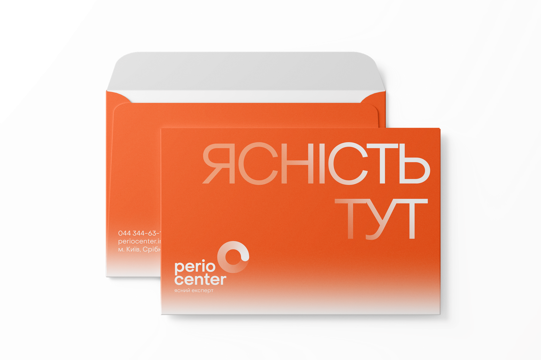
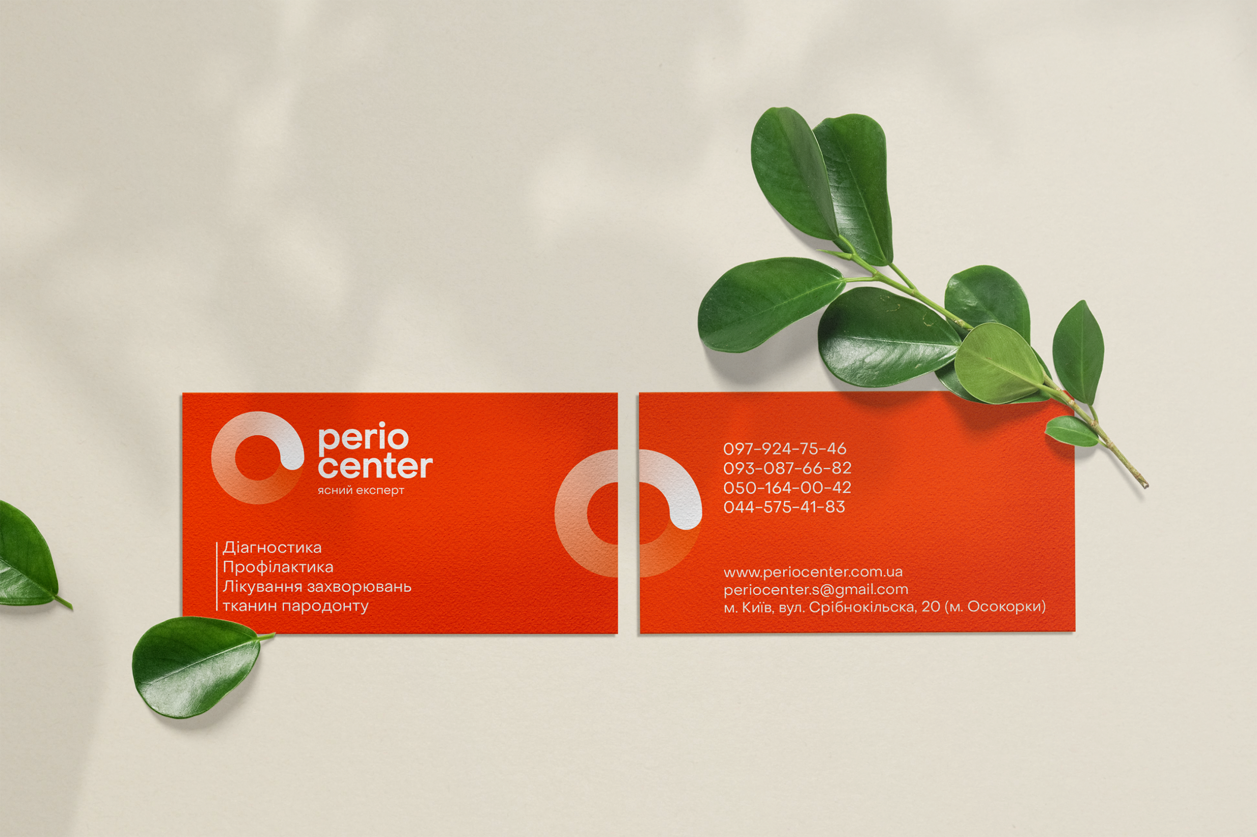
It was decided not to abandon the bright orange color. It was unique and attractive. But we needed the brand to be memorable not only for its color. We developed a unique mark that emphasized our new brand ideology and was easy to associate with PerioCenter.
IDENTITY
The main stylistic element of the brand is a circular gradient, symbolizing a gentle process of transition from one point to another. From the beginning of treatment and unhealthy gums to a healthy, clear smile, from a withdrawn, unsocial person to a self-confident one. Thus, the identity conveys the core values of the brand, emphasizing the painlessness and correctness of the treatment approach.


Влучно дякуємо!
Влада Домченко
— Art Director
Поліна Кузьменко
— Lead Designer
Дар’я Дашенко
— Copywriter
Альона Довгопол
— Designer
