Алі Назар
— Creative Director
Алі Ніна
— Strategу Director & PR Director
Домченко Влада
— Senior Designer
Ковтун Влад
— Copywriter
Кулібаба Світлана
— Client manager
In post-Soviet countries, psychological therapy is often associated with mental disorders and psychiatric illnesses. This is a misconception. Gestalt therapy is psychology for happy people—it makes life more open, comfortable, and helps individuals gain a deeper understanding of themselves.
Hennadiy Mustafayev is one of Ukraine’s top certified practitioners.
Our goal is to break the stereotype about psychologists and introduce the audience to Hennadiy Mustafayev’s modern methods. No more ignoring the challenges of happy people!
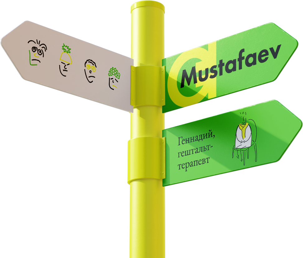
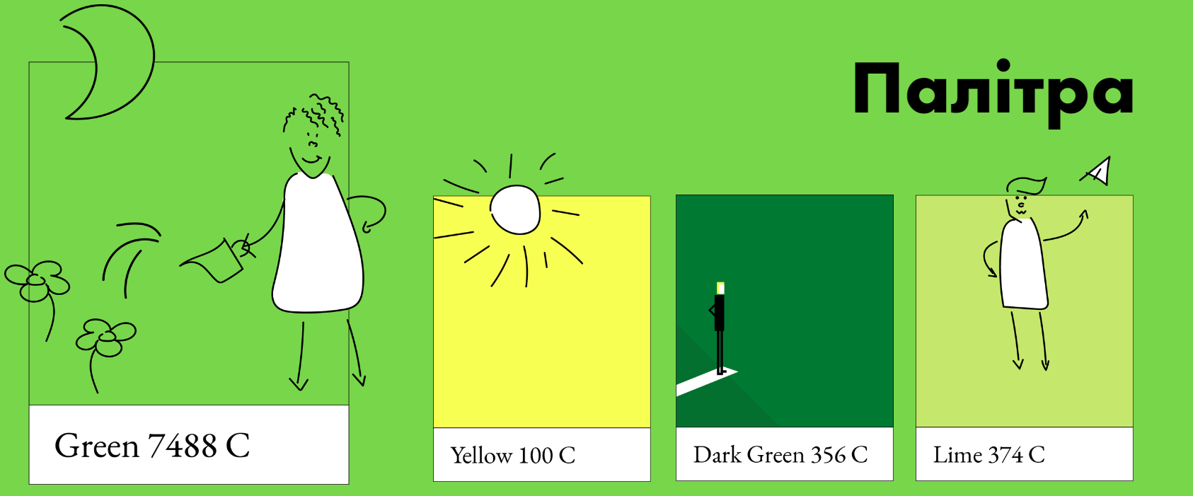
The brand logo is a classic text-based logo, designed using Futura typography.
The logo combines Hennadiy Mustafayev’s name with the brand’s core service—Gestalt therapy. Gestalt refers to the phenomenon of an unfinished action—when a person feels satisfied with their interaction with the world, the gestalt is closed.
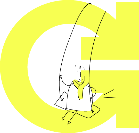
This concept is reflected in the “G” symbol, representing both Hennadiy’s initial and the word “Gestalt”. The arrows within the symbol indicate movement toward completion, visually reinforcing the idea of closure and resolution.

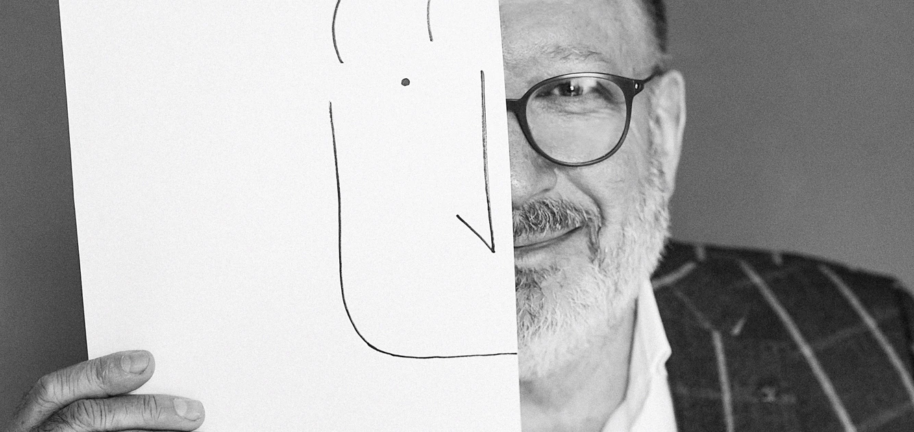
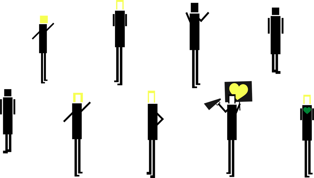
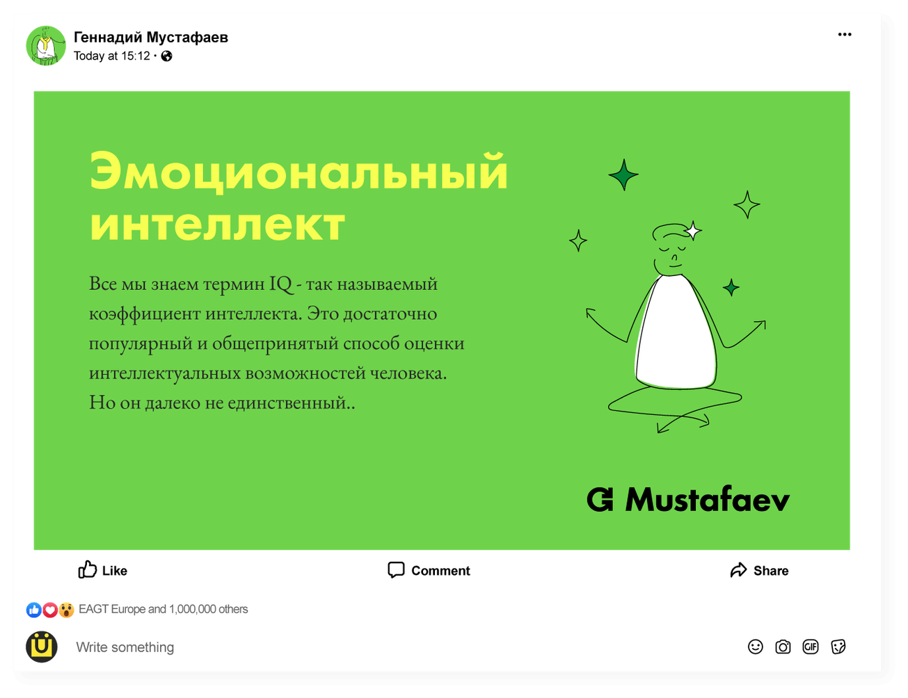
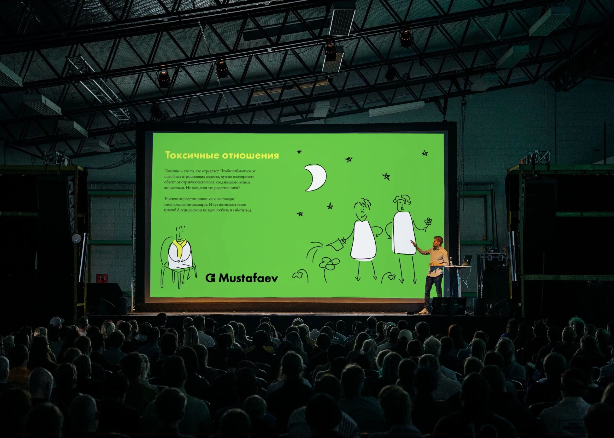
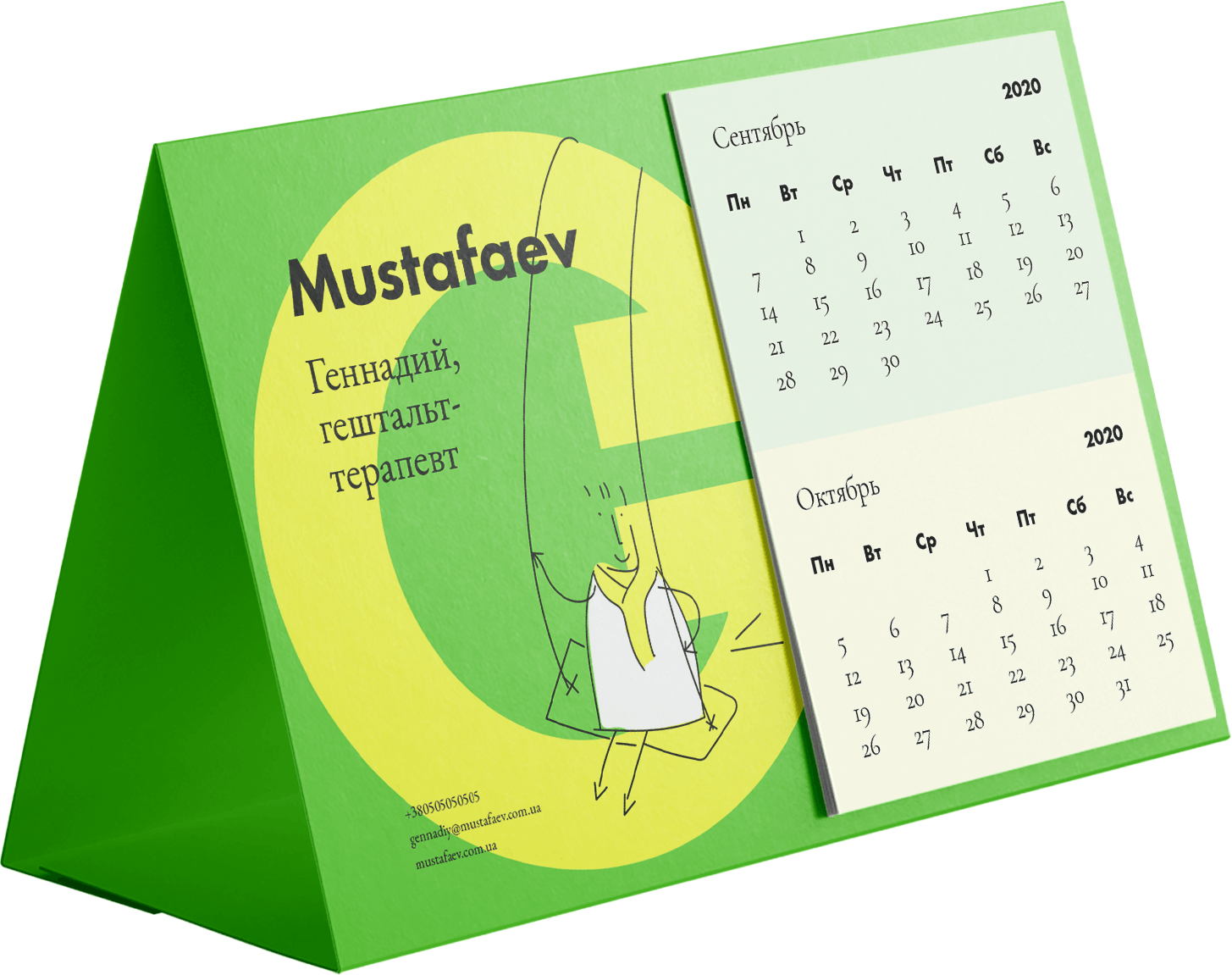
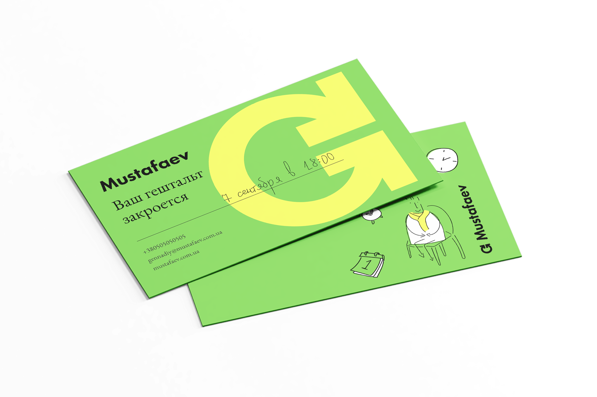
A personal brand is always built around an individual—their reputation and expertise. This concept is deeply reflected in the brand’s identity. We aimed to step into the shoes of Hennadiy’s guests and bring his personality to life—even on simple sticky notes.
We also added a yellow scarf, because it’s his favorite!
Hennadiy’s notepad alter ego lives within the identity, alongside other stylistic elements like typography. It playfully swings on the logo or peeks out from branded folders, adding warmth and character to the brand.
But Mustafaev is more than just a personal brand. It represents the complex and multifaceted world of emotions and relationships that arise between different people in various circumstances.
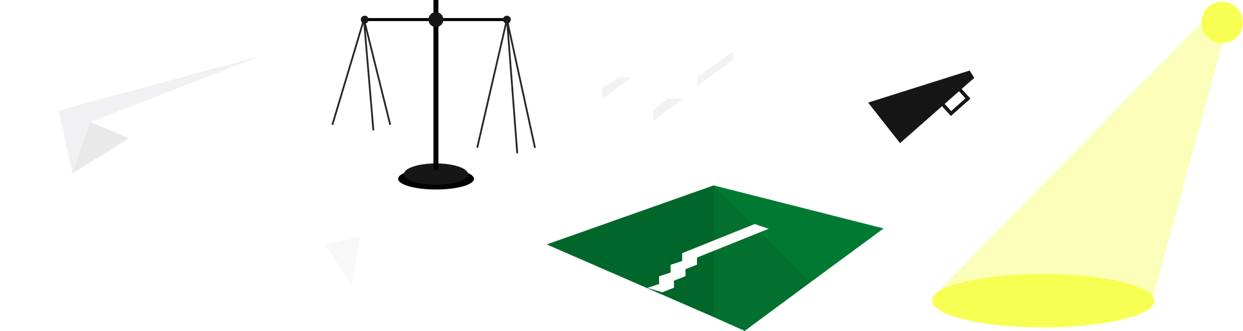
So, we created a “draft of the Universe”, translating life and human connections into two illustration systems.
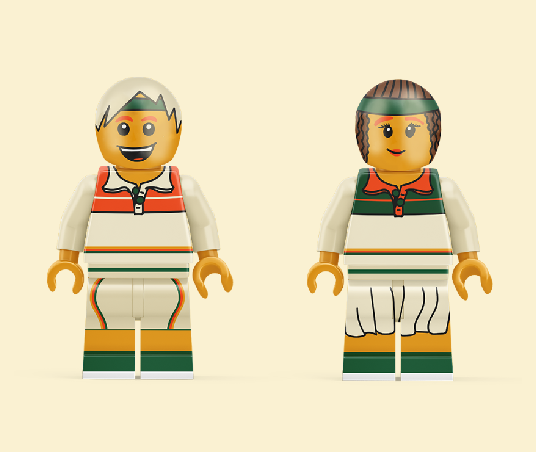
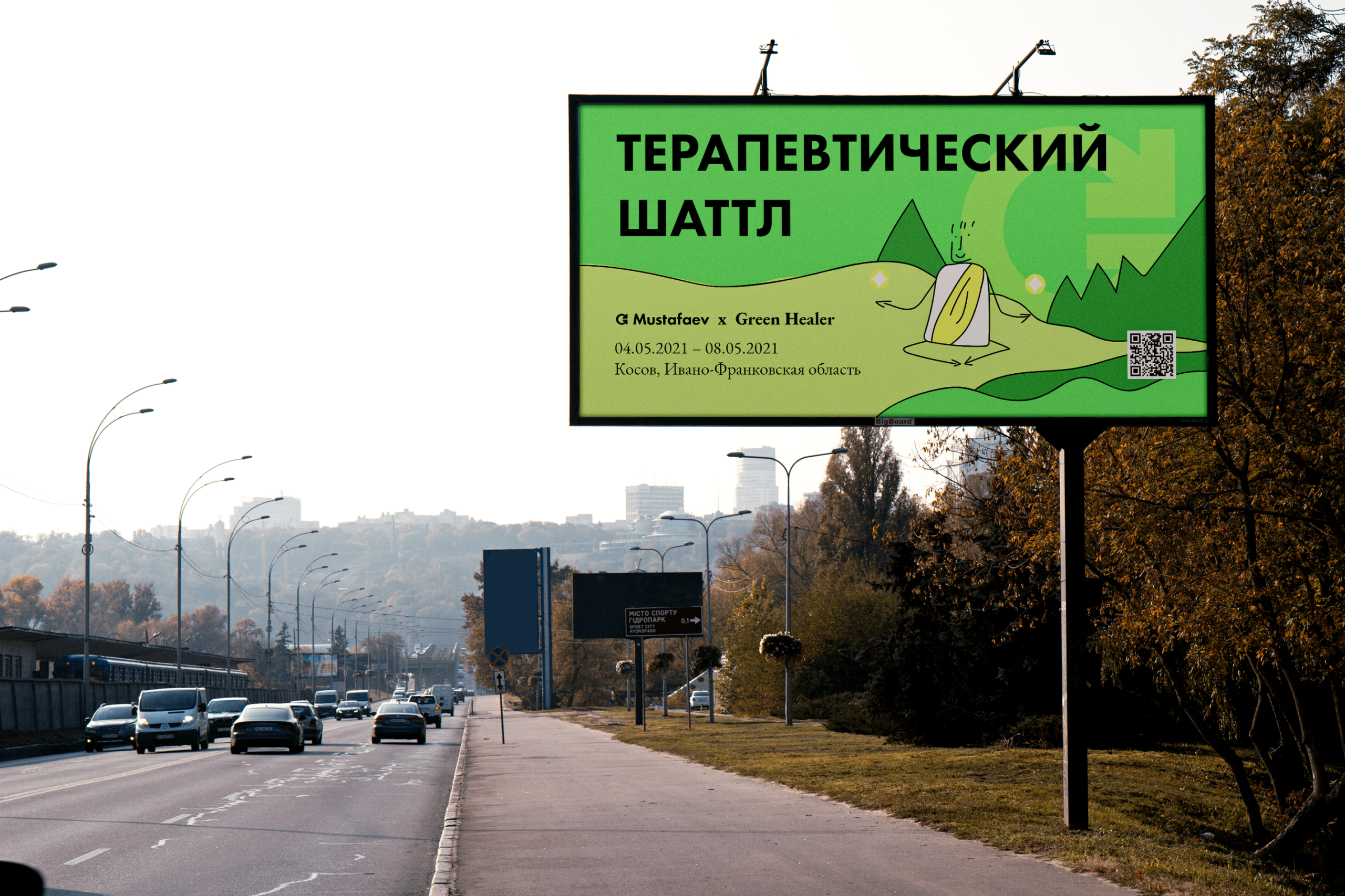
EDUCATION, EVENTS, AND GROUP GESTALT THERAPY
Imagine sitting in a Level 1 Gestalt Therapy course lecture, listening as Hennadiy shares something fascinating about psychology. Being an empathetic person, you internalize his words—until suddenly, bam! You realize:
“Wow, this is about me! I should behave differently!”
As your gestalt closes, you quickly sketch mental images in your branded Mustafaev notebook so you don’t forget.
This “quick doodle” metaphor became the foundation for the illustrative graphics system used in group-oriented communications. Since these sessions are often fun and uplifting, this illustration style features:
The result? A lively, engaging visual language that captures the spontaneity and insights of group therapy experiences.
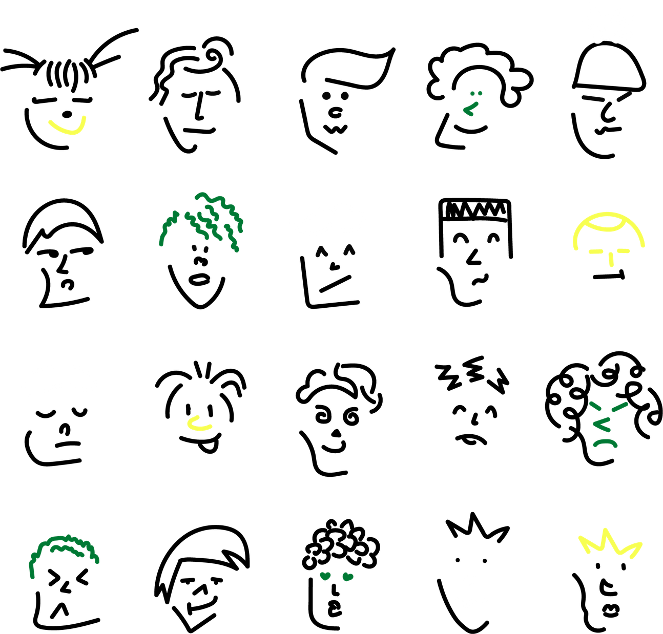
We created a dynamic, modular illustration system that is fun and easy to assemble, allowing for the effortless creation of new sketches. Even those without deep graphic design or illustration skills can easily add new necessary elements to the illustrations.
These visuals have become a consistent theme across branded materials. Characters that resemble real people—and even Hennadiy himself—interact with textiles, business cards, and other brand assets, making the identity both relatable and engaging.
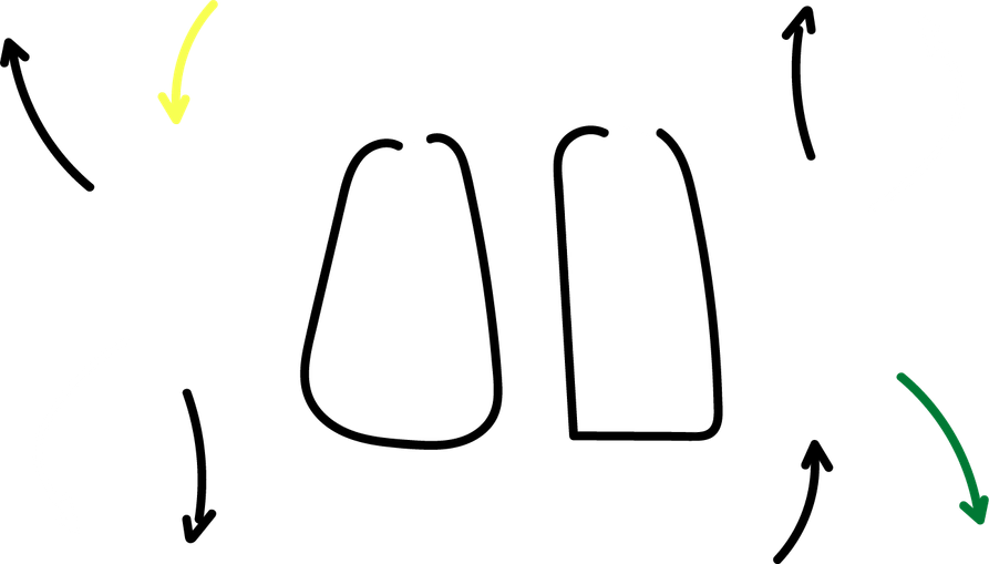
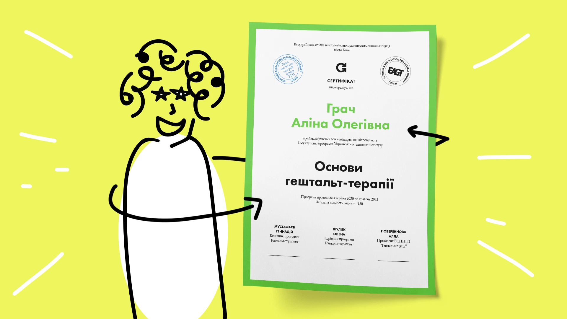
INDIVIDUAL AND COUPLES THERAPY
Therapeutic sessions involve deep personal work between a client and a psychologist, addressing internal struggles. This is a complex, intimate process that requires a unique visual communication approach.
This system uses:
Unlike the playful, expressive “It’s Fine” system, Hennadiy’s character does not appear here. The focus is solely on the individual—their inner world and relationships with their surroundings.
Faces are hidden to reflect the confidentiality of therapy and the mystery of emotions. Instead, subtle illustration elements hint at deeper meanings, allowing each viewer to interpret their own experience.
The brand’s communication is built on two typefaces: Futura and Garamond. Their combination carries a metaphor: creating a bright future requires deep psychological knowledge and experience.


Алі Назар
— Creative Director
Алі Ніна
— Strategу Director & PR Director
Домченко Влада
— Senior Designer
Ковтун Влад
— Copywriter
Кулібаба Світлана
— Client manager
Кузьменко Поліна
— Designer
Мартиненко Анастасія
— Client Director
Поп Сабіна
— Designer
Посад Влад
— Art-Director
Терещенко Олена
— PR-manager

50.45463528375301, 30.488101031134022 Kyiv, BC "Veles", Hlybochytska St, 17А