Али Назар — Creative Director
Али Нина — Strategist
Домченко Влада — Senior Designer
Ковтун Влад — Copywriter
WEARM workwear is a strong and reliable brand—one you can count on during tough tasks, one that instills confidence in action.
The brand’s positioning is embedded in its very name. “We arm” translates from English as “we arm” or “we equip,” while also echoing the word “wear.” This means that in WEARM workwear, everyone will feel equipped and protected.
The visual communication system of the WEARM brand consists of four key elements. This section outlines the principles of their function, the rules for their interaction, and illustrated examples of their application.
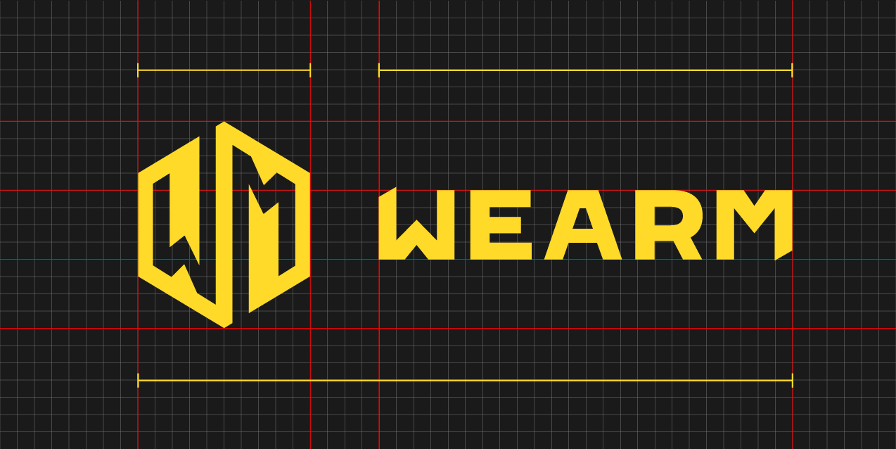
The WEARM logo is a combined mark, consisting of both text and a symbol.
The text part of the logo is set in a geometric sans-serif typeface, reflecting reliability, strength, and resilience. To convey confidence, a custom typeface with sharp angles was developed.
The symbol is formed by the letters “W” and “M,” which share the same shape, creating a rhythmic and easily recognizable design.
The WEARM logo has multiple configurations, allowing it to adapt to various formats while maintaining proportions and readability across different surfaces.
These configurations ensure strong brand recognition, which is essential for consistent branding across applications.
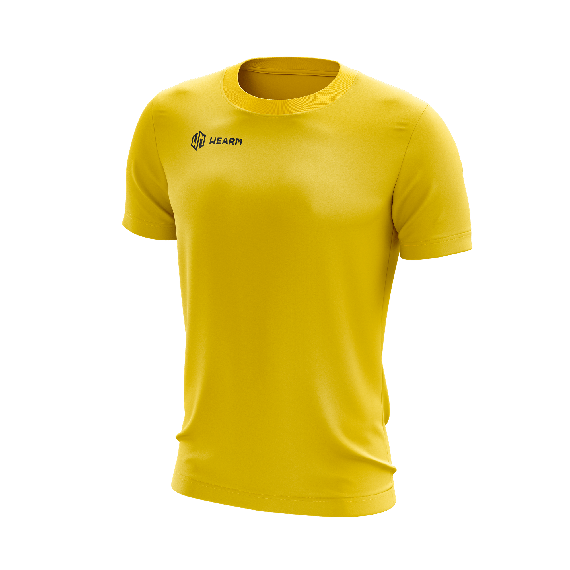
The symbol can also function independently, primarily for small-format materials.


Beyond print materials, the logo is also used in digital formats.
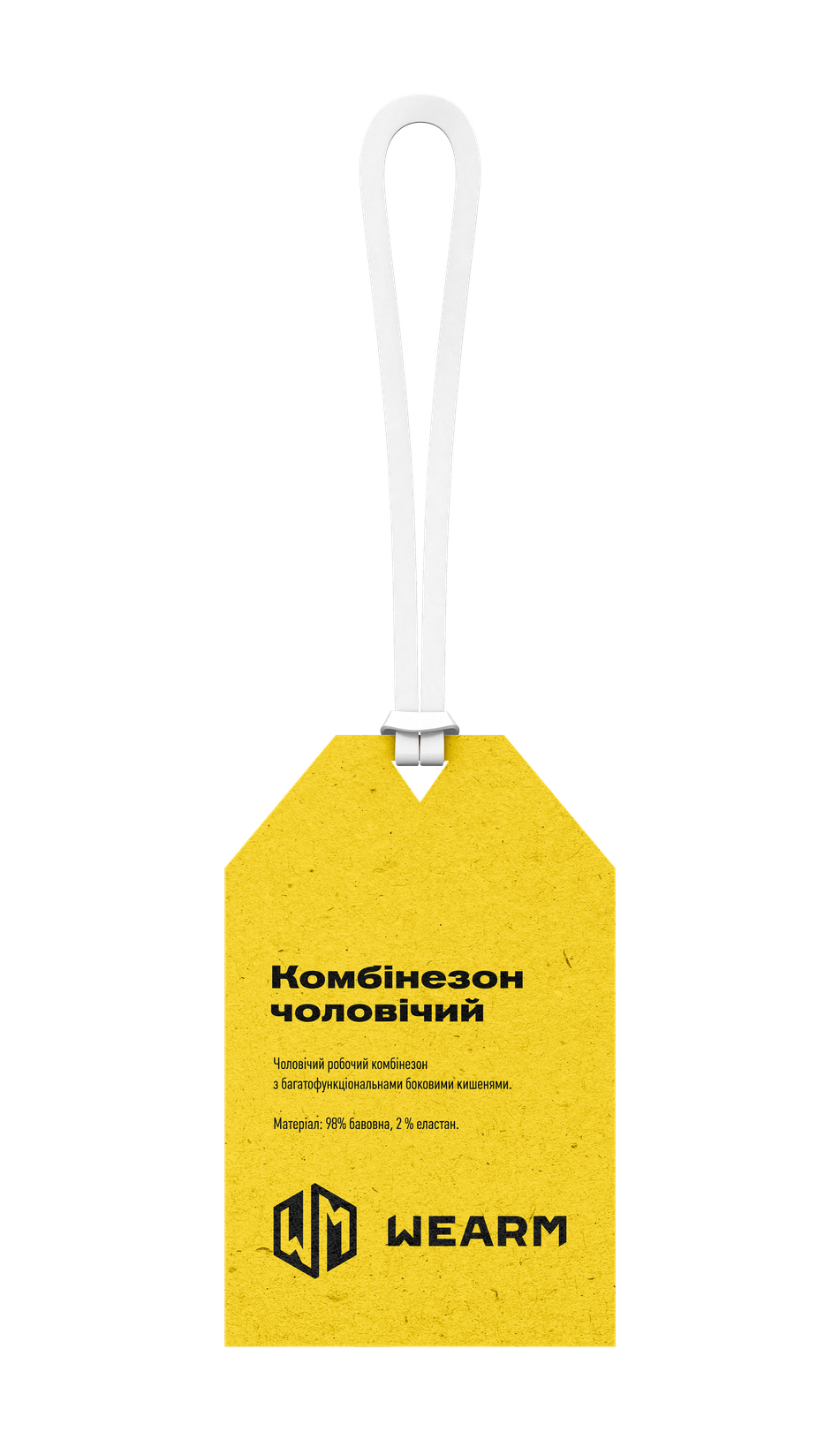
A reduced minimal configuration of the logo is available for placement on surfaces with extremely limited space (such as icons and symbolic markings).

WEARM workwear utilizes a typographic pairing of Akzidenz-Grotesk Pro Extended Bold for headlines and Plumb Condensed Regular for body text.


Али Назар — Creative Director
Али Нина — Strategist
Домченко Влада — Senior Designer
Ковтун Влад — Copywriter
Kузьменко Полина — Junior Designer
Мартиненко Анастасия — Client Director
Поп Сабина — Junior Designer
Посад Влад — Art Director

50.45463528375301, 30.488101031134022 Kyiv, BC "Veles", Hlybochytska St, 17А