Алі Назар
— Creative Director
Алі Ніна
— Strategist
Кулібаба Світлана
— Head of Client Service Department
Ковтун Влад
— Creative Team Lead
The Children’s Search Service “MAGNOLIA” is the largest organization dedicated to finding missing children and bringing them back home—to warm beds and their parents. Over 20 years of experience and trust.
Develop a new style to draw attention to this important cause, increase the organization’s visibility, and help build a trusted resource. A significant part of the success in searches depends on engagement with society.
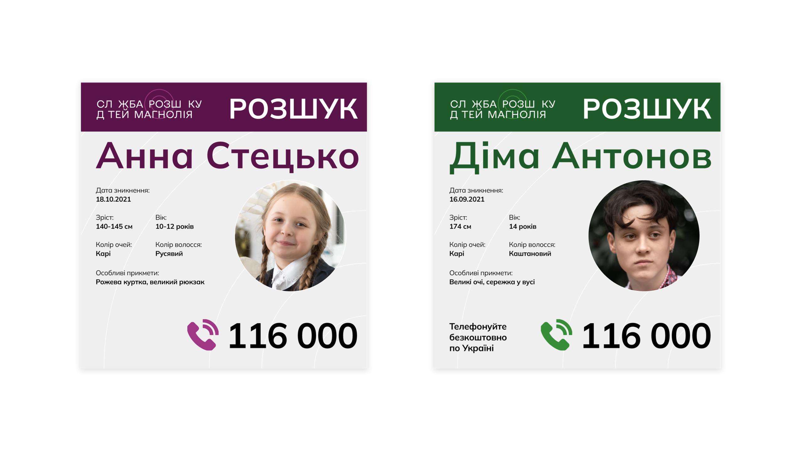
The Children’s Search Service “Magnolia” plays a crucial role in coordinating the search for missing children across Ukraine.
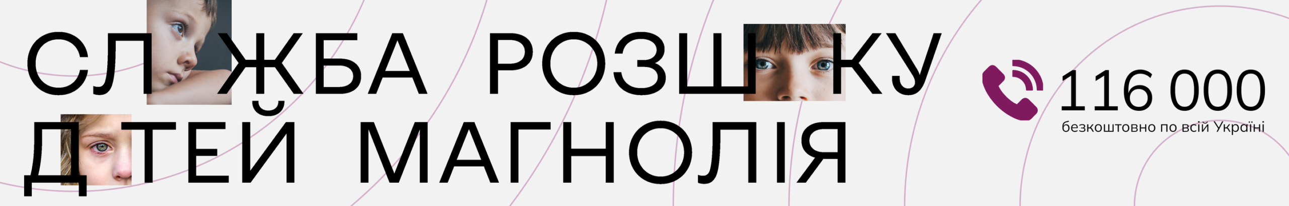
The logo concept is based on disappearing letters—symbolizing the painful reality of missing children, a situation that leaves no one indifferent. For parents, it is like taking a letter away from the words “mom” or “dad”, emphasizing the deep loss they experience.

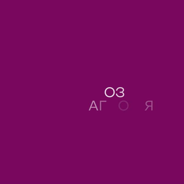
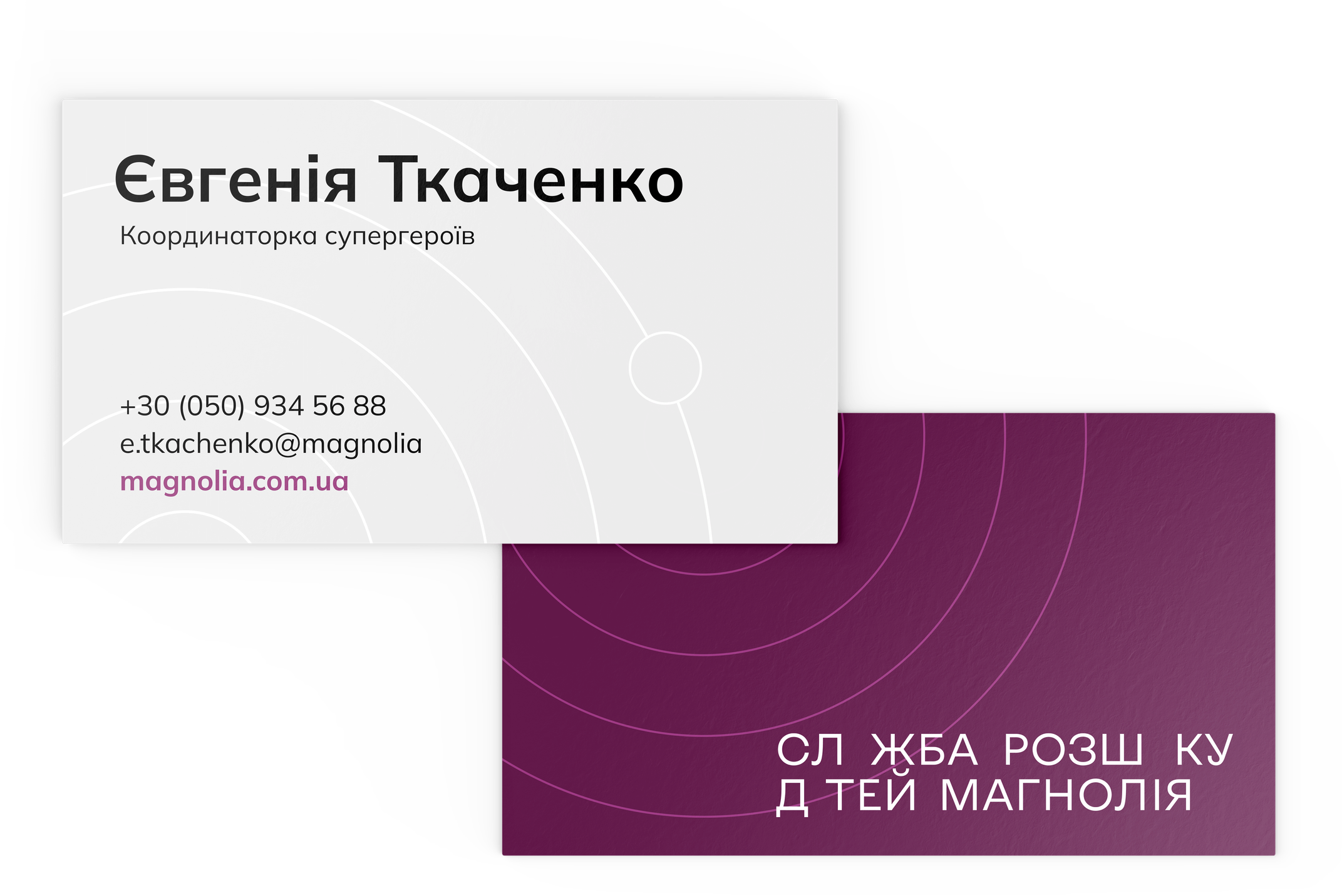
The logo of the Children’s Search Service “Magnolia” is a classic typographic logo with distinctive symbolic elements.
The typography used in the logo is Kyiv Type in its sans-serif iteration. Kyiv Type is a freely available grotesque typeface created by Ukrainian typographer Dmytro Rastvorcev. The typeface is stylistically inspired by the Ukrainian avant-garde and designed using modern font development technologies.
The distinctive symbolic element takes the shape of a radar, expanding from the center of the letter “o” in the word “розшуку” (search), symbolizing the continuous efforts to locate missing children.
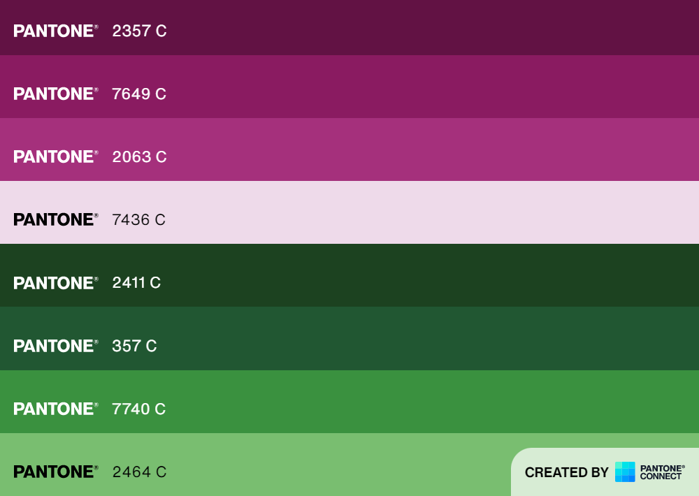
The color palette consists of two primary colors, along with basic monochromes: black and white.
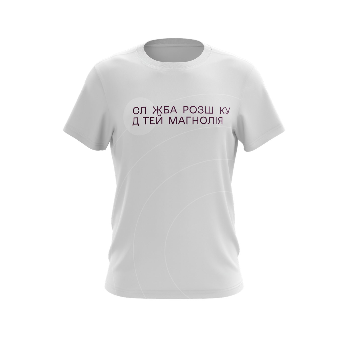
The typography used is Mulish—a variable, freely licensed sans-serif typeface. It is a contrasted, highly readable grotesque font, adaptable and supporting both Latin and Cyrillic scripts.
Mulish offers multiple weights and numerous ligatures, allowing for customized text compositions.

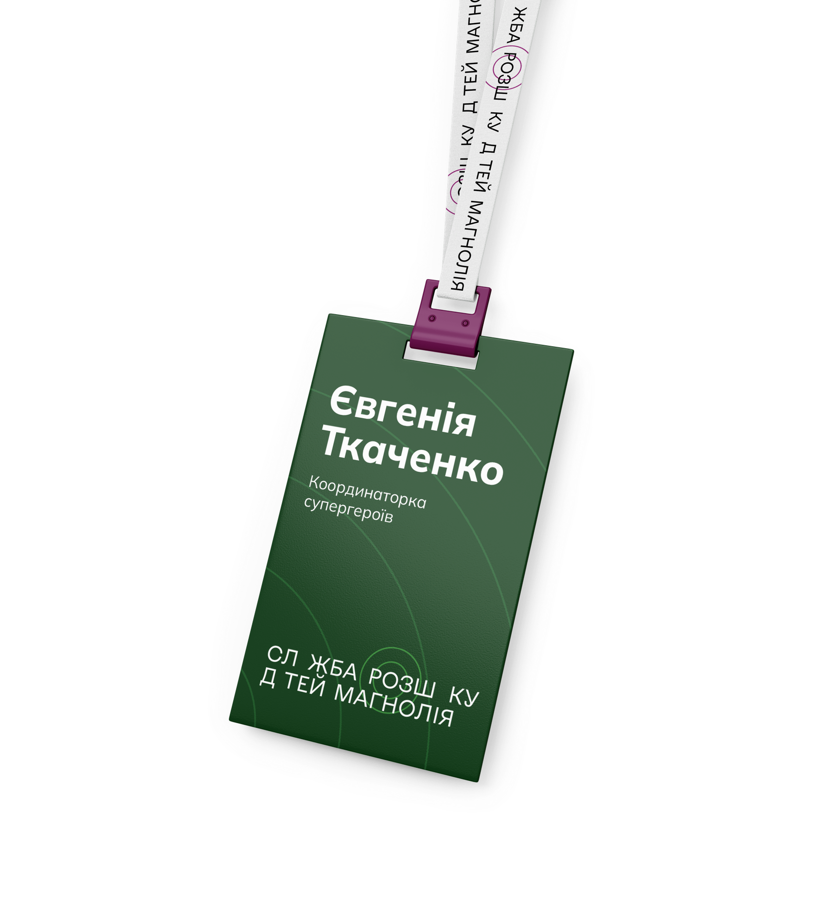
The key stylistic elements of the identity include a linear radar, which adds dynamic meaning to brand materials. These elements should subtly match the background, differing by just one shade from the primary palette. Compositionally, they should be placed to guide the viewer’s eye across the layout.
Additionally, the stylistic radar element mirrors the radar symbol in the logo. To maintain clarity, the radar should not be duplicated in both the logo and background on the same surface—except in specific branded materials where such an overlap enhances the design.
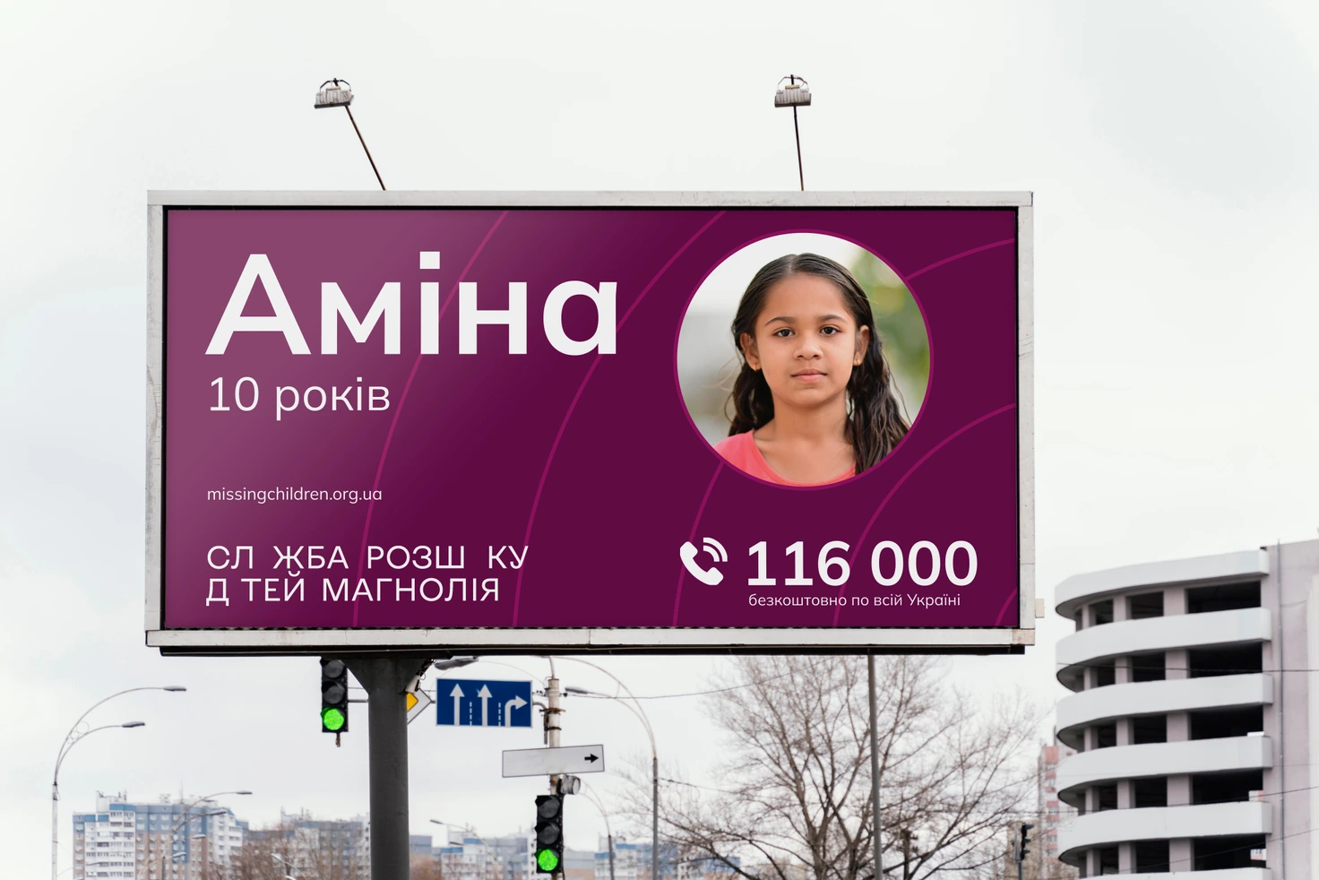

The next stage of our collaboration was an advertising campaign aimed at encouraging support for the project.
Specifically, the campaign sought to:
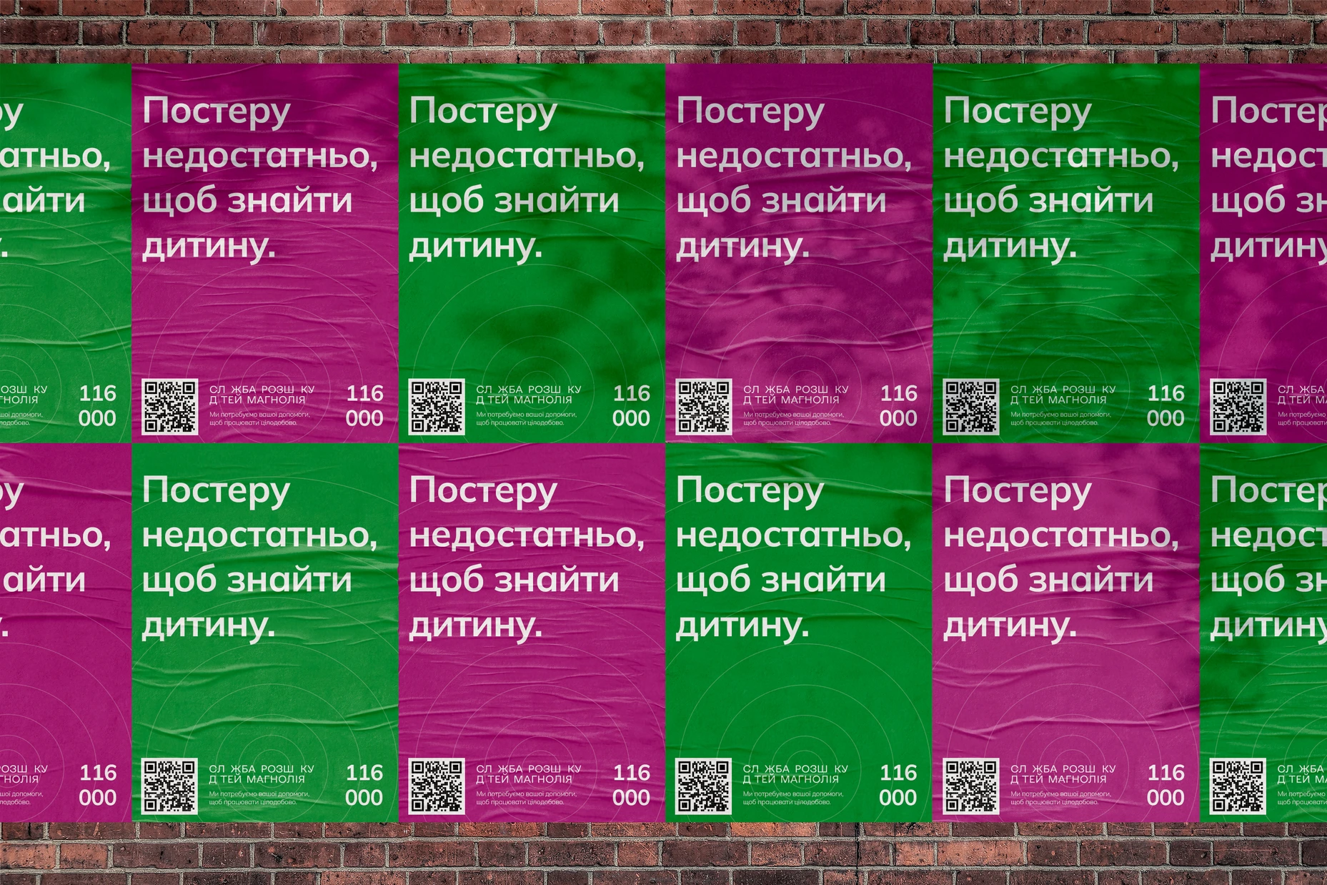
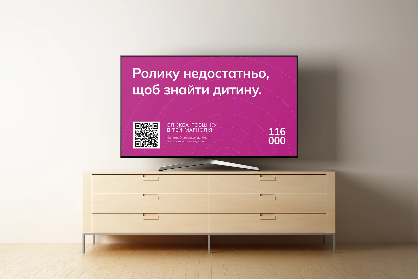
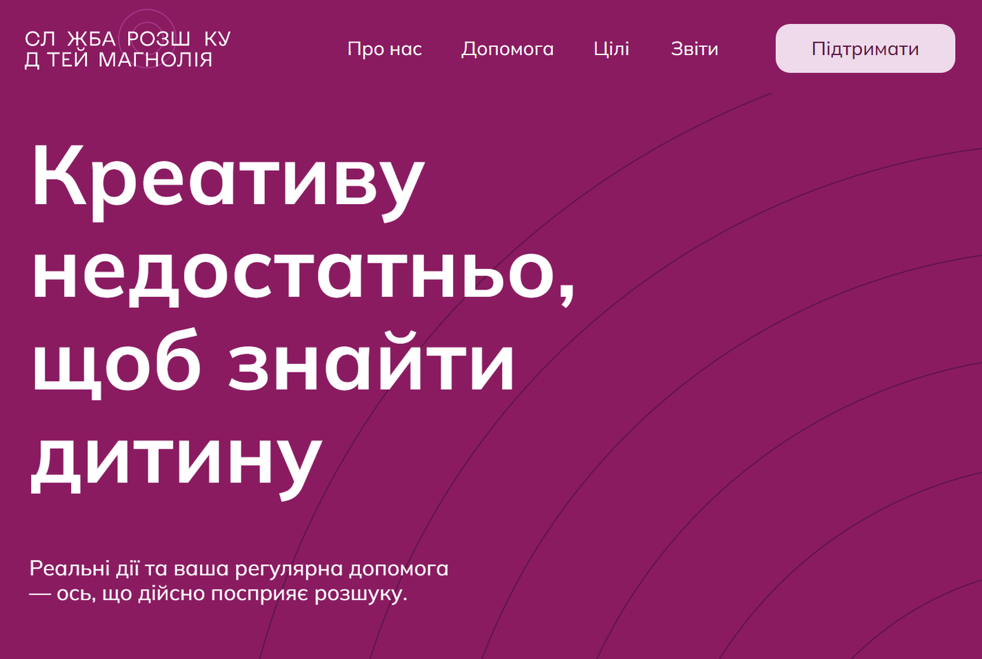
“Creativity is not enough.”
An advertising campaign can raise public awareness, highlight the issue, and encourage action. But creativity alone won’t find a missing child. It takes resources—human, financial, and emotional.
To find a child, Magnolia needs your support. Creativity won’t pay the bills for a 24/7 hotline.
This concept can be expanded to address any future needs that may arise.
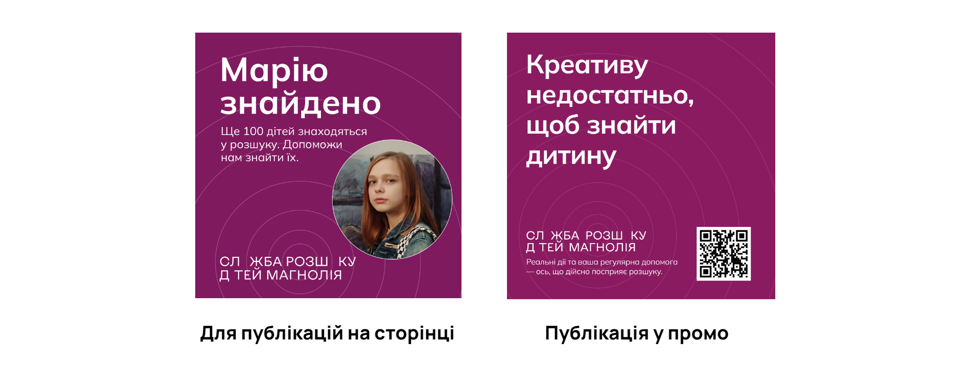
All the “insufficient” creativity directed users to this page, where they could make a one-time donation or subscribe to ongoing sponsorship of the project in just two clicks.
Алі Назар
— Creative Director
Алі Ніна
— Strategist
Кулібаба Світлана
— Head of Client Service Department
Ковтун Влад
— Creative Team Lead
Домченко Влада
— Art Director
Кузьменко Поліна
— Designer
Поп Сабіна
— Designer
Варгіч Наталія
— Public Relations Manager
Дашенко Дар'я
— Copywriter

50.45463528375301, 30.488101031134022 Kyiv, BC "Veles", Hlybochytska St, 17А