Алі Назар
— Creative Director
Кулібаба Світлана
— Client Service Director
Нєказаков Дмитро
— Art Director
Домченко Влада
— Art Director
CLIENT
Iprint is a silk-screen printing company from Odessa, also offering garment production based on ready-made patterns. They operate in B2B but can take on individual orders. They reached out because they wanted to find the core of their target audience, change the brand’s vision, and refresh their image.
TASK
The company already had clients, not unknowns in the fashion world. However, they rarely managed to publicize their names and add them to their portfolio. So, Iprint found itself at a dead end. They produce quality and stylish products, but they couldn’t show it. They were not standing out in the market. The main task was to say, “Hey, we are here and have always been here.” This was achieved through precise marketing, brand strategy, and a new visual positioning.
TARGET AUDIENCE
In a strategic session, we determined that the focus should be on young entrepreneurs (owners of their own clothing brands). Based on research, the portrait of the target audience emerged. His name is Maksym, 25 years old. We learned important details about him, from his family status to his fears and barriers. The question arose: “What does Maksym want to get from the brand?”
INSIGHT
We analyzed why people choose the silk-screen printing method. In one of the in-depth interviews, a value came up:
“For me, the value of silk-screen printing is that I can reproduce art — I can replicate a unique item. Thanks to this, many people can wear creative, complex things that might have been created over years.”
We are a reliable partner who brings any idea to life in a comprehensive and turnkey manner.

NAMING
FORMATE
The name “Formate” comes from the English “for mate,” which means “for a friend.” We are created and work for our mates — Ukrainian brands. We help them and create for them. In addition to the literal translation, the word “form” reflects our printing, which adapts to any design form and brings even the boldest ideas to life. The word “format,” embedded in the name, hints at an unconventional approach.
Our format is silk-screen printing, and that’s our unique value.
POSITIONING
By combining the uniqueness of our offerings, we become the perfect partner for brands in screen printing and apparel production, capable of providing comprehensive manufacturing solutions. We deliver an unreal reality — only Formate can realize the boldest ideas. We’re in sync with you and your brand. We prove that silk-screen printing is cool, and only Formate knows the secret of the “eternal T-shirt.” Technology and safety are the foundation of our work.
REBRANDING
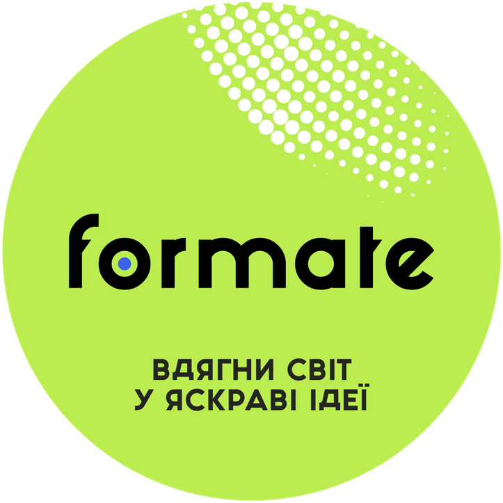
Our clients are stylish and creative people, so our brand needed to align with this in its visual communication. We chose digital colors to convey energy and because the brand can reproduce even the most complex pantone shades.
LOGO
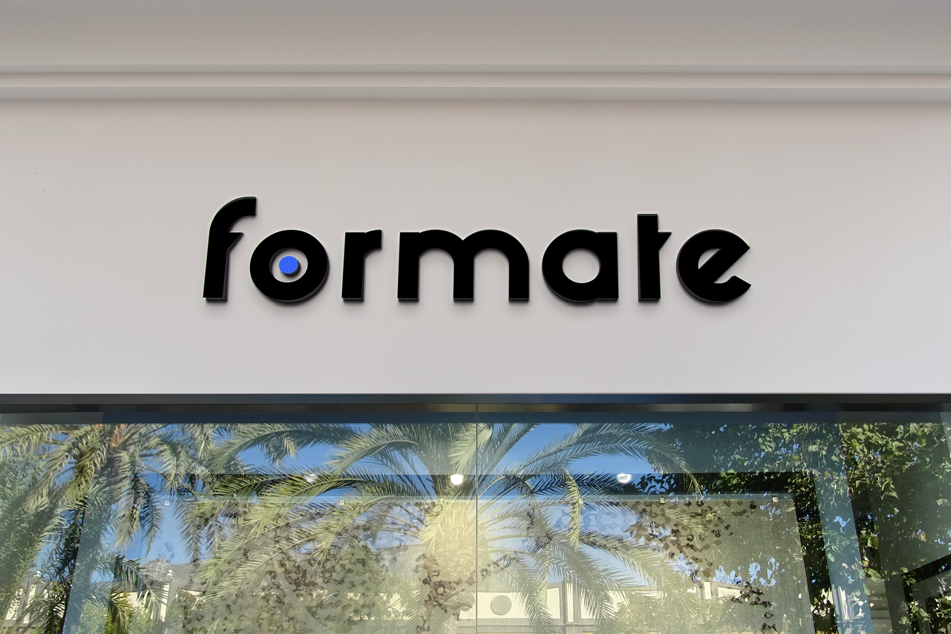
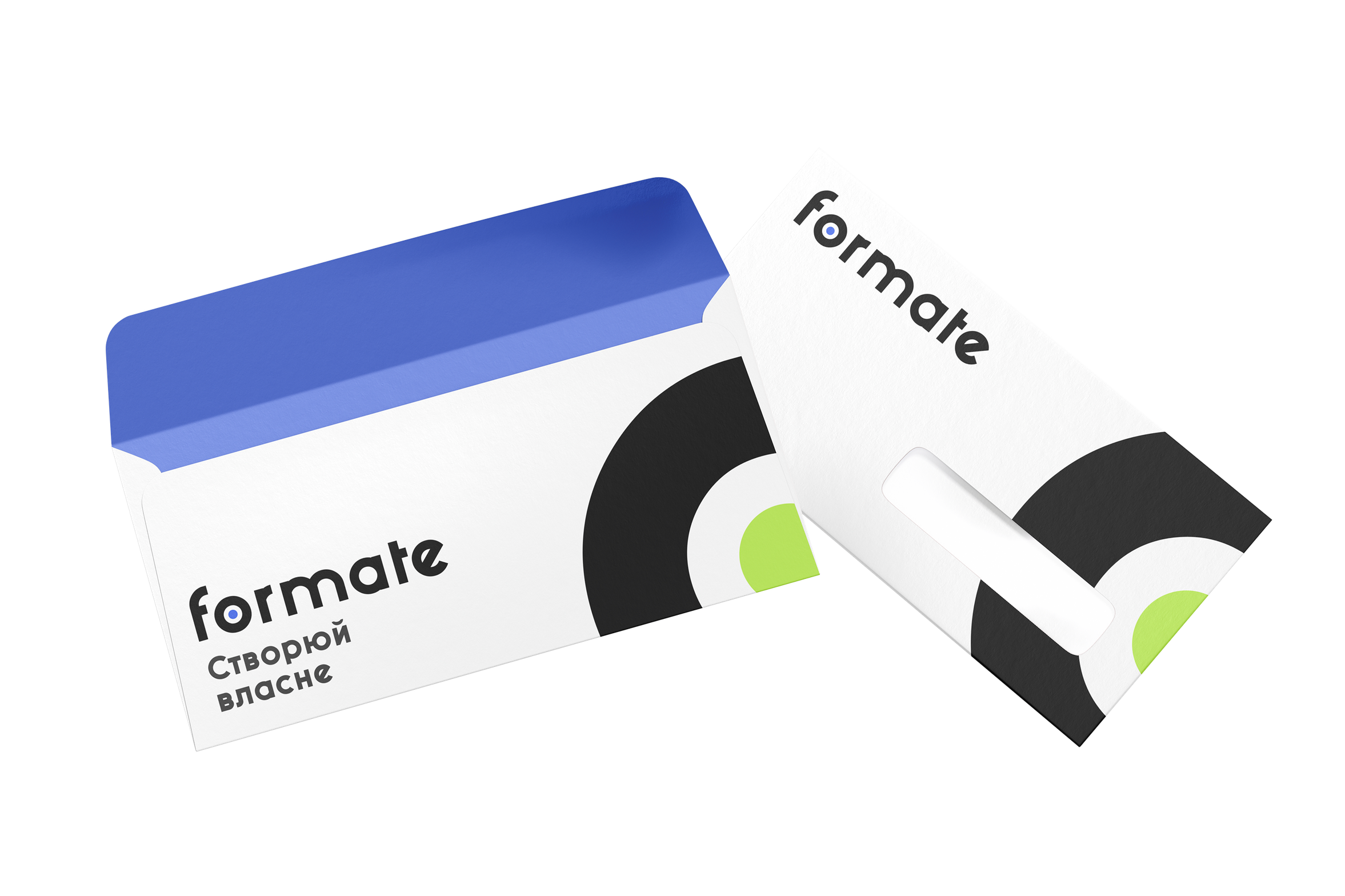
The logo combines a text-based part using the brand’s proprietary font and a color dot that represents both the brand and silk-screen printing. The sharp triangular serifs of the “f” and “t” emphasize the rounded dynamic of the letters “o” and “e.” Together, the composition clearly communicates the brand’s core values.

IDENTITY
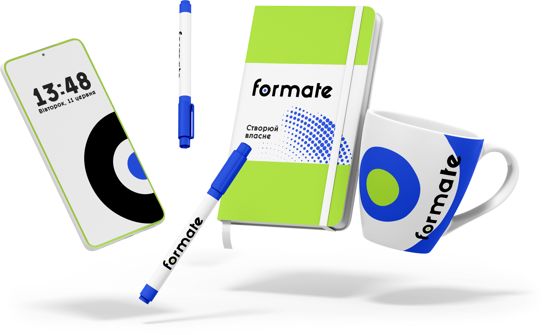
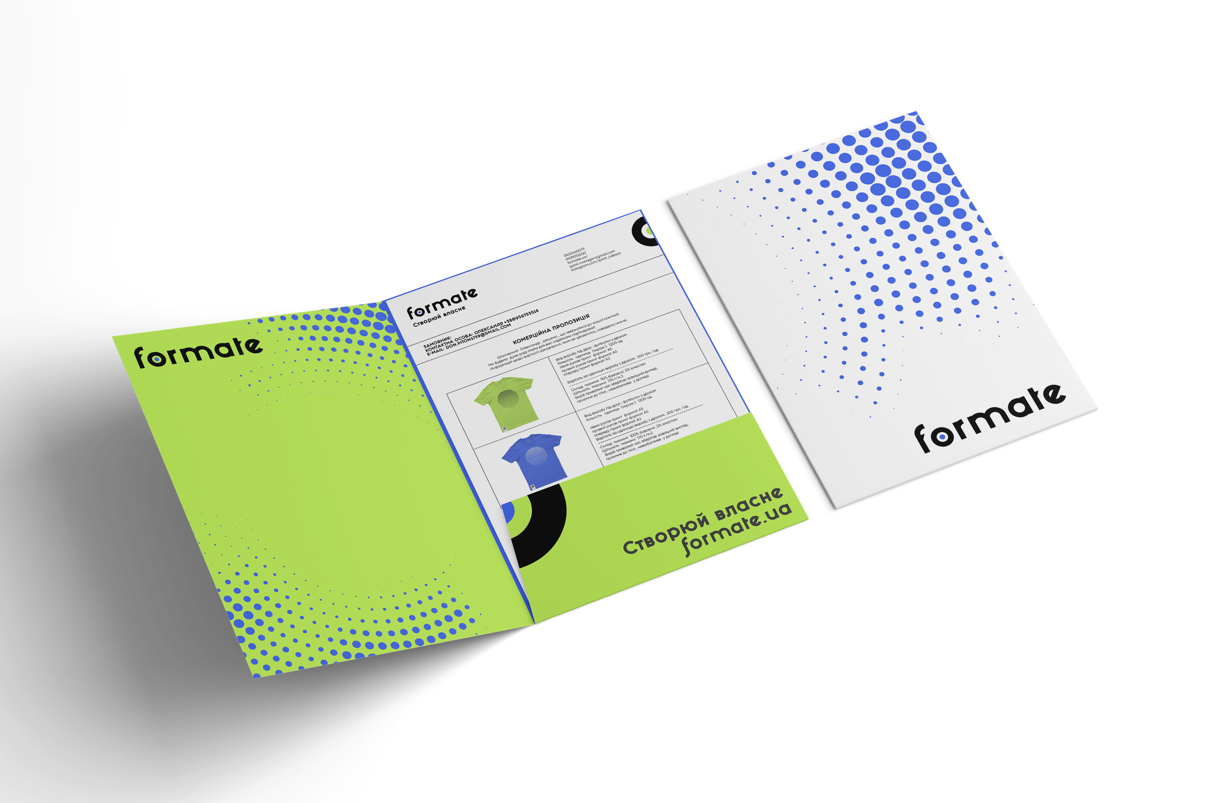
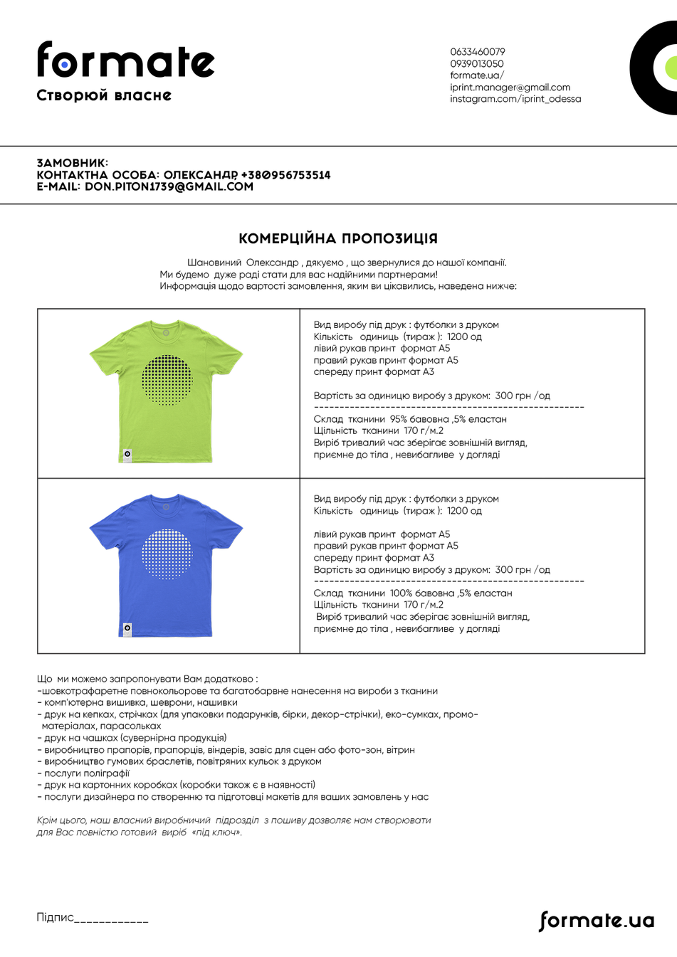
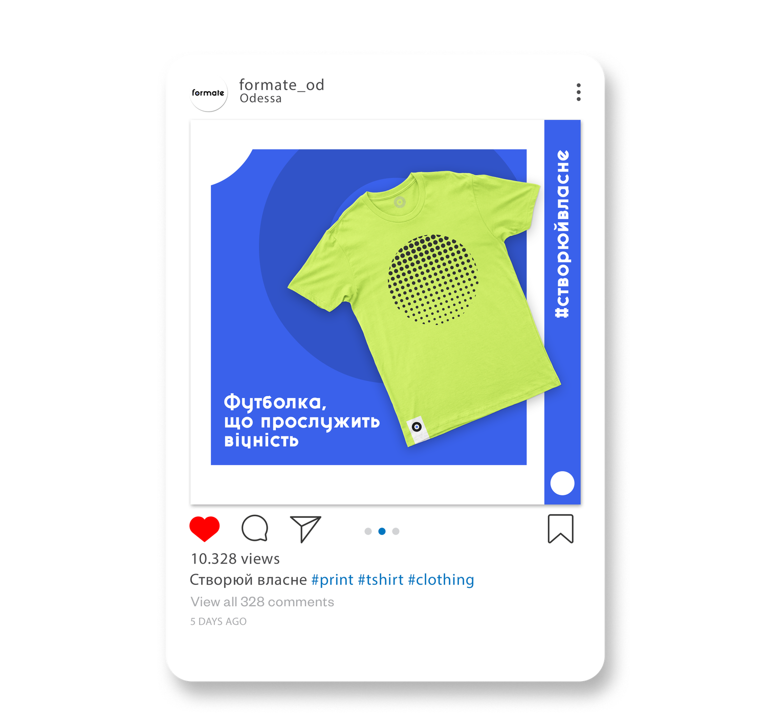
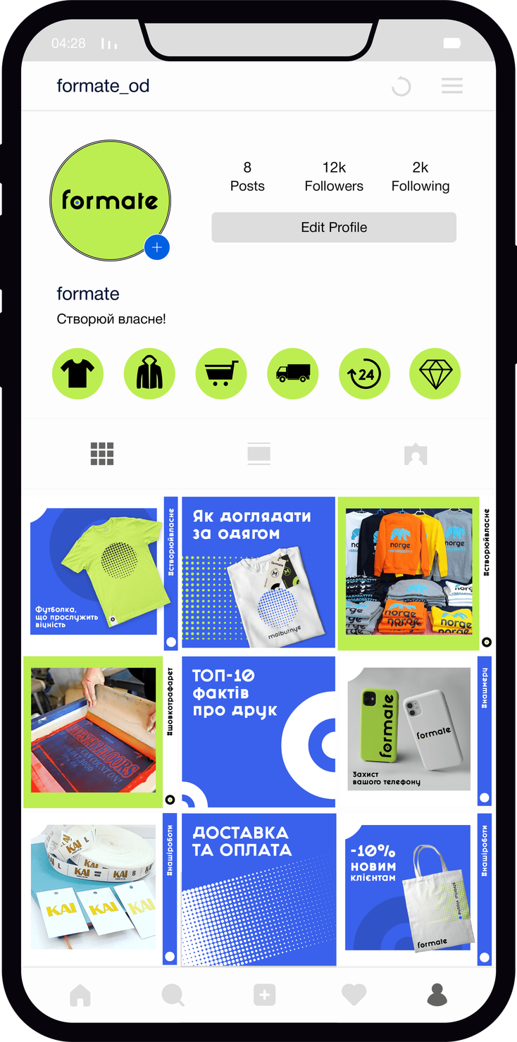
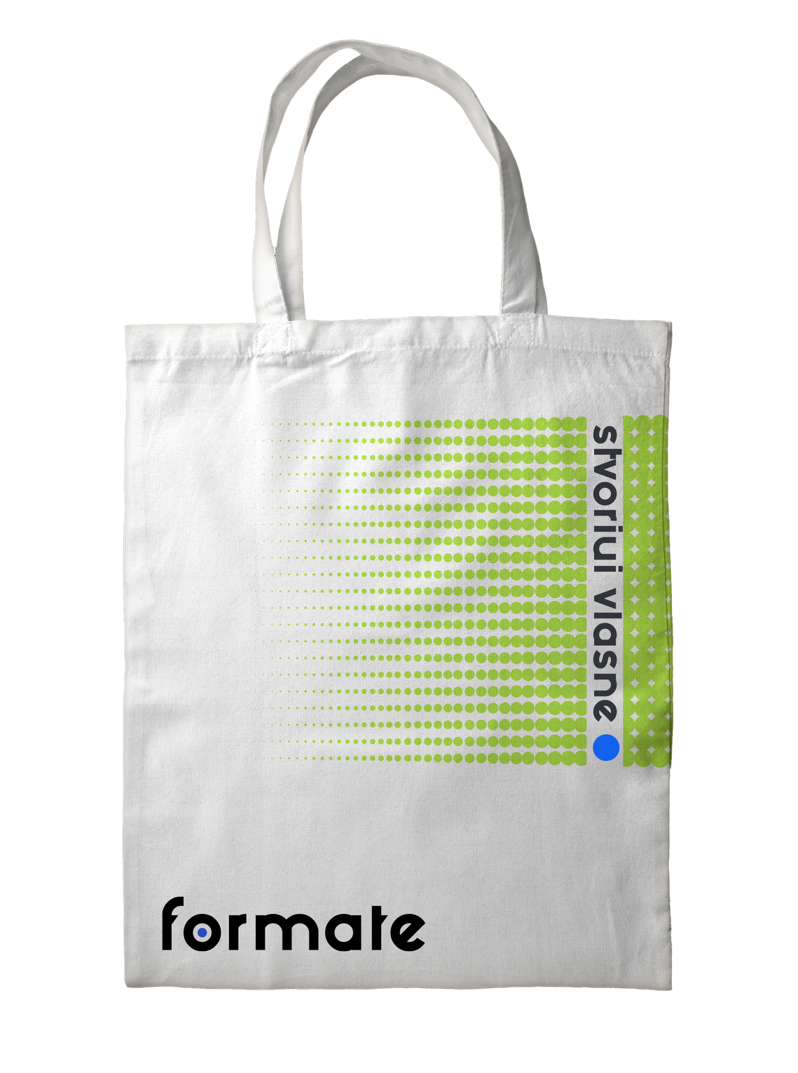
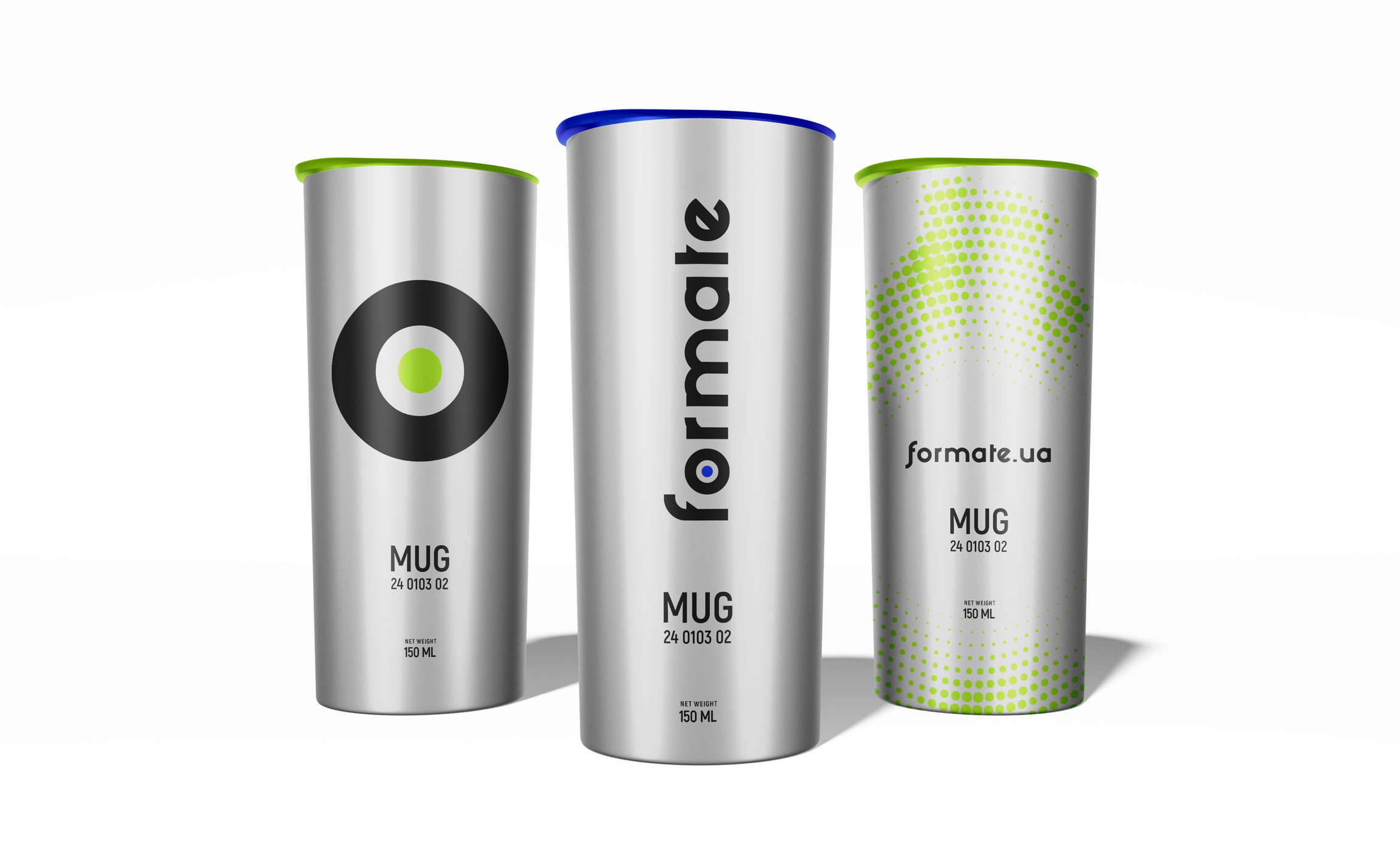
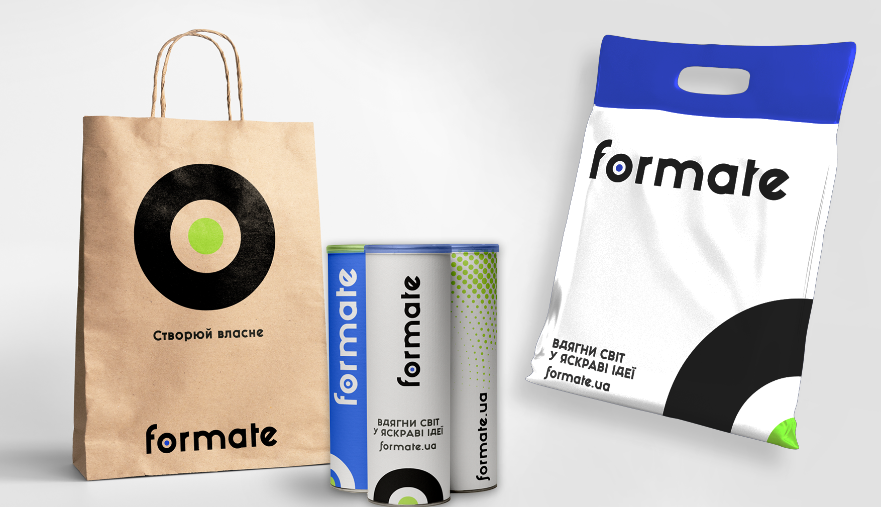
The main stylistic element of the brand is the color dot inside a black circle, symbolizing the goal and representing 100% achievement of results. The halftone technique is used for creating the brand’s pattern and graphic elements, with evenly distributed dots of varying sizes.
RESULT
Now, Formate can be recognized not only for its quality but also for its distinct voice and style. The brand is on par with its fashion industry clients in terms of branding. Everyone has heard and seen who is capable of bringing the boldest ideas to life.
BIG THANKS!
Кузьменко Поліна
— Designer
Алі Ніна
— Strategist
Ковтун Влад
— Creative Team Lead
Дашенко Дар’я
— Copywriter