Алі Назар — Creative Director
Алі Ніна — Strategist
Анастасія Мартиненко
“Fresh integrated marketing for the Ukrainian restaurant chain ‘Pesto cafe'”
TASK
Pesto cafe has come to us to rethink their brand and stand out among competitors. What was needed was a new business architecture to become unique in the segment: a full analysis, strategy adjustments, rebranding, and product and advertising positioning. But don’t worry, Pesto — we will find your marketing!
RESEARCH
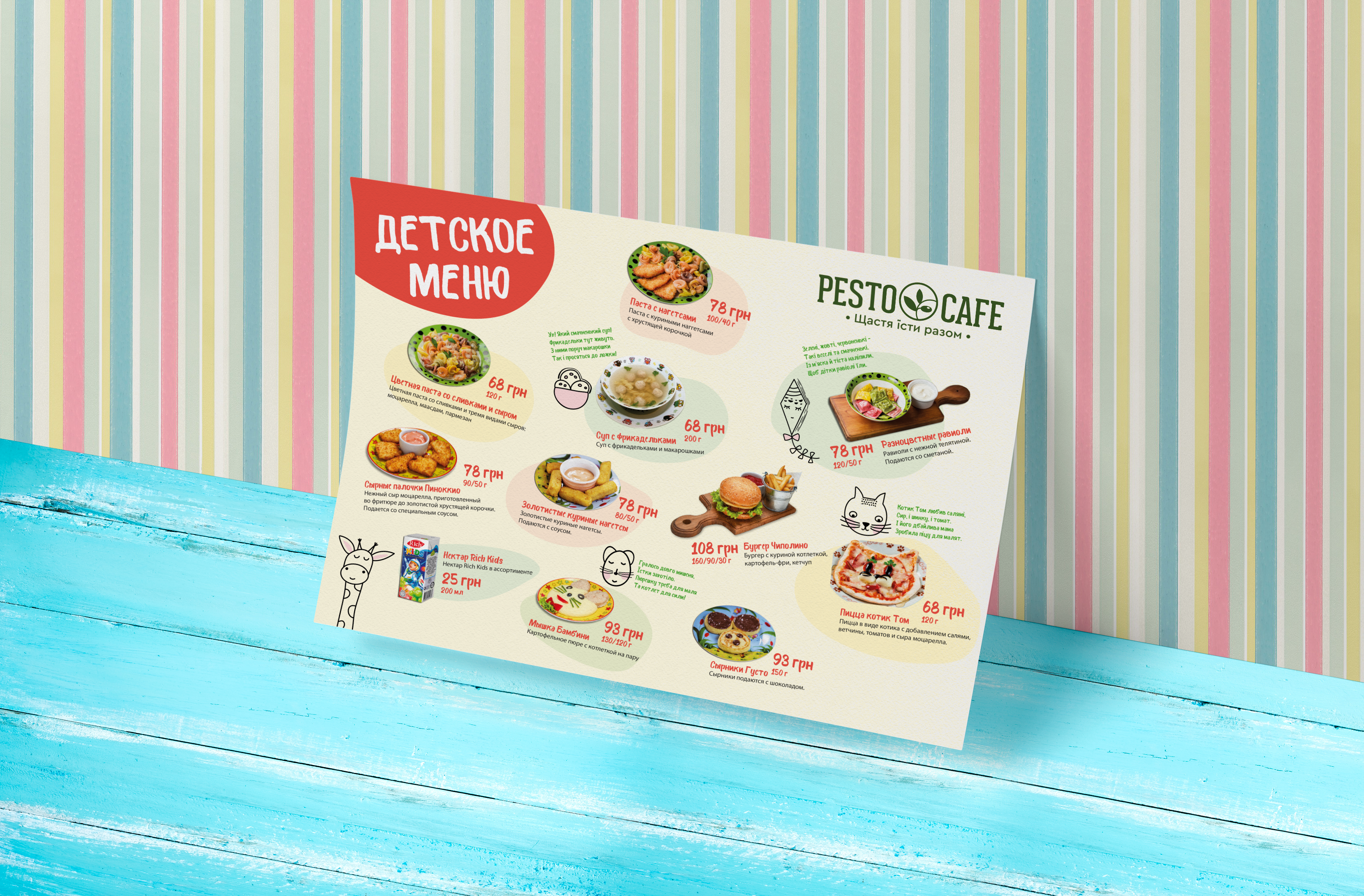
We embarked on a full expedition into the core of the business. The first step toward insights was the customers. We chose the method of quick surveys in the most relevant locations to learn every detail, every touchpoint with the brand. It turned out that Pesto cafe is most often chosen by parents with children. And we also discovered that customers love pizza!
We dug even deeper — researched the competitor market, studied the international experience of family restaurants, and found our uniqueness. This is how the insight and marketing positioning were formed.

No more ITALIANO VERO
POSITIONING
“Pesto cafe — happiness in eating together.”
During the strategic session, the question arose: “How do we communicate that we’re a family-values restaurant without explicitly saying we’re a family-values restaurant?” This slogan elegantly captures the essence of family and comfort and can be seamlessly applied across various brand touchpoints.
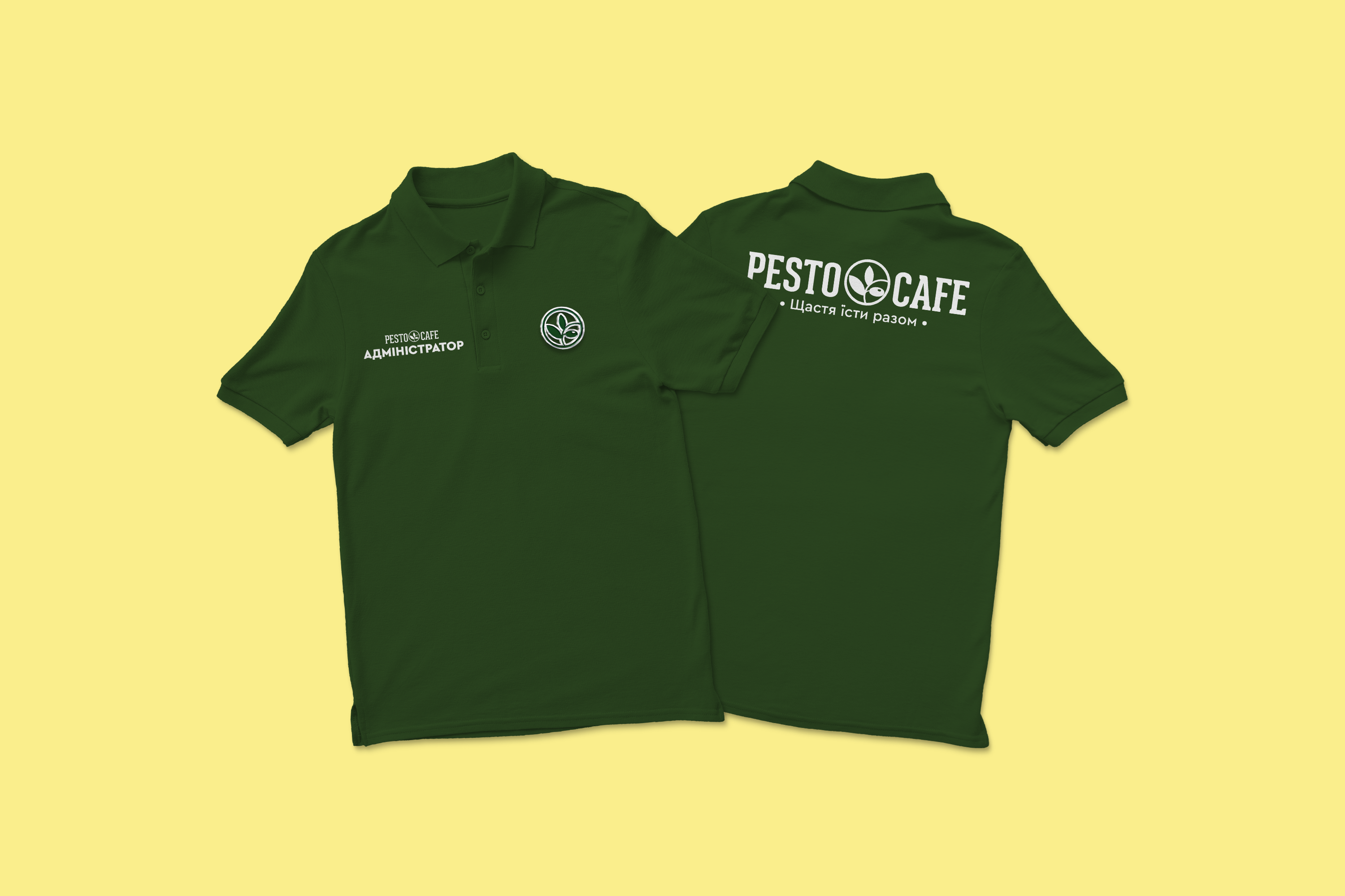
The new marketing direction required changes in the visual identity. So, we decided to transform the logo and develop new branding elements to align with the new platform. Let the visuals speak for the brand.
We modernized the symbol, making it stronger while maintaining its recognizability and the original energy of the brand.
ADVERTISING CAMPAIGN
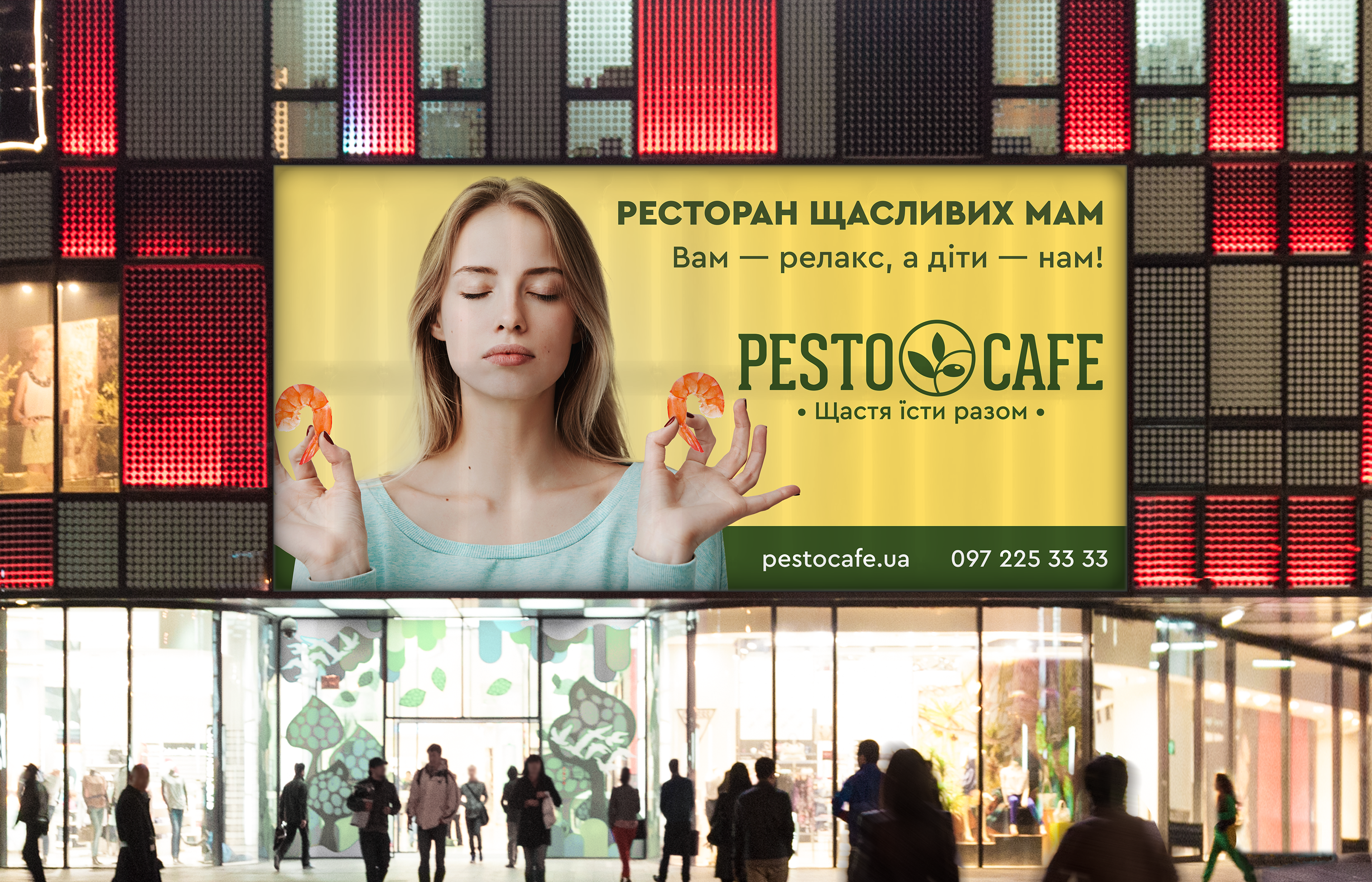
We needed to convey that this is a family cafe where you can truly RELAX. So, the creative team came up with the concept — “The Restaurant of Happy Moms,” because with our brand, moms finally have time to enjoy their meals. At the final stage, the campaign was complemented by the tagline “You relax — we take care of the kids.”
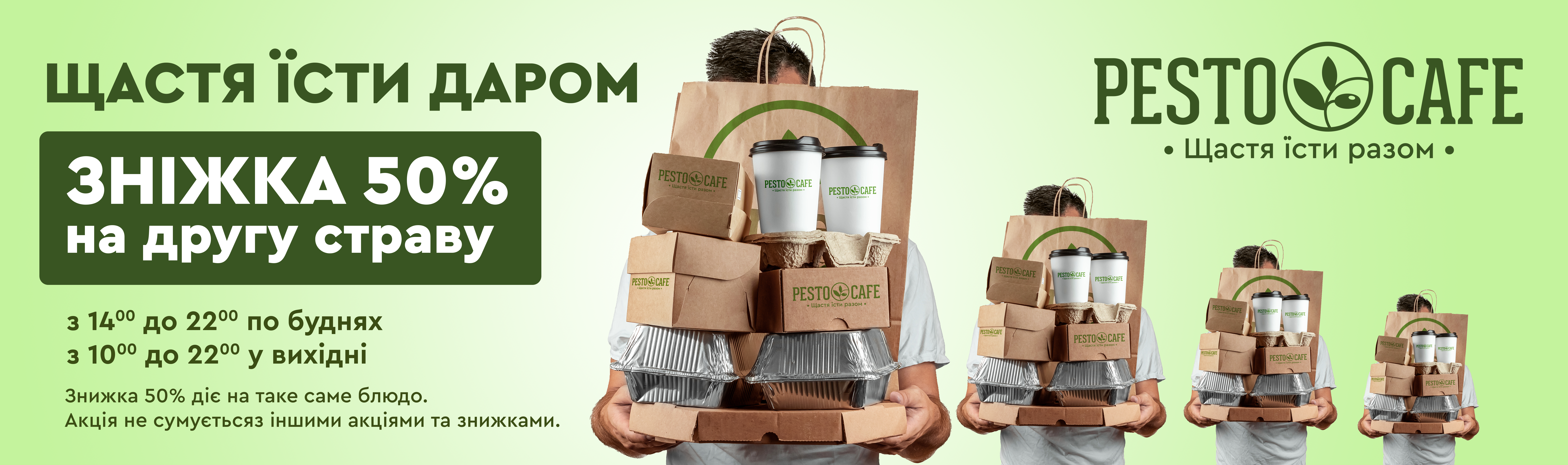
Additionally, we created promotional offers. The brand slogan evolved into the campaign “Happiness is eating for free.” And, of course, we developed a detailed media plan to ensure the campaign hit the hearts of the audience.
RESULT
We created a cozy space for all your loved ones. Now, parents know where to relax and enjoy delicious food. Pesto cafe has been living with its new slogan and logo for over two years.
Despite the lockdown, our ad was seen across all social media, and the insights and messages still resonate today.
Влучно дякуємо!
Тарас Бондарчук — Art Director
Вікторія Пучкова — Copywriter