Алі Назар
— Creative Director
Алі Ніна
— Strategist
Кулібаба Світлана
— Head of Client Service Department
CLIENT
The owner of RC Forum brewery stores has already cooperated with us. But now he came with a new idea: “I want to expand and enter Kyiv.” The market for small neighborhood shops is quite competitive, so he needed successful marketing to win the hearts of his neighbors.
TASK
To develop a concept that will encourage people to purposefully go only to this store. Each of you knows your neighborhood store, where you stop by after work or while walking the dog. We had to become something more – to become an integral part of the day. And we will do this through comprehensive marketing, branding, communication strategy and put the new brand in its best clothes.

TARGET AUDIENCE
Based on the research, we came up with a portrait of the target audience. His name was Kostya, 27 years old. We researched and described Kostya from head to toe, because all our communication will be directed to him. Where does he live? What kind of family does he have? What does he do? What are his goals and desires? How does his day go? And most importantly: their weaknesses, fears, barriers, peculiarities, and joys.

INSIGHT
Kostya is often in a bad mood after work. He wants to avoid conflict situations and get a boost of positive energy for the day. He wants to come home as soon as possible to turn on his favorite TV series. So we have to become that place of strength, a pleasant part of the day. To create the highest quality service, save time and emotional resources of customers.

POSITIONING
hi market – will turn everyday tasks into enjoyable ones
Our Kostya is always on the go and running somewhere. So, like a true friend, we will become an island for him to catch his breath, which will always be a pleasant part of the day. It’s that friendly market where you go between errands, buy groceries, drink coffee, and have a snack on the way. You know that it is always there, in your yard or in the neighborhood. So you never worry about running out of milk or salt. The brand appreciates care, friendliness, and inspires you to do everyday but important things.
NAMING
hi market – your friendly market.
Hi means “hello” in English. This says almost everything.
The name conveys simplicity and friendliness. The market always says “hi” to you. It doesn’t matter if you came to buy groceries or just passed by. This name conveys the main message: “Hello, friend! Come and visit us. We have a nice warm atmosphere here. We will become a loyal friend in all your affairs. Whether it’s dinner or a quick snack.”
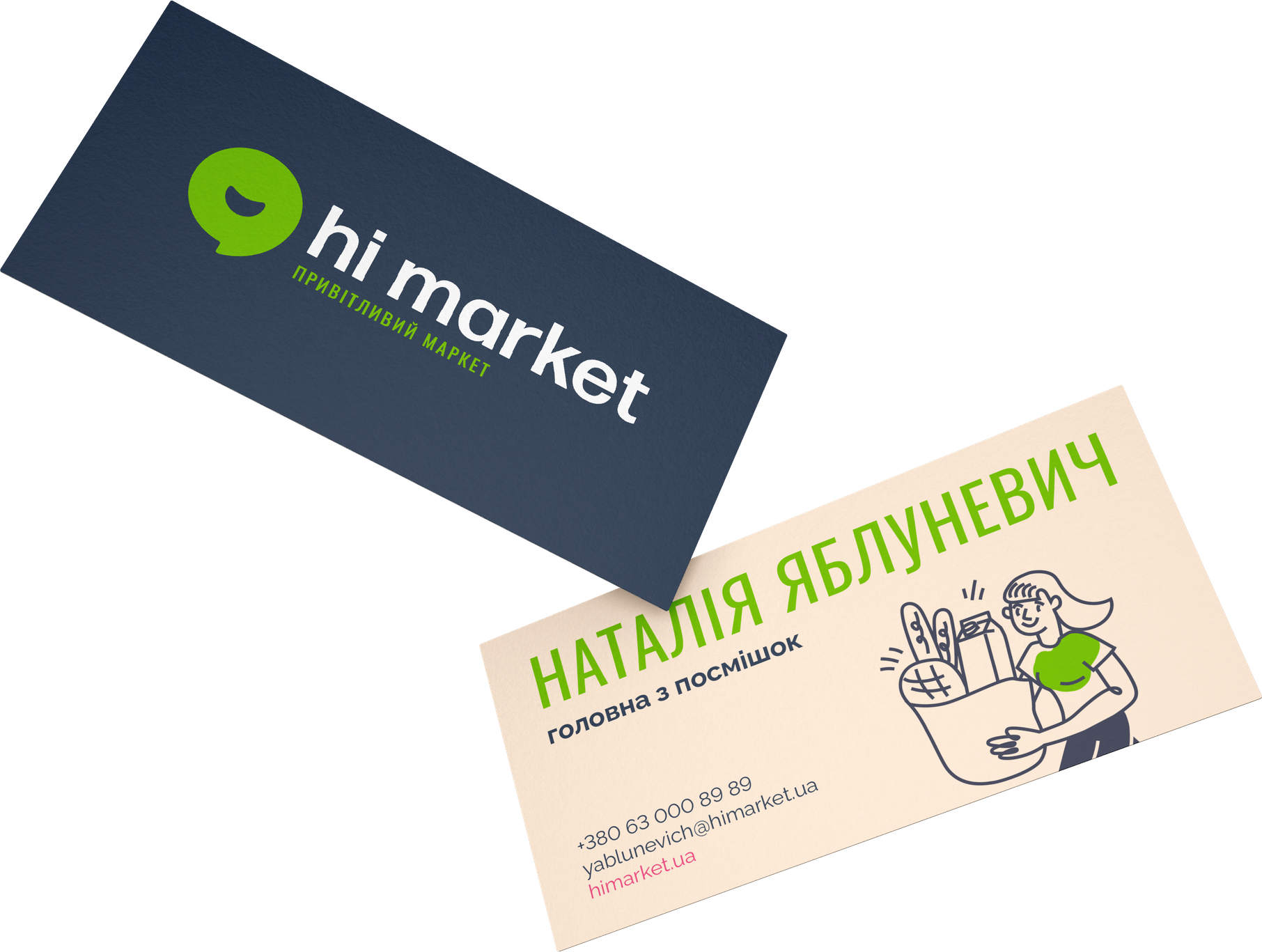
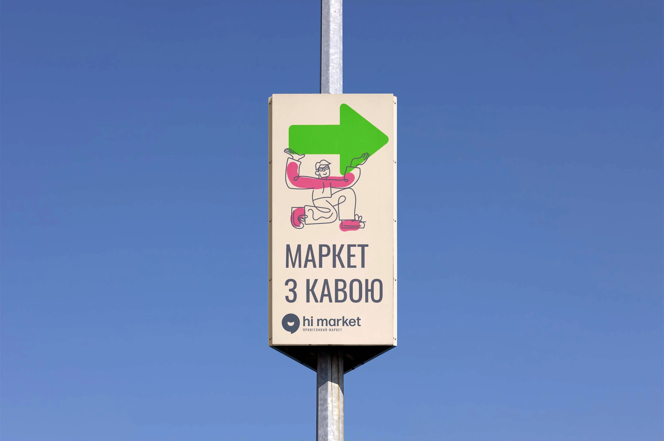
LOGO DESIGN
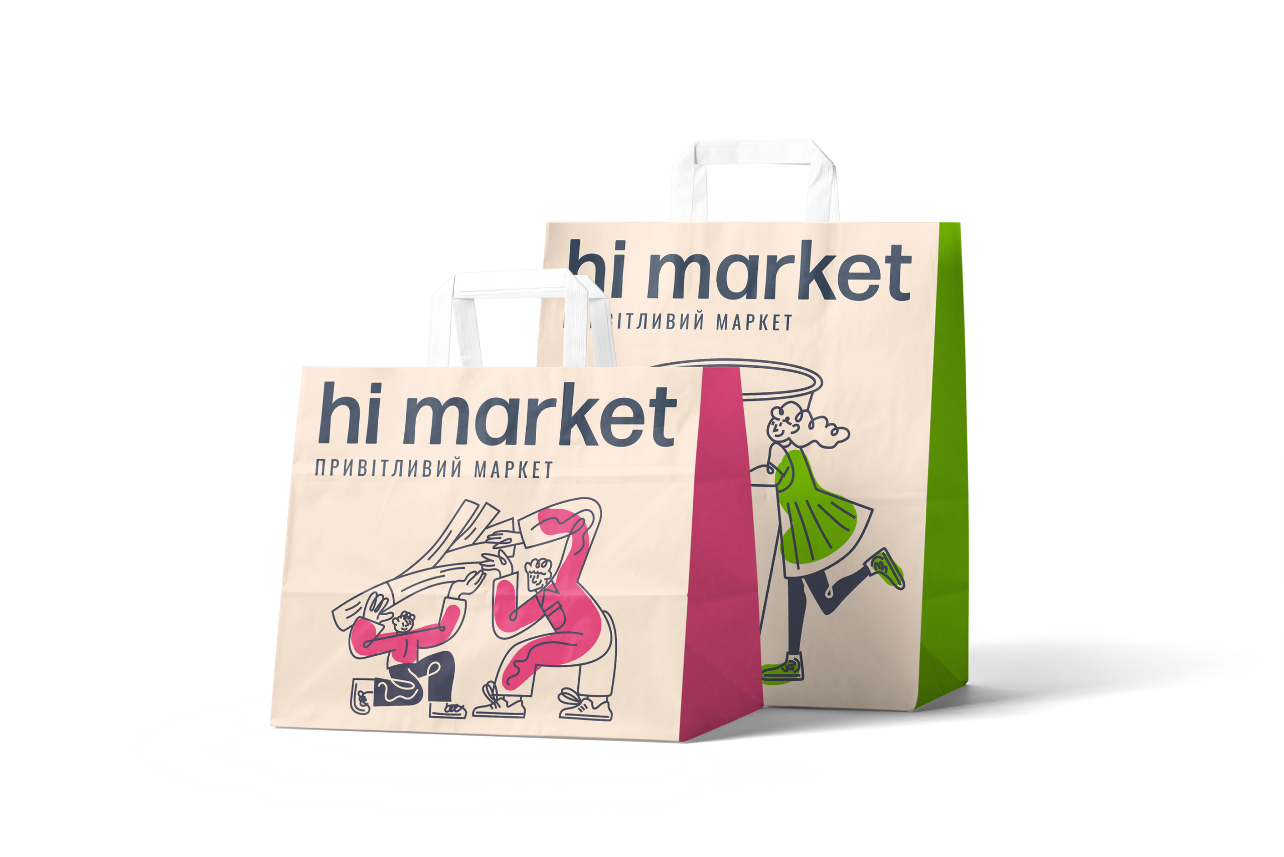
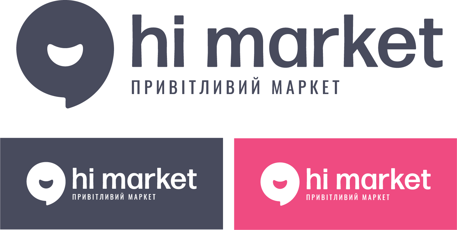
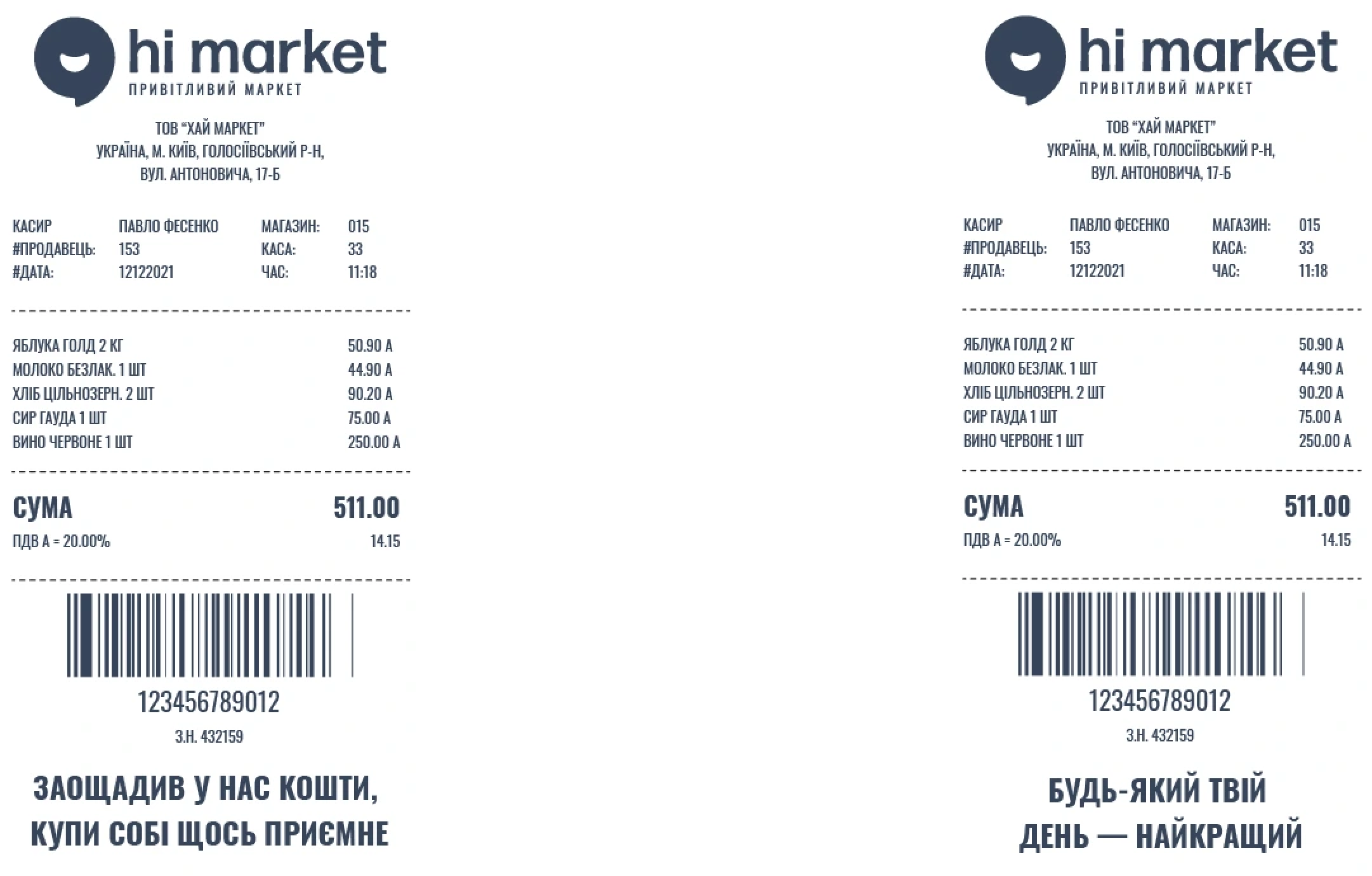
The hi market logo is a classic combined logo consisting of a symbol, a typographic inscription and a descriptor. The typography used to create the typographic part of the logo is a friendly humanistic grotesque with softened corners and specially customized stems in the letters.
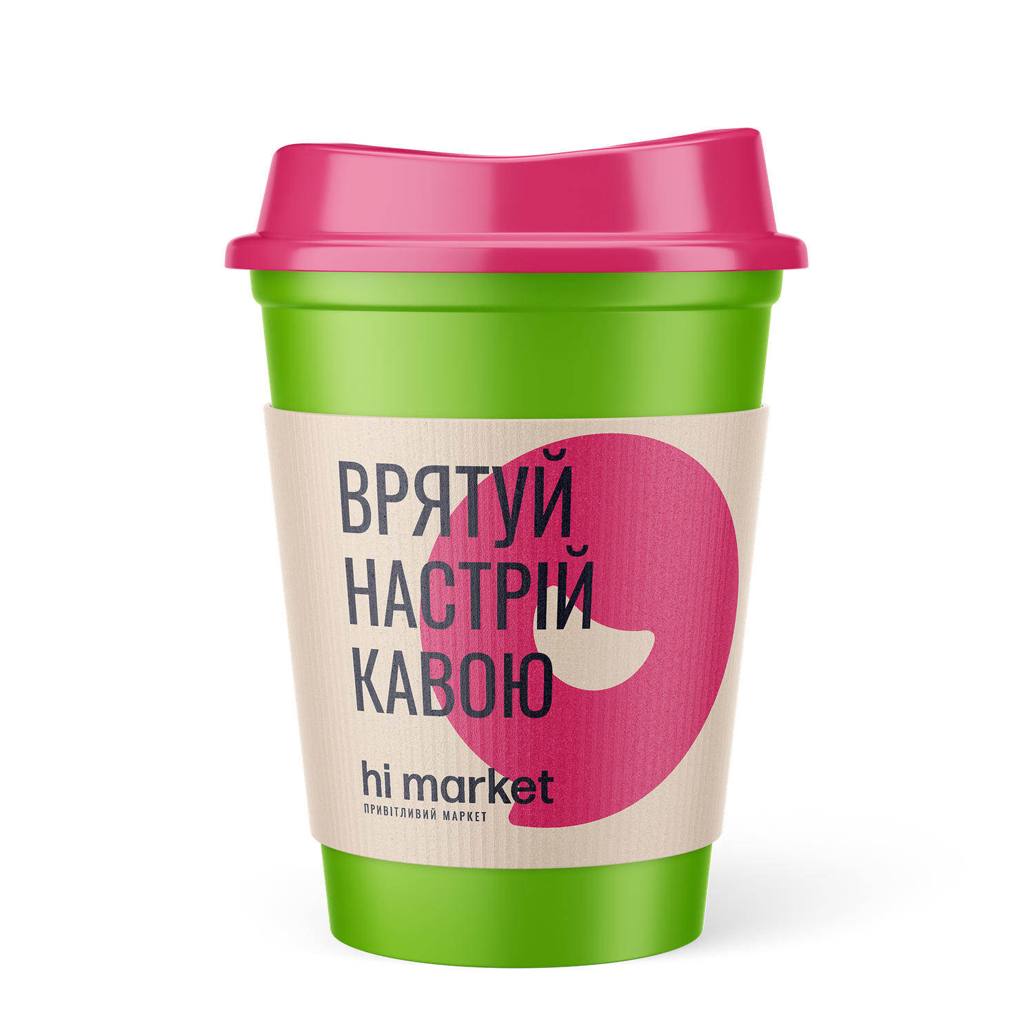
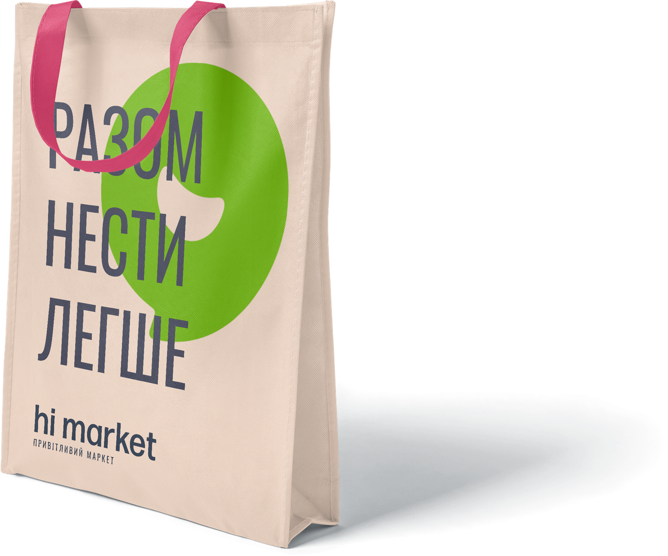
The symbolic part of the logo is based on a doughnut that smiles friendly to everyone who communicates with the logo. This element is also used in the identity as a stylistic element.
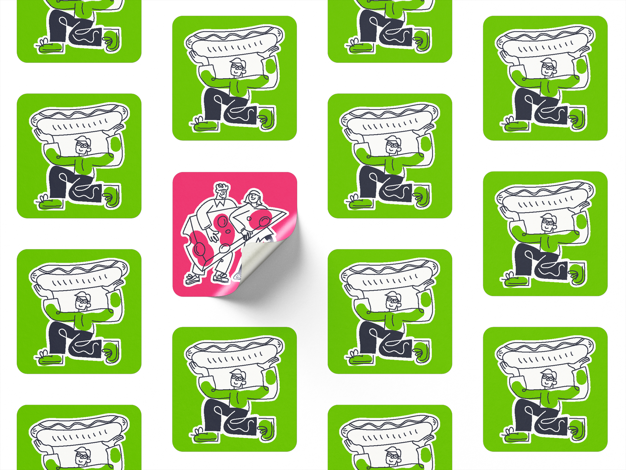
IDENTITY AND ILLUSTRATIONS
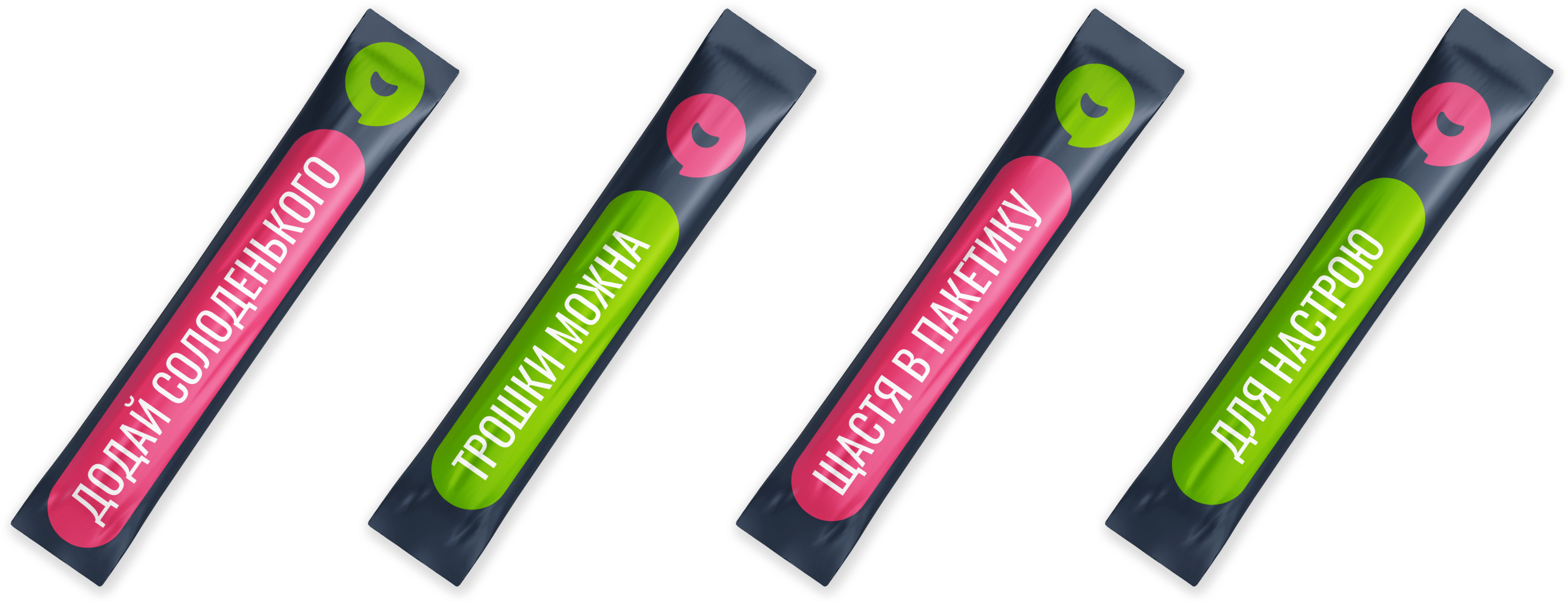
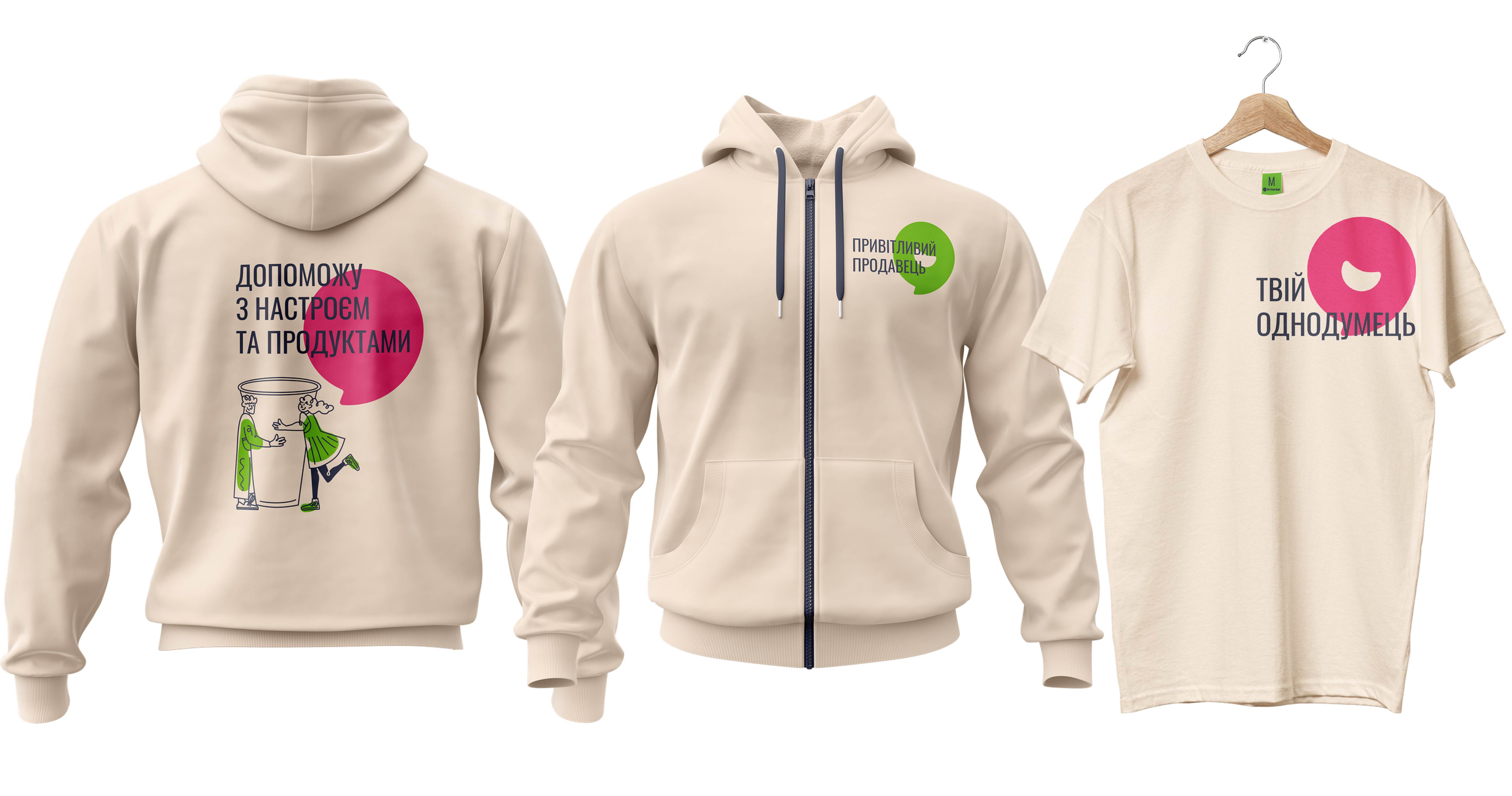
The main task was to convey the friendliness and friendliness of the market. It was decided to develop the theme of money and add illustrations with people to emphasize the mood. The identity includes a system of illustrations consisting of cheerful and friendly linear people with products from hi market. The illustrations have soft angles, friendly lines, and positive subjects. In addition, they can be partially inverted in color and colored in brand colors.

RESULT.
Now hi-market customers will have one more friend. And the owner of RC Forum can safely enter the Kyiv market with the new brand. We even designed the interior for the new stores so that his “high” could be felt in every detail.
Влучно дякуємо!
Ковтун Влад
— Creative Team Lead
Домченко Влада
— Art Director
Кузьменко Поліна
— Designer
Дашенко Дар'я
— Copywriter