Алі Назар
— Creative Director
Алі Ніна
— Strategist
CLIENT
The owner of an already well-known PerioCenter, our long-time client, asked us to develop a new clinic that would change the way people think about dentistry in Ukraine.
TASK
The main task was to create a clear product with a philosophy that is not yet present on the market. No teeth and no blue colors. A completely different brand and messages.
TARGET AUDIENCE
Based on the research, we came up with a portrait of the target audience. This is Mariana, she is 35 years old and has a daughter. She is a very cheerful woman who works in HR for an average salary on the market. We learned all the details about her to build a brand specifically for Mariana.
INSIGHT
Mariana could not get to the dentist for a week, and then it turned out that she had to pay more than she expected. So we want to change this injustice and give people the opportunity to visit the doctor on time, without queues and waiting. We want to be simple and transparent, friendly and always there.
POSITIONING
We want to change the perception of dental services in Ukraine:
From “long wait” to “make an appointment today for tomorrow”,
From “you have to go far away” to “we are nearby”,
From “will there be enough money at the checkout?” to “today’s visit will cost 1450 UAH, do you have any questions about the treatment plan?
TVOYA dental studio is a timely service that will help people perceive a visit to the dentist as a normal, everyday event, an integral part of their lives. A place where they can get the best services with clear and affordable pricing in the shortest possible time and close to home.
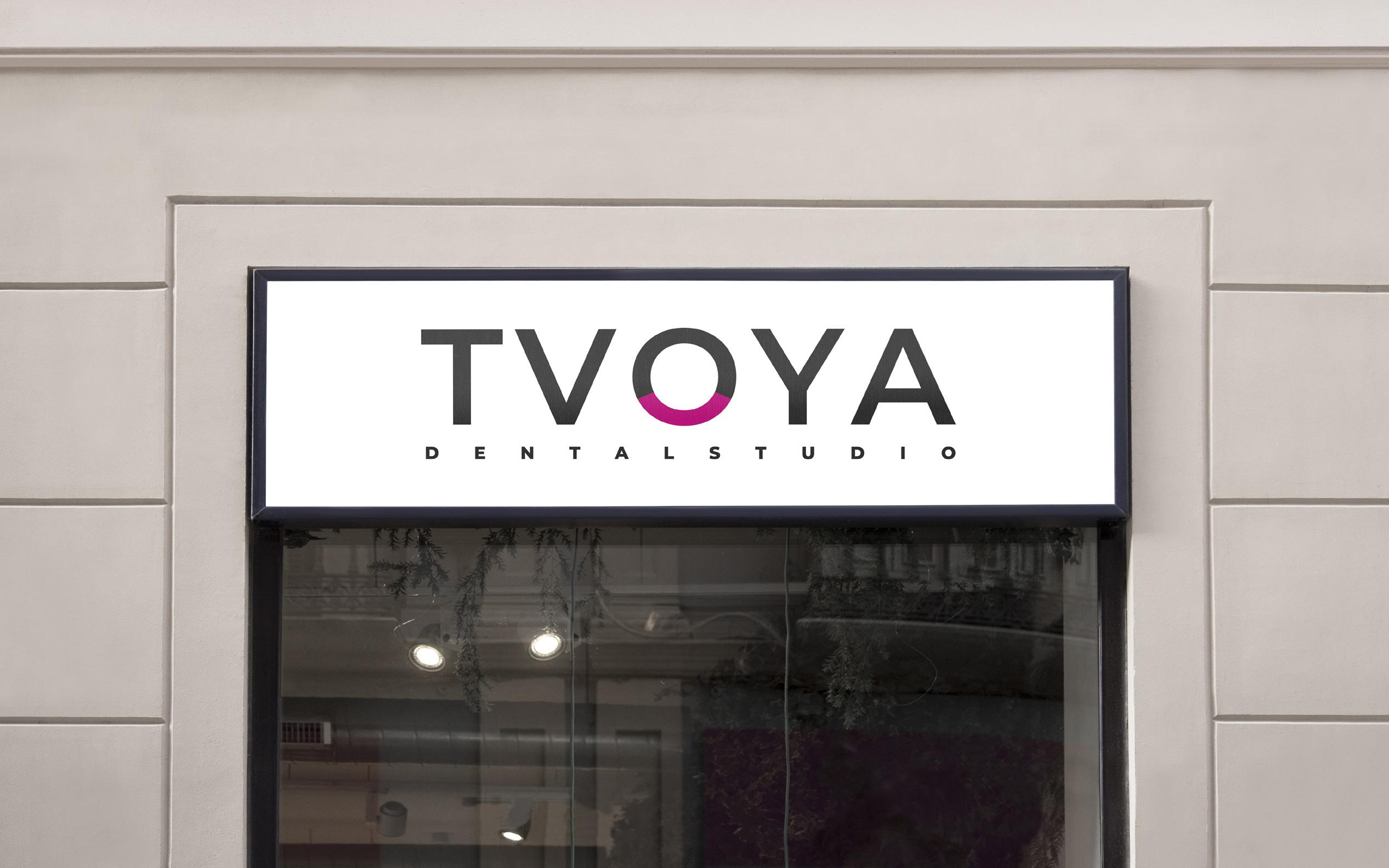
NAMING
Why TVOYA dental studio?
Why is it so important for us to have something of our own?
Each of us has something special. Something that is always there, that warms the soul, soothes, supports and inspires.
Your cozy home where your family is waiting for you.
Your favorite job, where you are respected and listened to.
Your workplace where you are successful.
Your masseur who knows how to fix you.
Your nearest bakery with the best croissants in town.
And we are exactly that kind of clinic: native, close, TVOYA
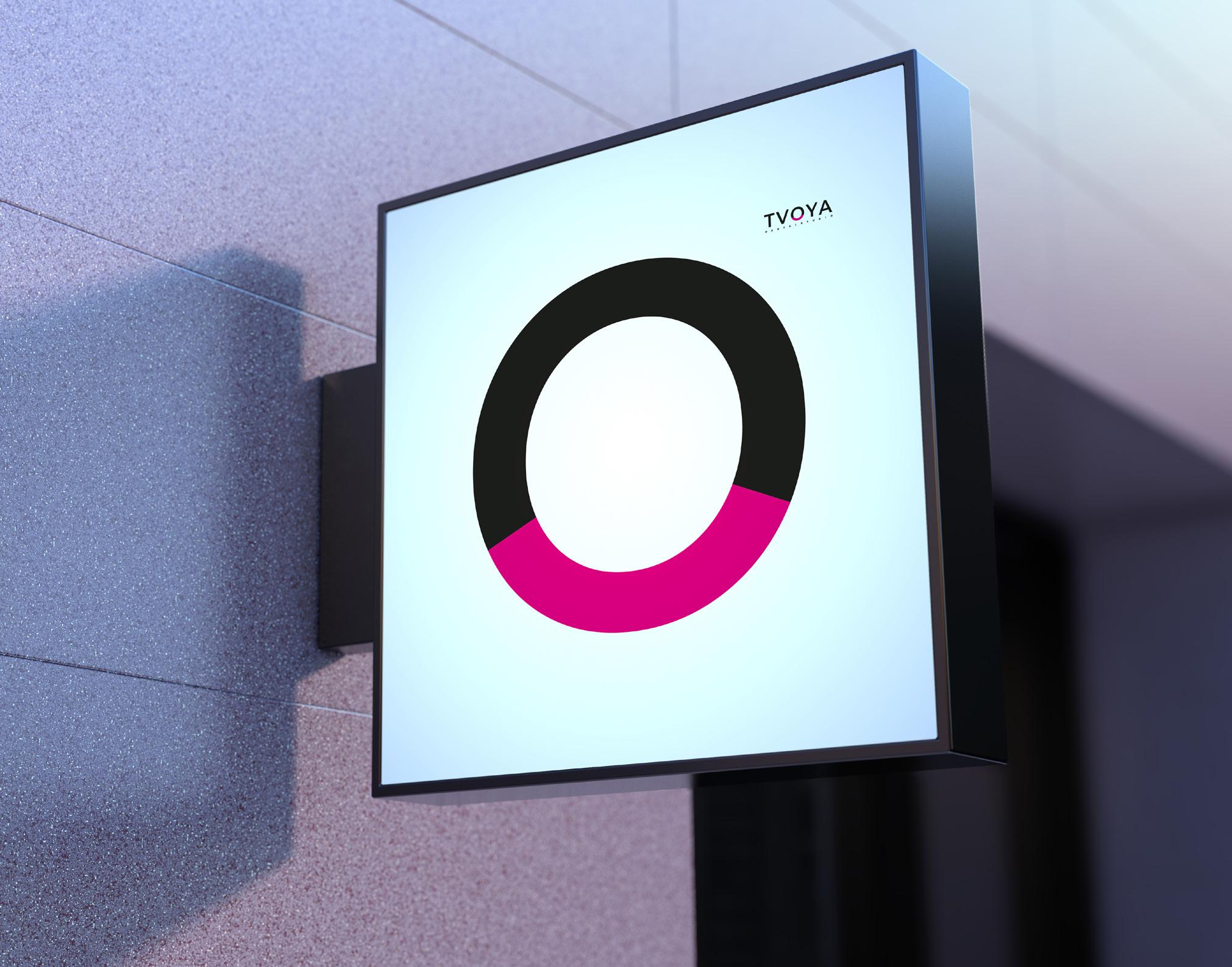
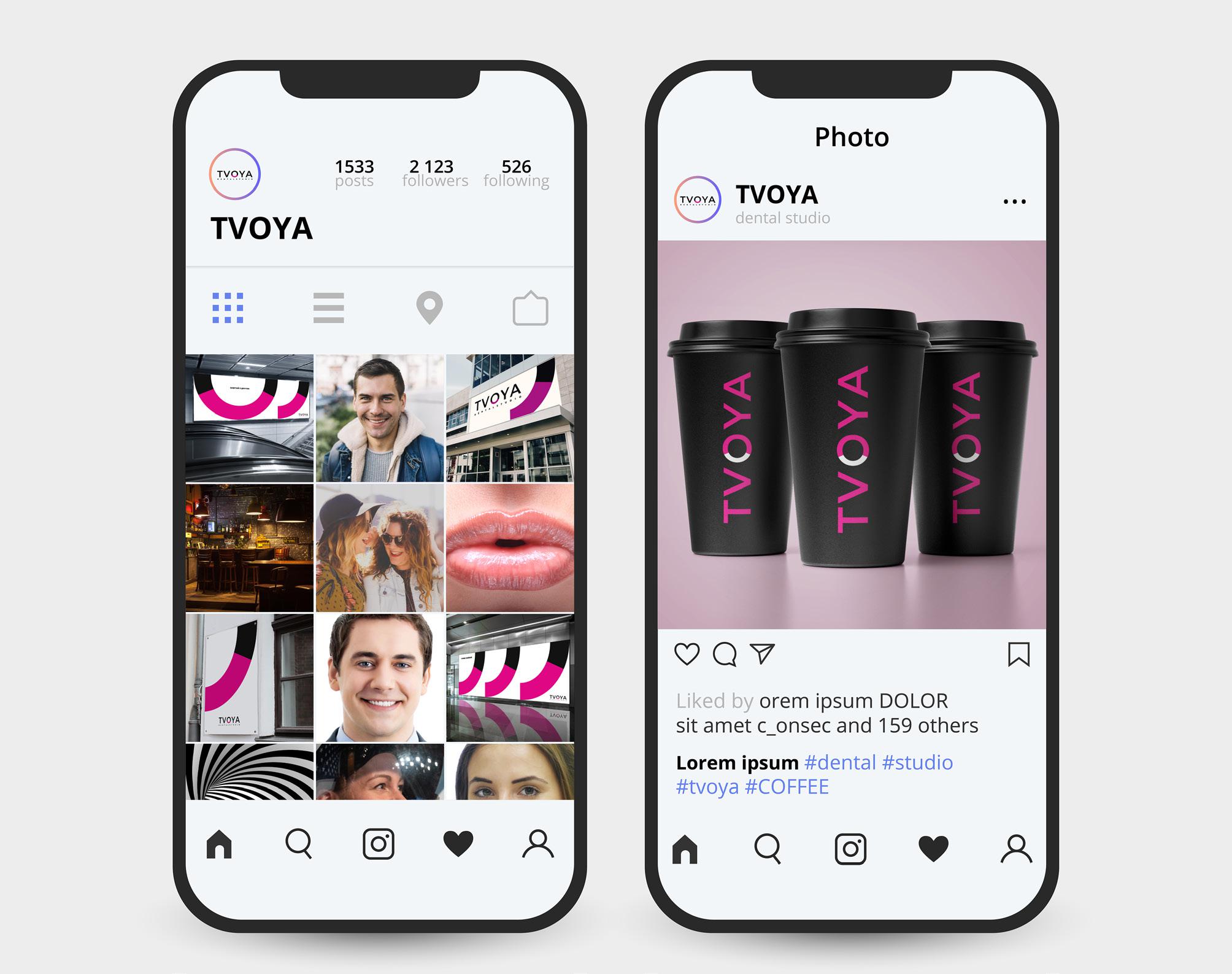
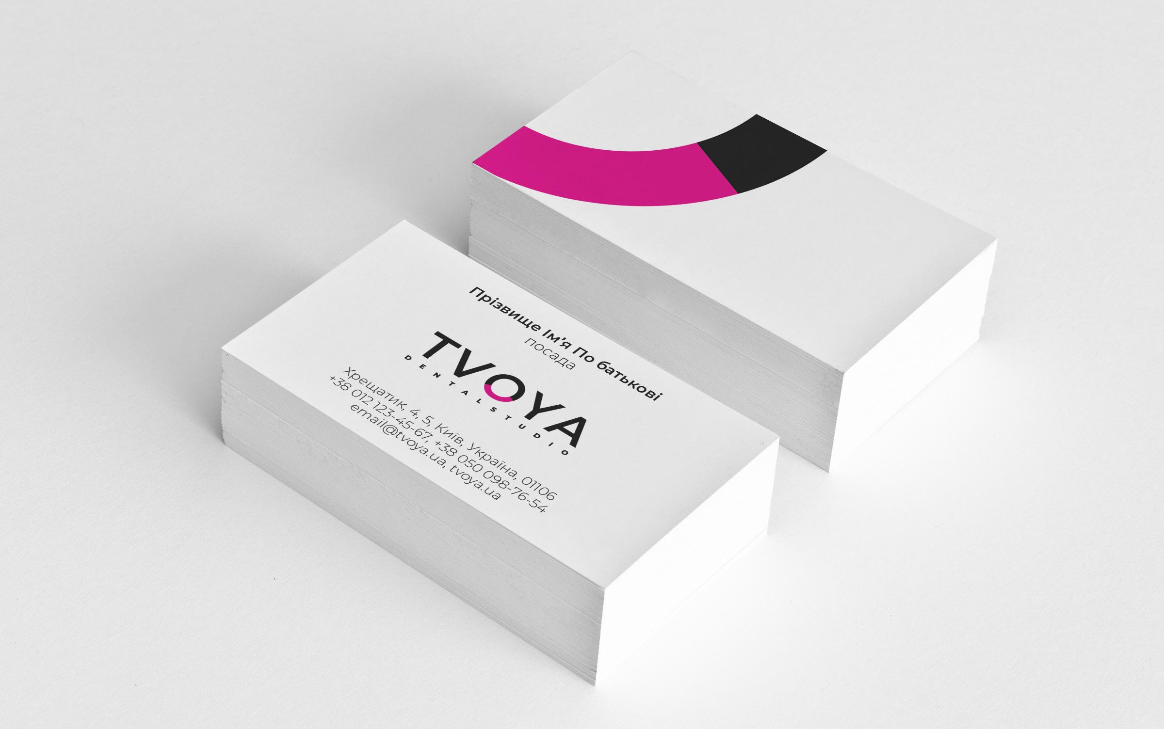
LOGO DESIGN
The logo is based on the Montserrat font.
The symbolic part of the logo is a smile of satisfaction, which is inscribed in the letter O.
The logo also contains the one-word descriptor DENTAL STUDIO.
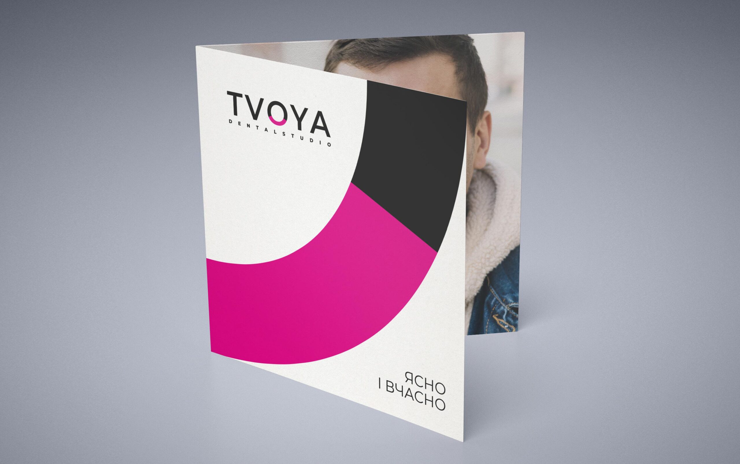
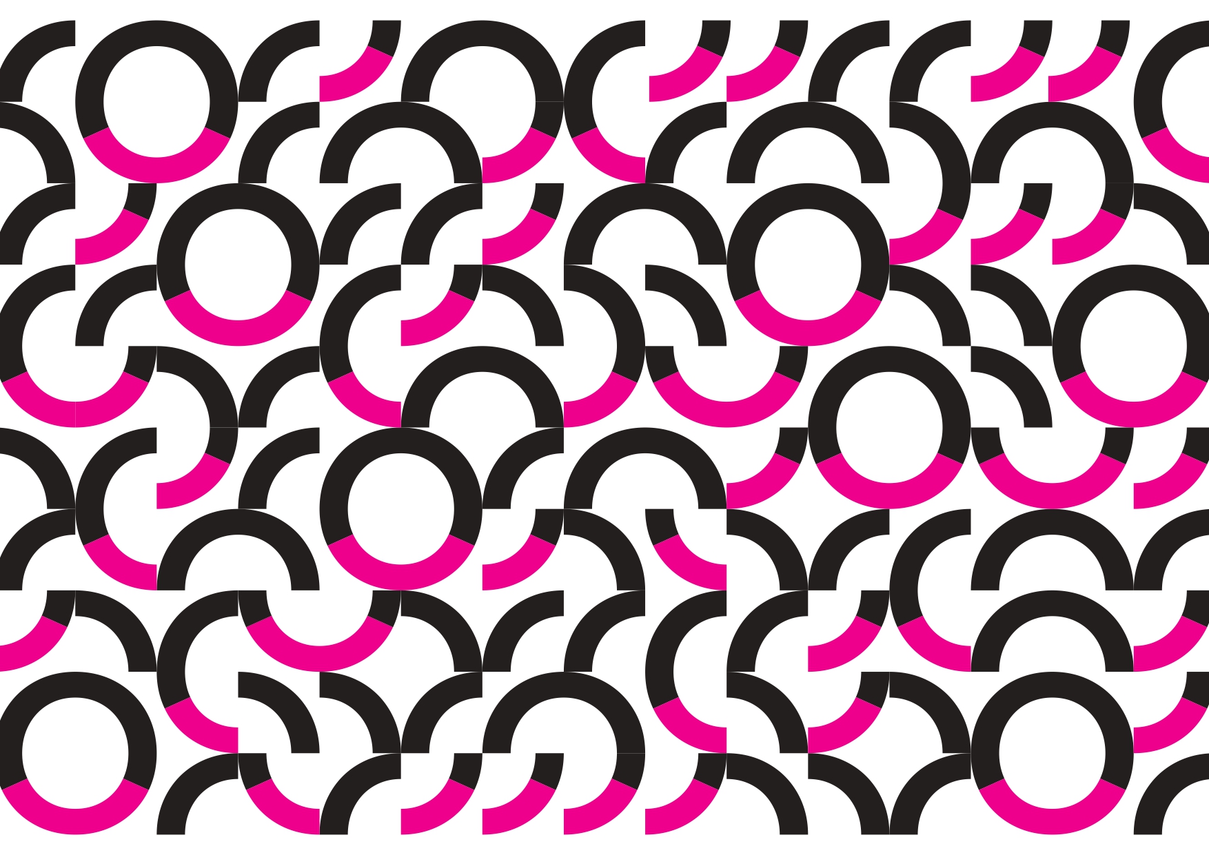
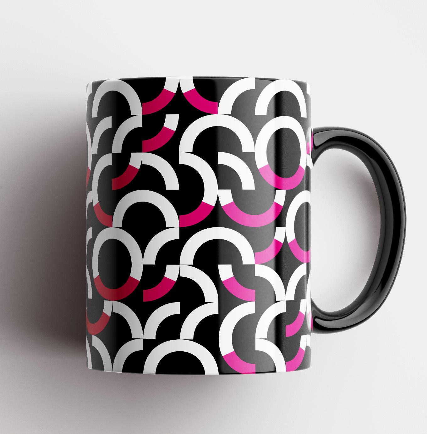
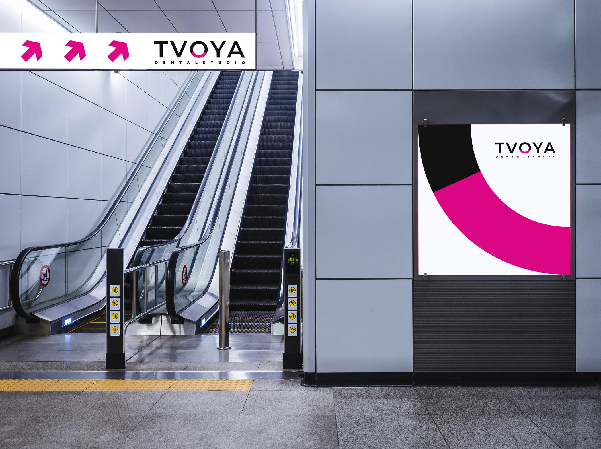
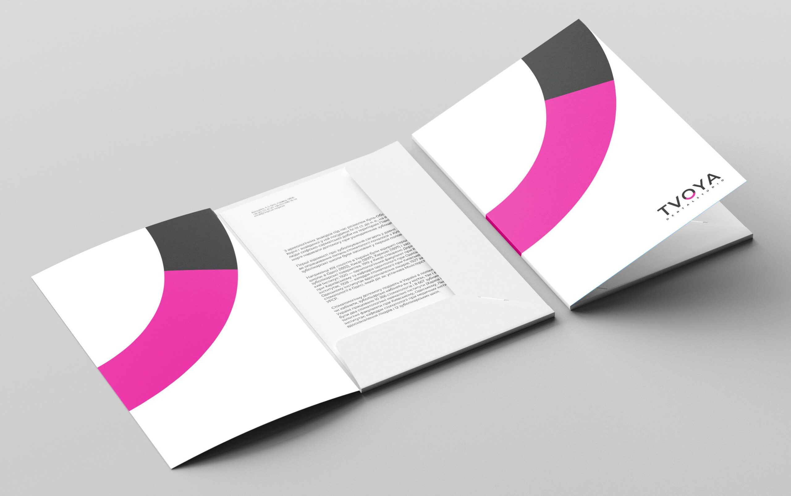
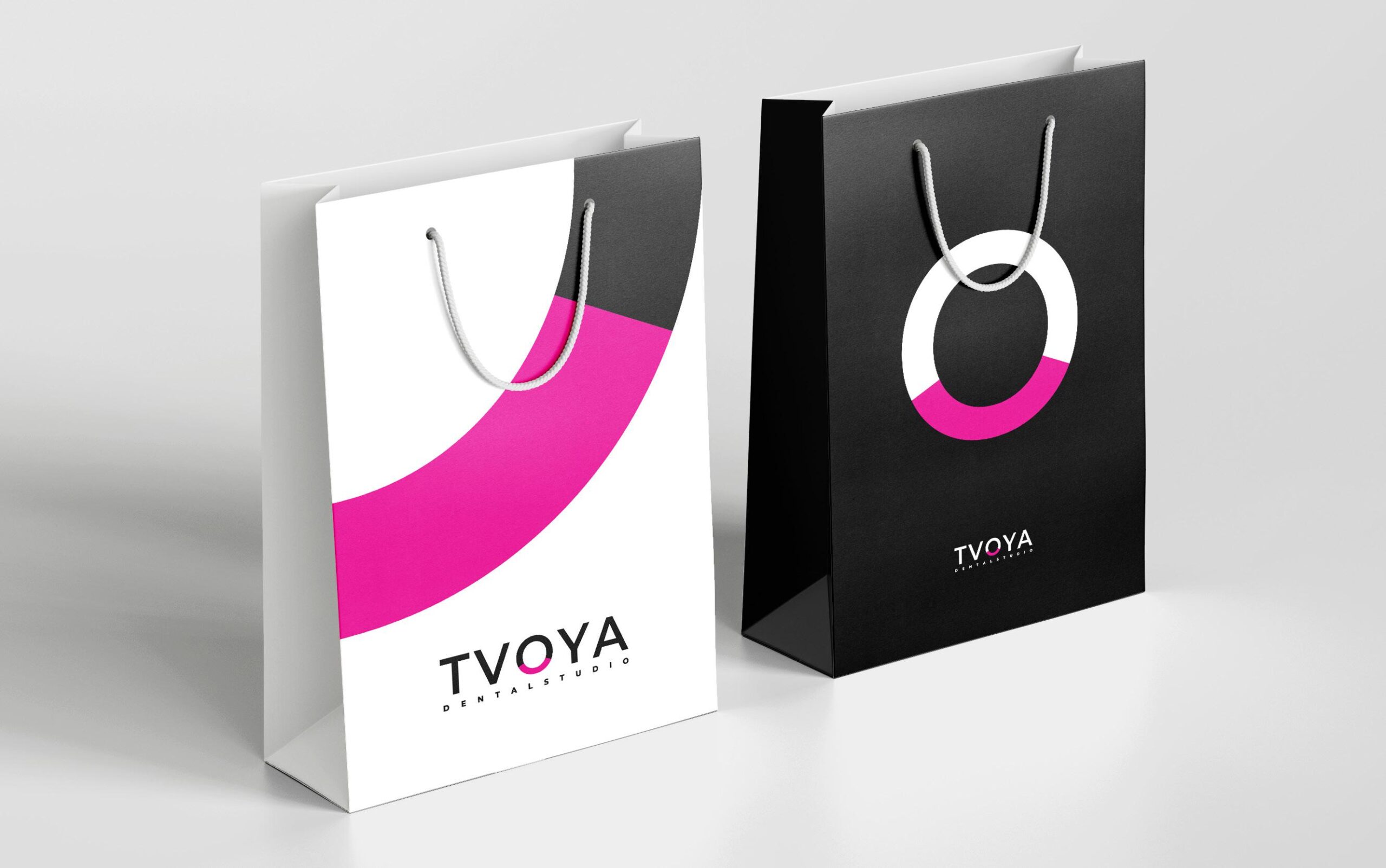
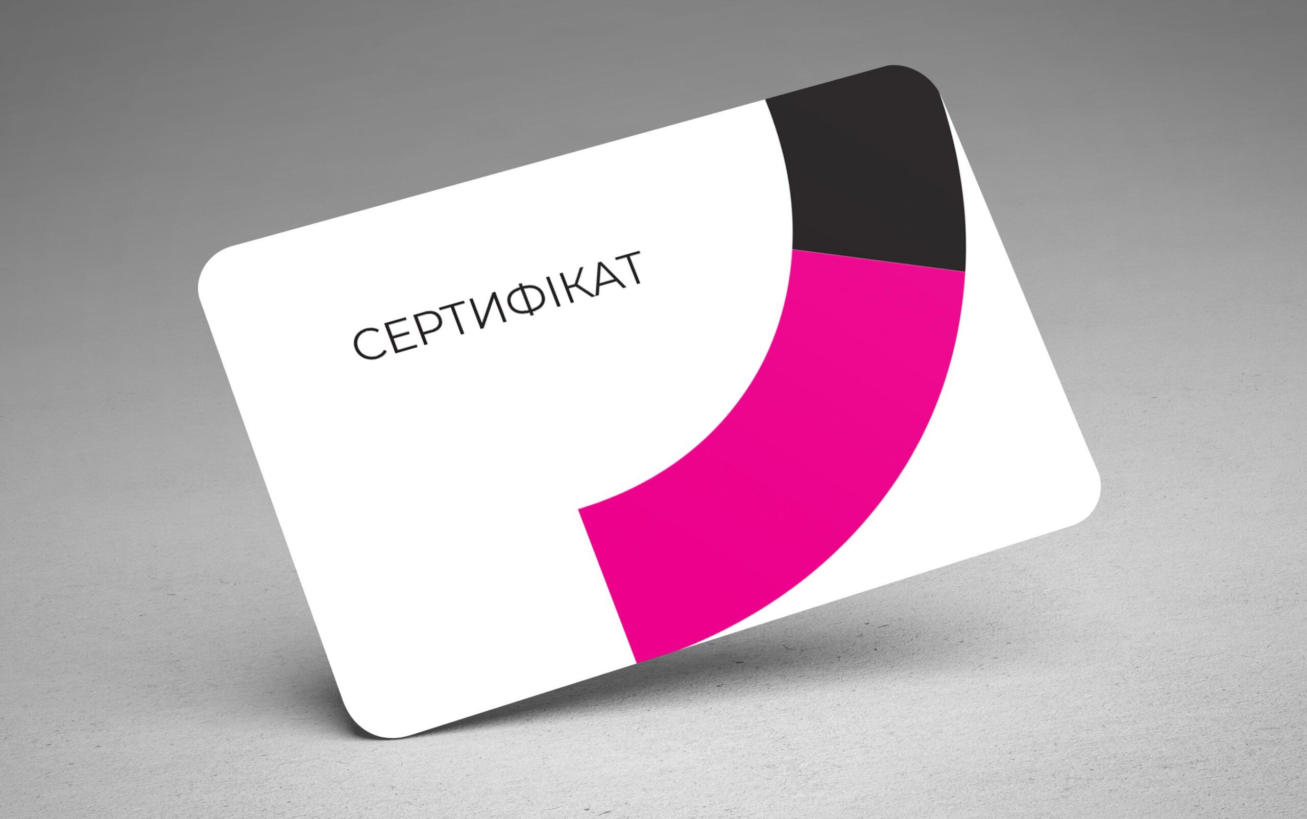
IDENTITY AND PATTERNS
The main color and the main style differentiating element is the bright pink brand color. В
palette, it works together with monochromes – black and white.
The main style element is the letter O, as well as its halves and quarters.
Thank you very much!
Денис Філін — Copywriter
Олександр Іванішин — Art Director
Do you like it?
See more
Branding that gives clarity!
PerioCenter
HEALTHY chickens from KRAMAR!
"KRAMAR"
