Алі Назар — Creative Director
Алі Ніна — Strategist
Лукавенко Світлана — Analyst
CLIENT
NGO Magnolia becomes Child Protection Organization Magnolia
Our brand is the first thing that comes to mind for the average Ukrainian when it comes to finding children. We have the trust of parents, children, and families thanks to our experience, community of like-minded people, and instrumental approach.
We also have the trust of our partners — project connections with a large ecosystem of government agencies and international organizations.
TASK
Develop a new style, thereby drawing attention to an important cause, increasing the visibility of the organization, and helping it build trust. Because a large part of success in the search depends on interaction with society.
BRAND MISSION
Ensure comprehensive and effective protection of children.
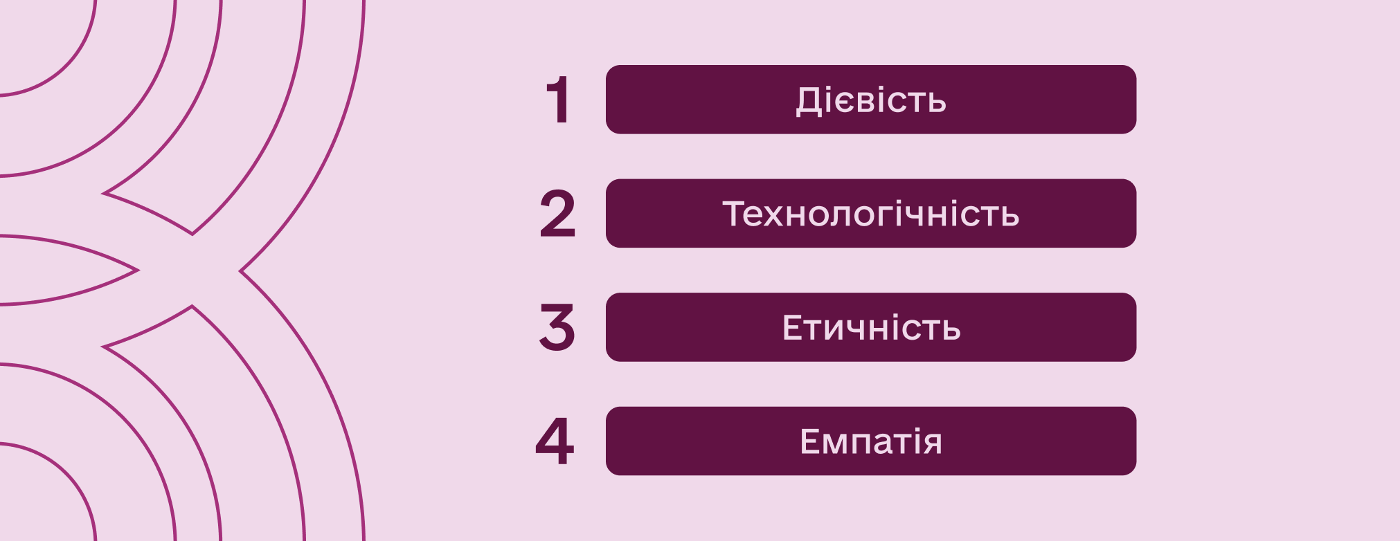
VALUES
Our ideology is the most effective combination of two forces: organization as an effective structure and organization as technologies and tools for effective child protection.
Therefore, our values are:
MESSAGES
We are child-centered.
We are one of the most well-known organizations in Ukraine that cares for children.
We are known and trusted.
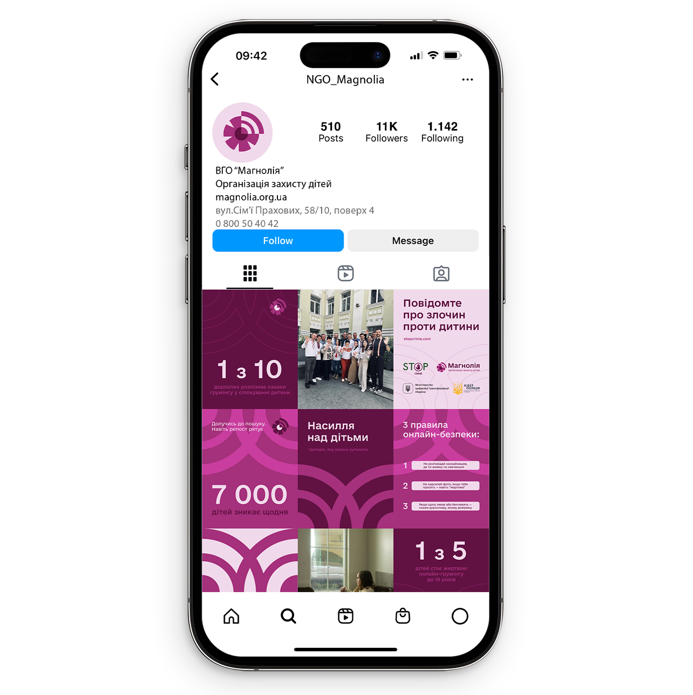
In order to engage a wide range of the public, all conscious Ukrainians in this field of child protection, we have our own and partner media resources to be visible and shape the information agenda in the field of child protection.
TONE OF VOICE
We use informal language with children and formal language with adults. We are a brand that is very close to families. When searching for children, we become like members of the family.
Our reputation is our main asset. Child safety is always the cornerstone and guiding principle of our work.
Therefore, our tone of voice with our partners is calm confidence, professionalism, expertise, prudence, and reliability. It is always a professional dialogue. It is always businesslike, formal language, but with the presentation of our expertise and the achievements of many years of experience.
In communication, we are sensitive but prudent. When drawing attention to problems or situations, we provide detailed information for understanding, but not for relishing.
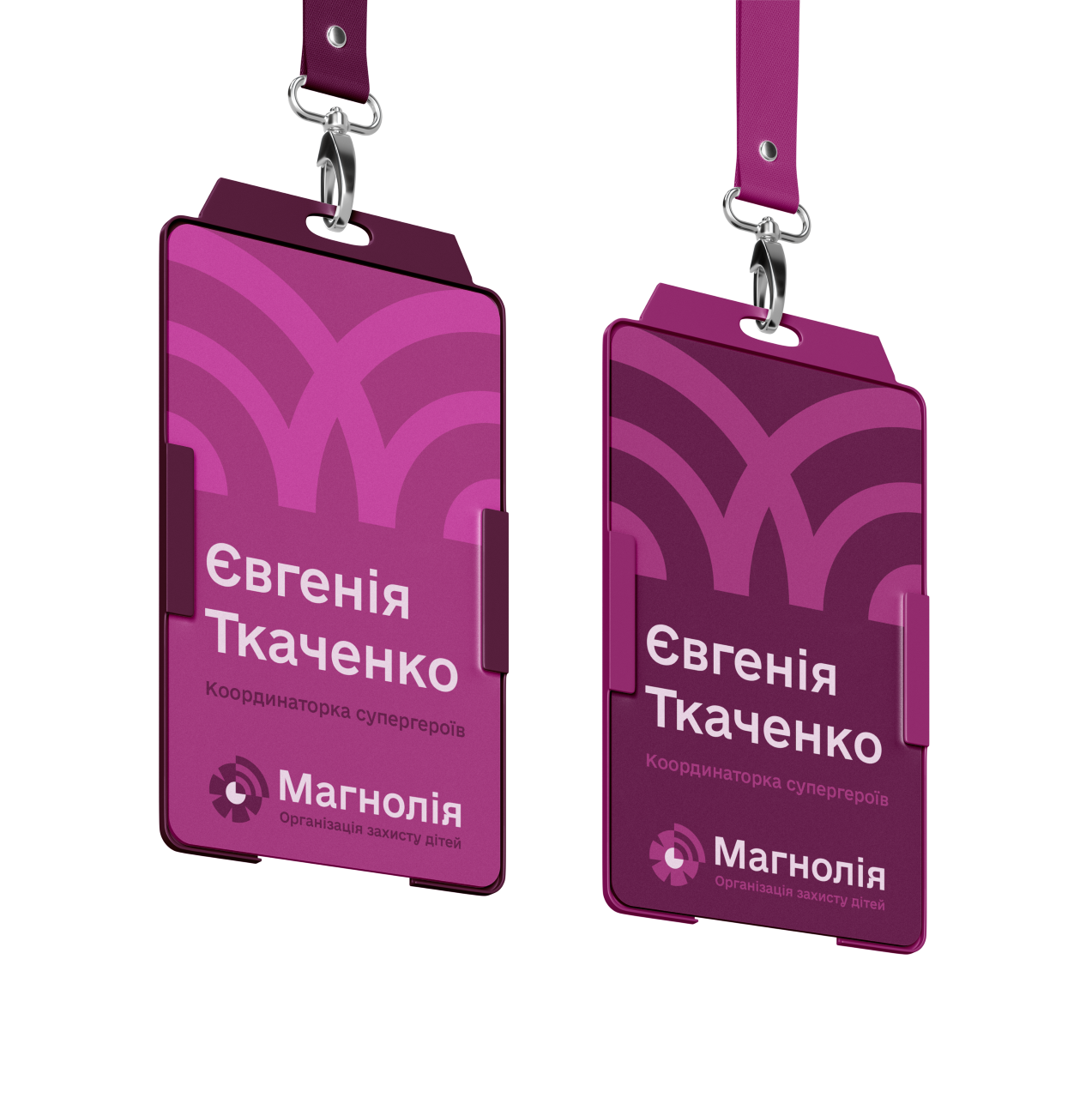
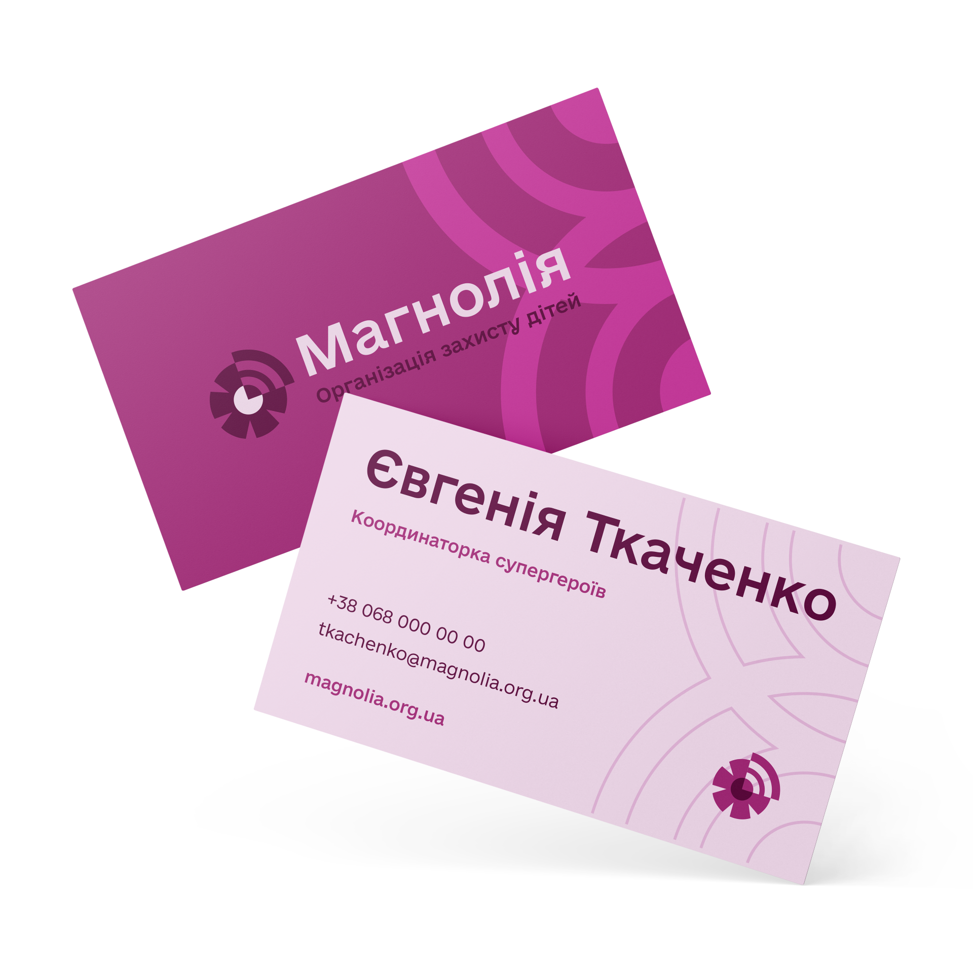
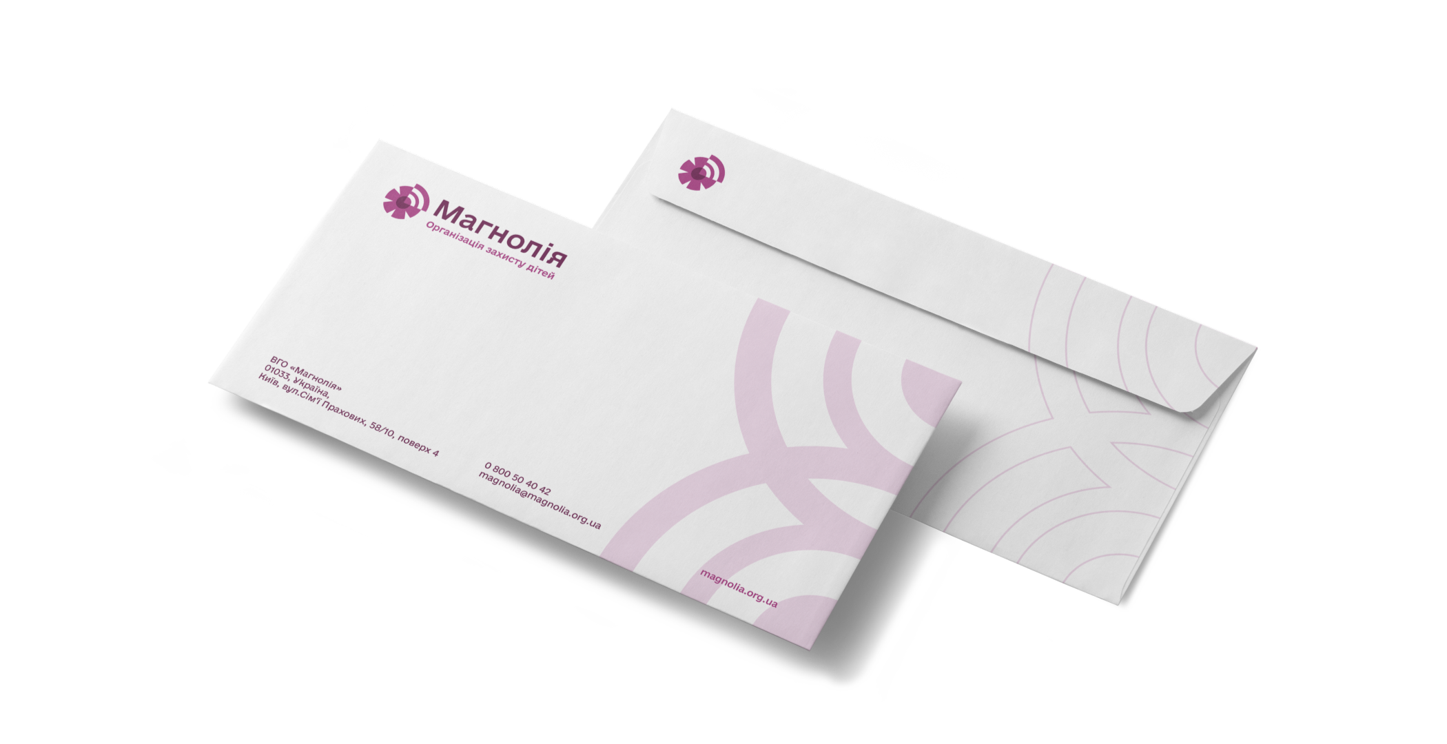
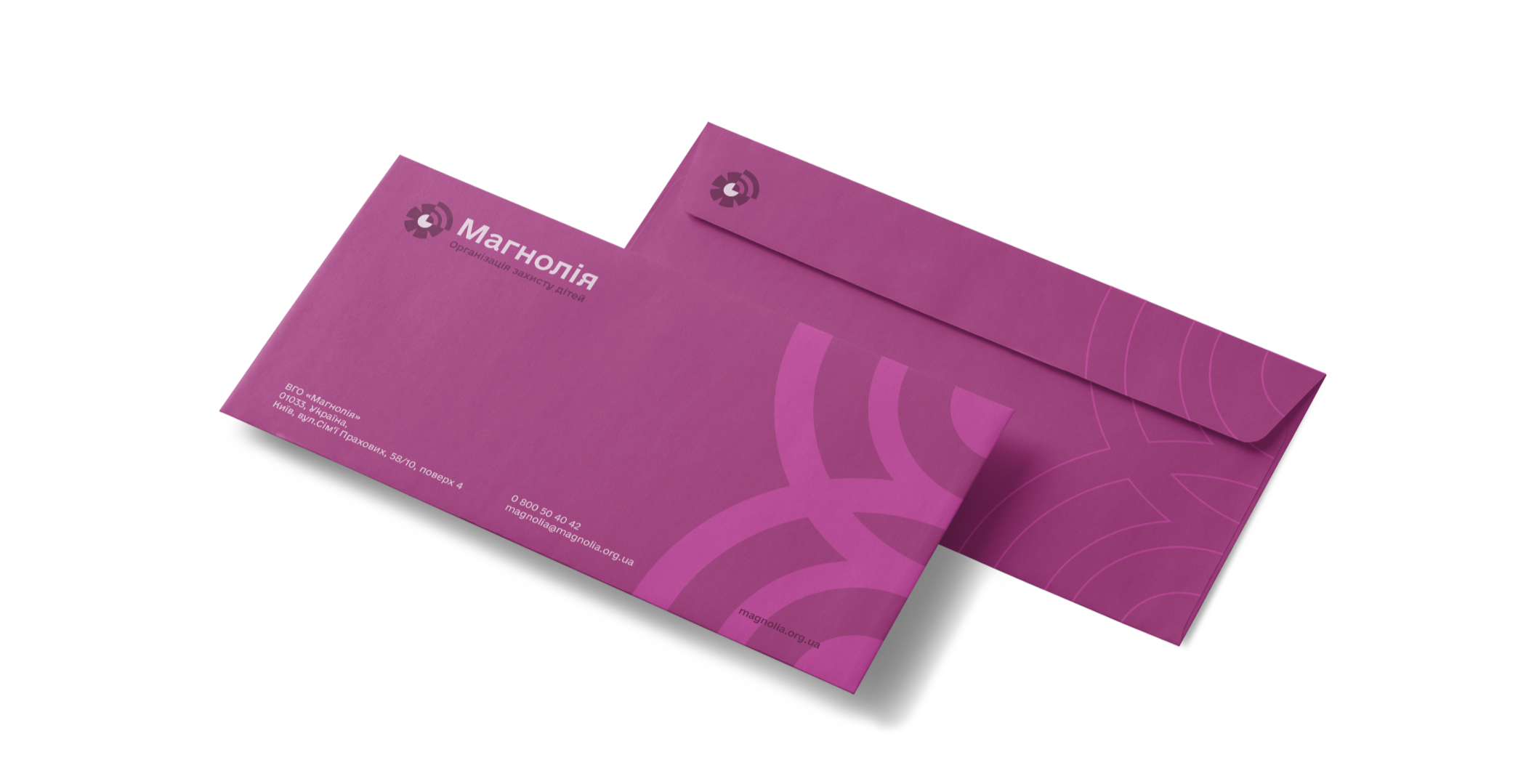
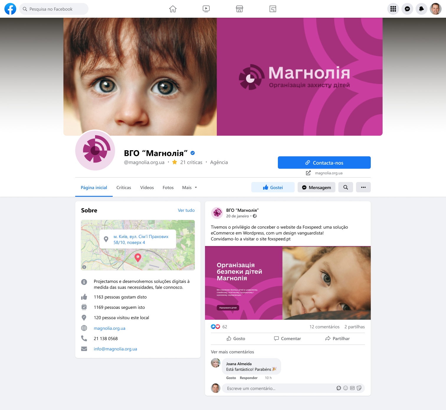
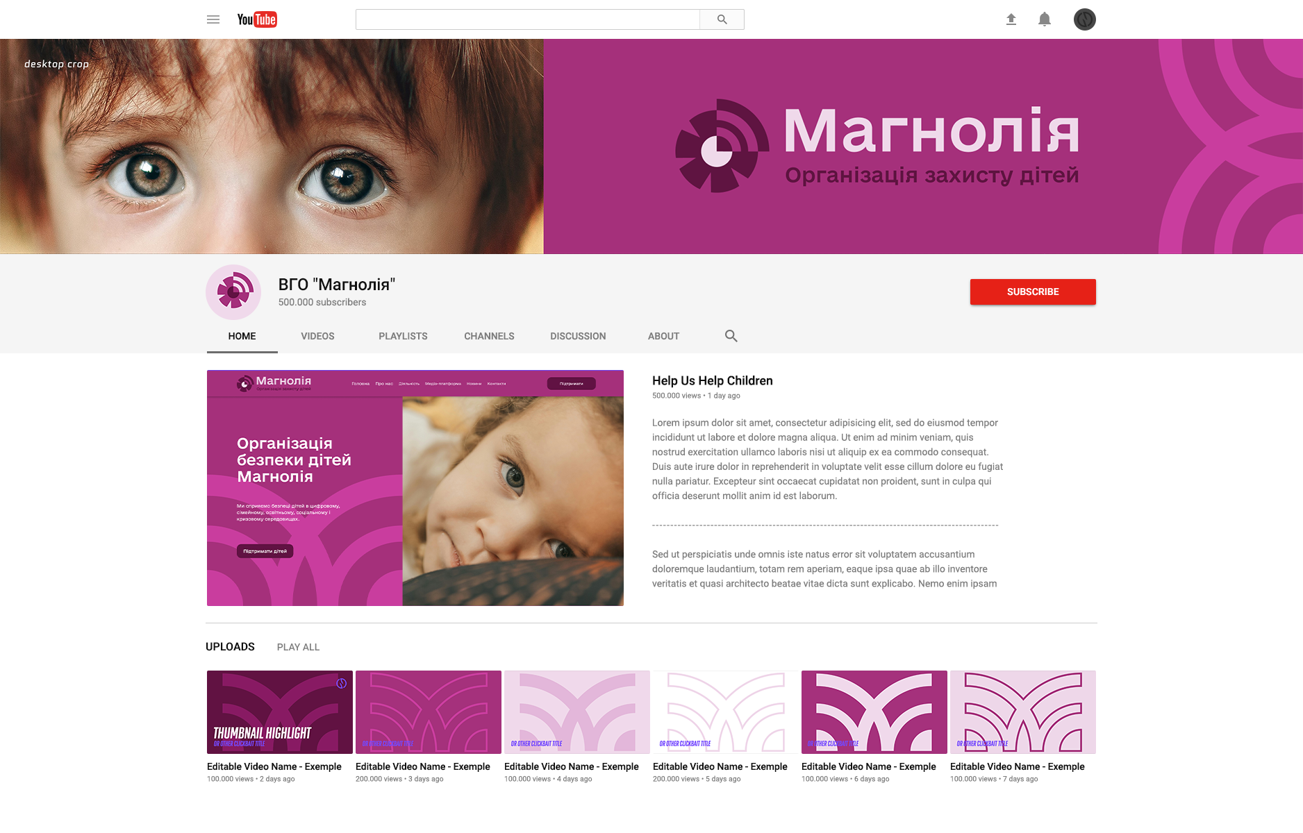
LOGO
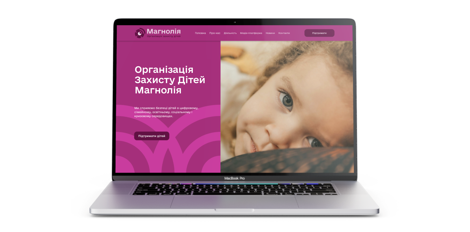
The Magnolia Child Protection Organization searches for and protects children throughout Ukraine.
Its logo conveys the modern, technological presence of an organization that is always connected and on guard for children’s safety.
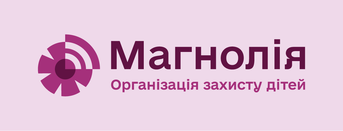
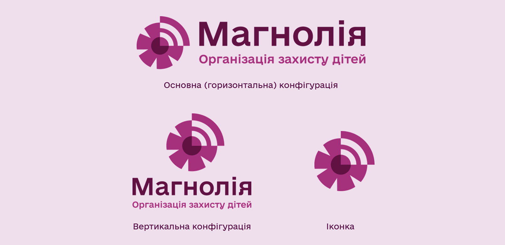
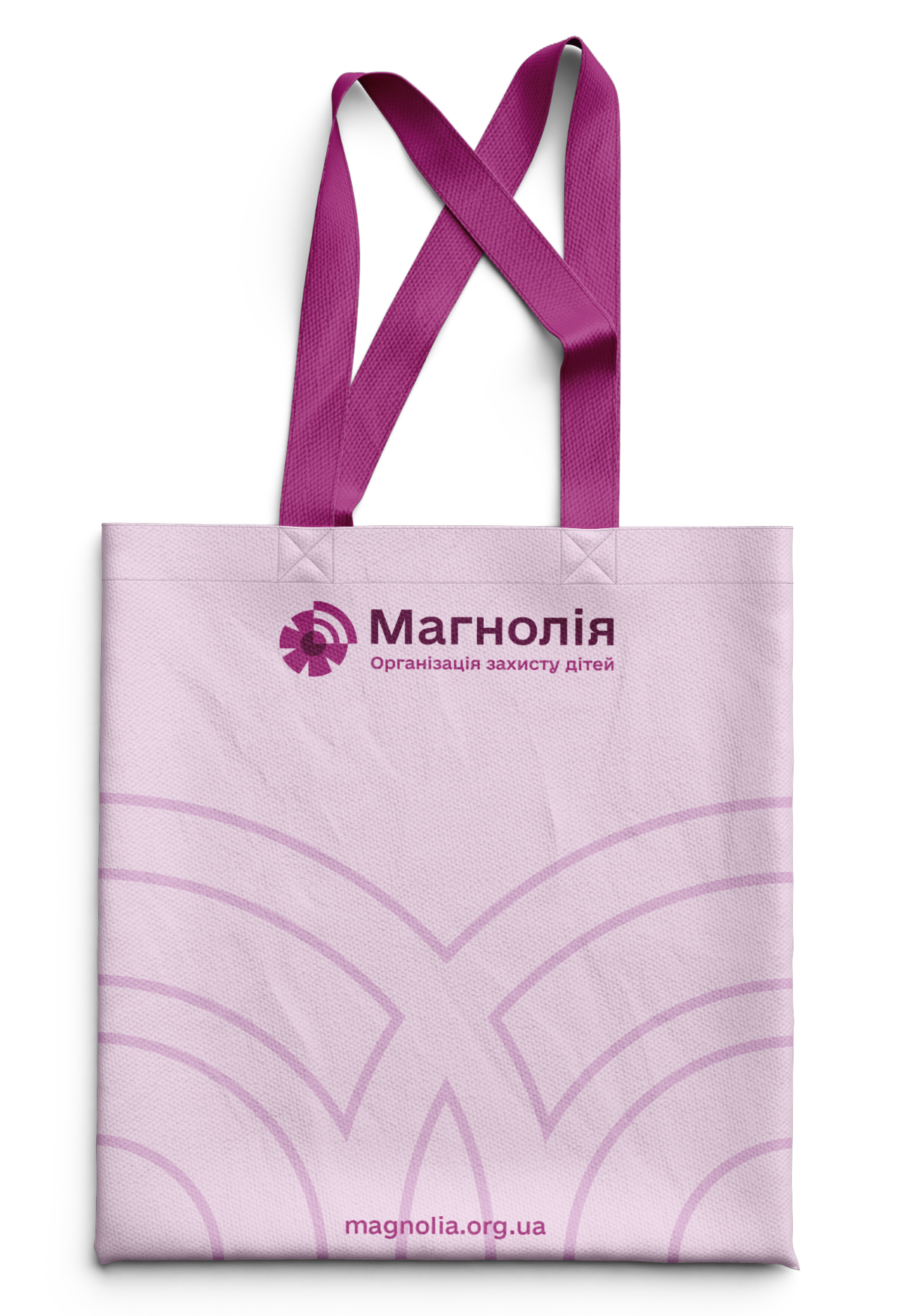
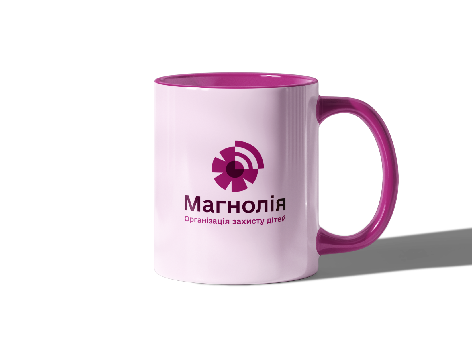
The Magnolia Child Protection Organization logo is a classic combination logo.
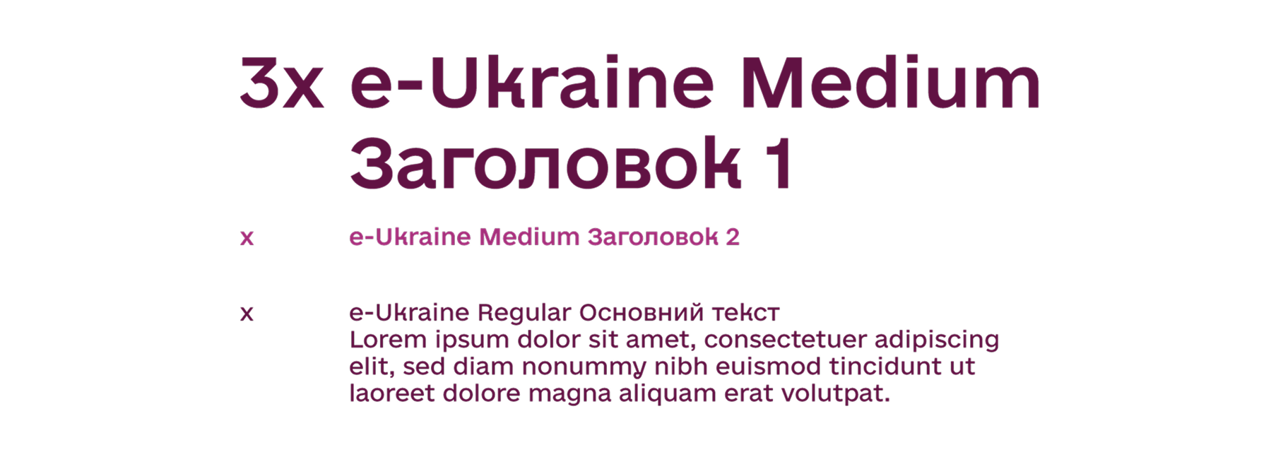
The logo uses e-Ukraine Medium typography.
The logo combines the image of a four-petal flower — as a symbol of care and trust — with waves of communication, hinting at digital presence and openness. Instead of one petal, we placed a Wi-Fi signal, which visually completes the circle shape — as a symbol of integrity and experience.
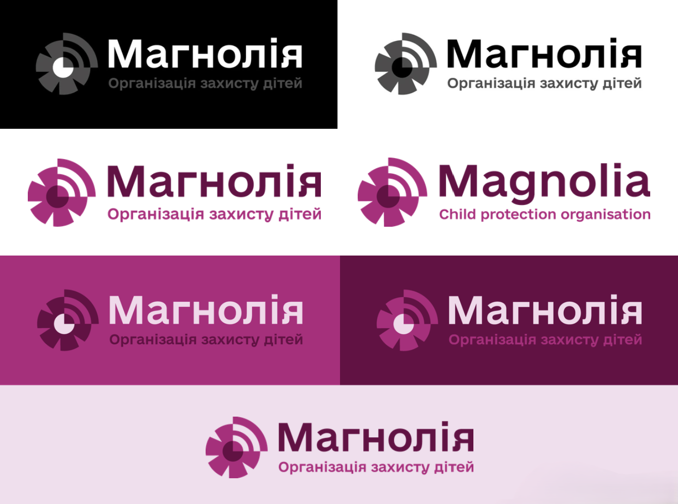
LOGO CONFIGURATIONS
The logo has several configurations, which simplifies its use in different areas. However, it also requires careful handling and consistent reproduction.
IDENTITY
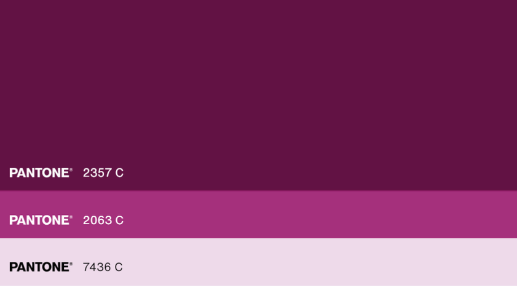
The color scheme consists of shades of purple, with white rarely used as a background.
They have several shades that are used for stylistic elements, color accents in the text, etc.
TYPOGRAPHY
e-Ukraine is a modern and inclusive font developed by the Ministry of Digital Transformation and used in government applications.
Its use in the branding of the Magnolia Child Protection Service hints at the strong cooperation between the organization and its sub-brands with the Ministry of Digital Transformation of Ukraine.
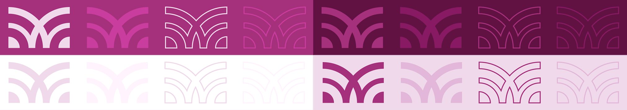
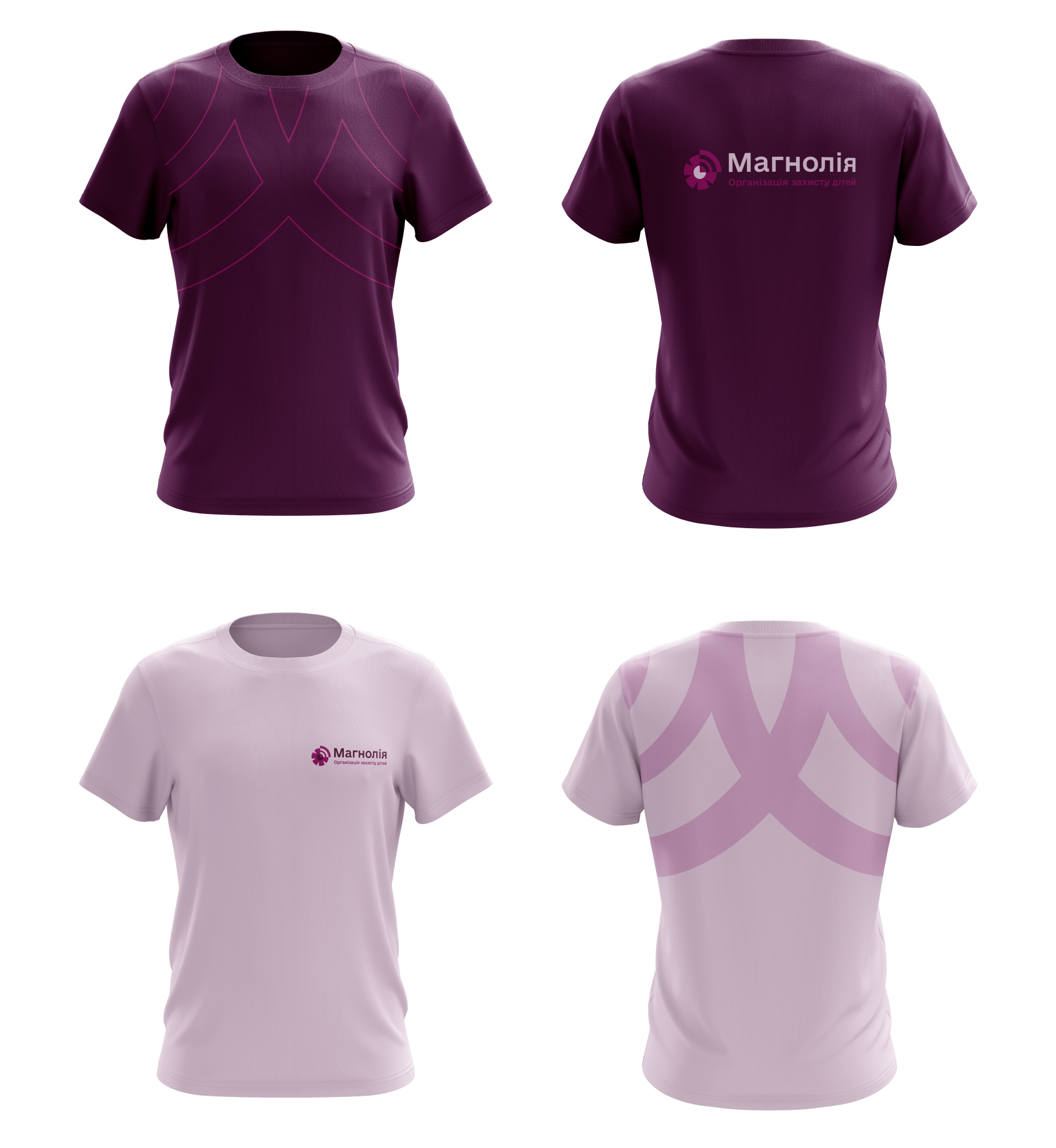
SIGNATURE ELEMENT
The main signature element is the waves of communication, which form the letter “M” when symmetrically reflected. It can be either outlined or solid and is placed as a background element or frame. Compositionally, they should be positioned so as to direct the dynamics of reading the elements on the layout.
The color scheme of the elements has many options with different variations in saturation and brightness.
Big Thanks!
Еліна Слободянюк — Guest Copywriter
Ремезовська Олена — Designer