Влад Посад
Віктор Коновалов
Тарас Бондарчук
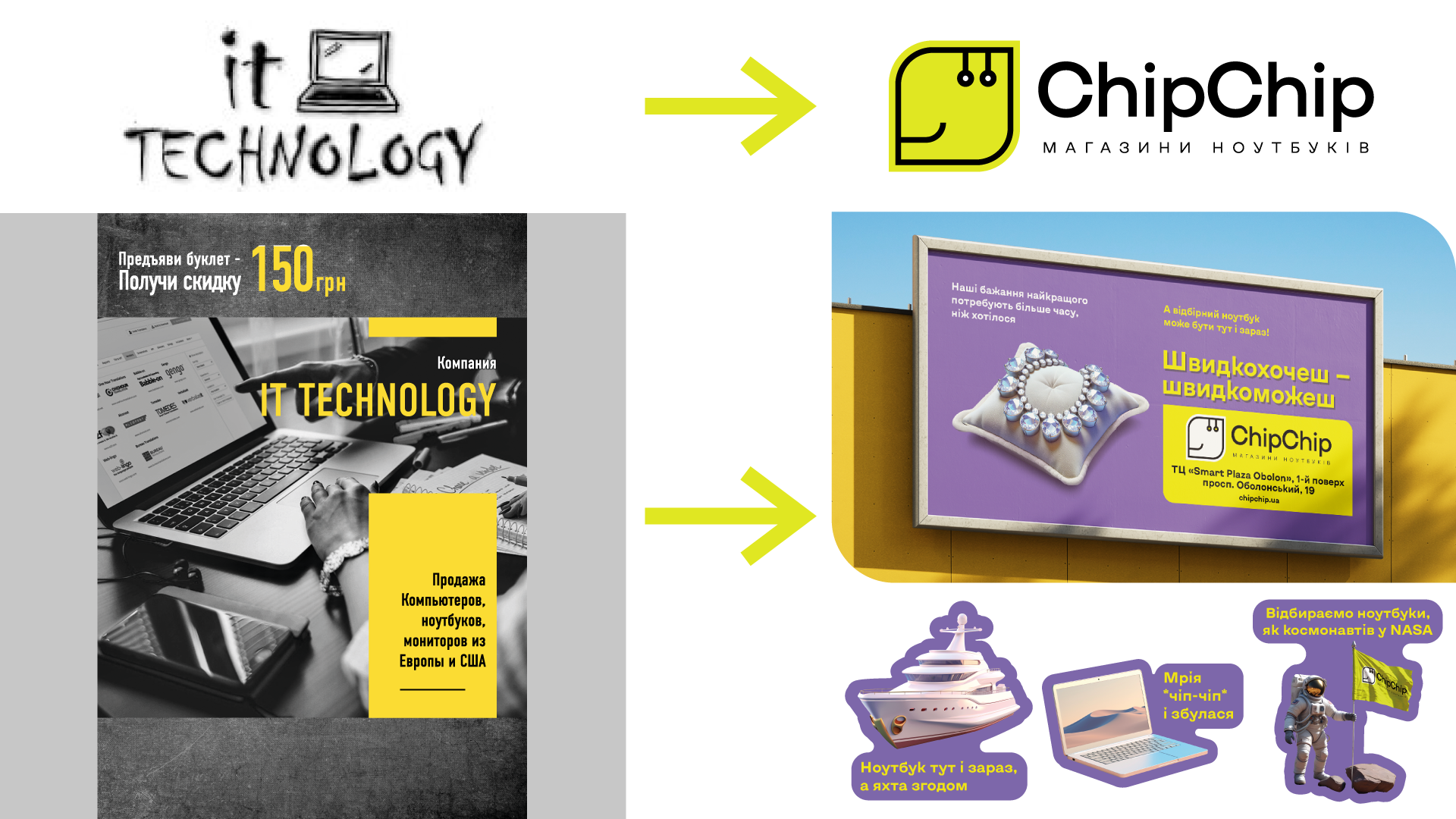
Our client’s business belonged to the broad category of used computer equipment retailers. The entire competitive segment appeared too uniform and emotionless. Products in this category did not inspire trust or command respect. As a result, our client was also stuck in a long queue, competing for the limited attention of consumers.
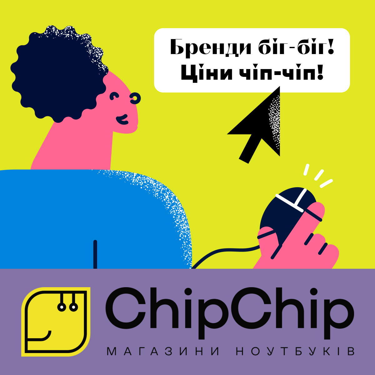
Someone famous once said, “Small goals don’t ignite hearts.” So, during a strategic session, our client set a bold objective: “We want every Ukrainian family to have a high-quality laptop!”
And that instantly set our hearts on fire.
With such a bold goal, the “worldview” of the future brand quickly took shape. ChipChip is a modern brand of convenient online and offline laptop stores, committed to providing every customer with reliable, high-quality computer equipment from world-renowned brands at a fair price.
We analyzed the existing audience and developed a modern avatar of the ideal customer. To communicate effectively, we created a new brand persona: a caring and approachable expert who always offers the best advice on choosing quality tech at a reasonable price.
From now on, the product is no longer perceived as “used”, but rather as “affordable, eco-conscious, and high-quality”, since ChipChip laptops come with the same warranty as new ones.
By developing a new brand platform and a dynamic design system, we transformed ChipChip into a competitive force in both the offline and digital landscapes.

A good cause needs a good name. That’s why the brand was given the sharp and catchy name ChipChip.
Chip refers to an electronic microchip, a fundamental component of every laptop, computer, and other electronic devices. The word “chip” also sounds similar to “cheap,” meaning “affordable” in English—though we don’t use it directly. Instead, we invite customers into our play on words. It’s a game, but when it comes to prices, we’re seriously low.
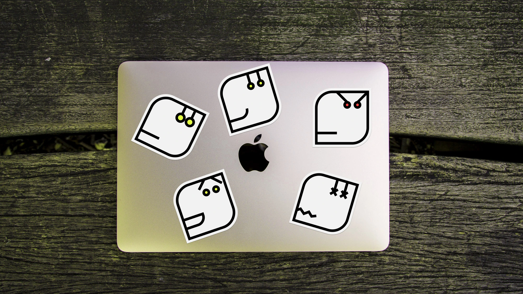
And what’s a good cause without its own hero—caring and kind? That hero is ChipChip, a friendly, smiling computer chip.
It symbolizes affordable technology, becoming a reliable assistant in every household.
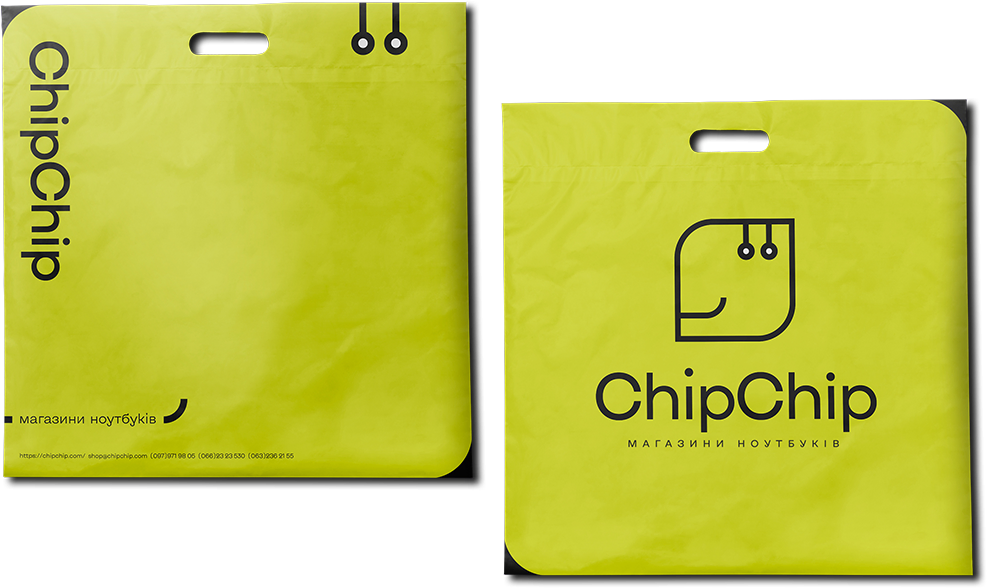
The graphic metaphor of the logo is based on a microchip board. The design features circuit-like contours and connectors, while the eyes and mouth form a friendly, smiling face—serving both as the logo and the brand’s mascot.

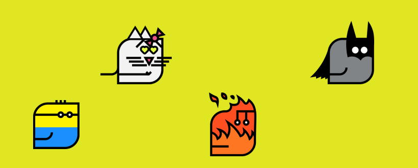
The logo was designed to be dynamic, meaning it can adapt and take on different forms and meanings while maintaining its recognizability in communication. Depending on the messaging goal and the medium it’s used on, ChipChip can shift into various compositional and emotional expressions.
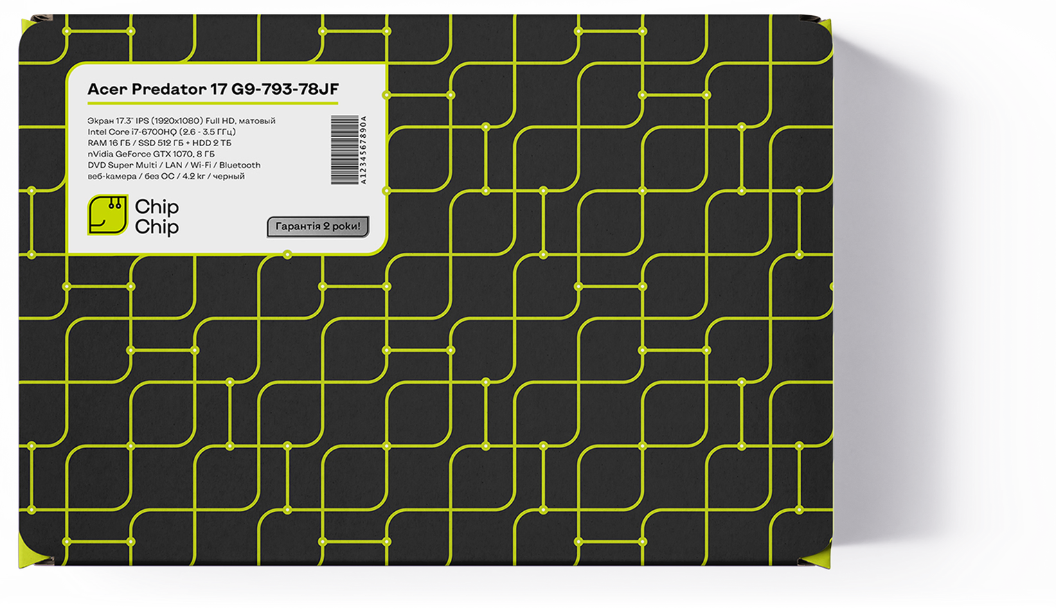
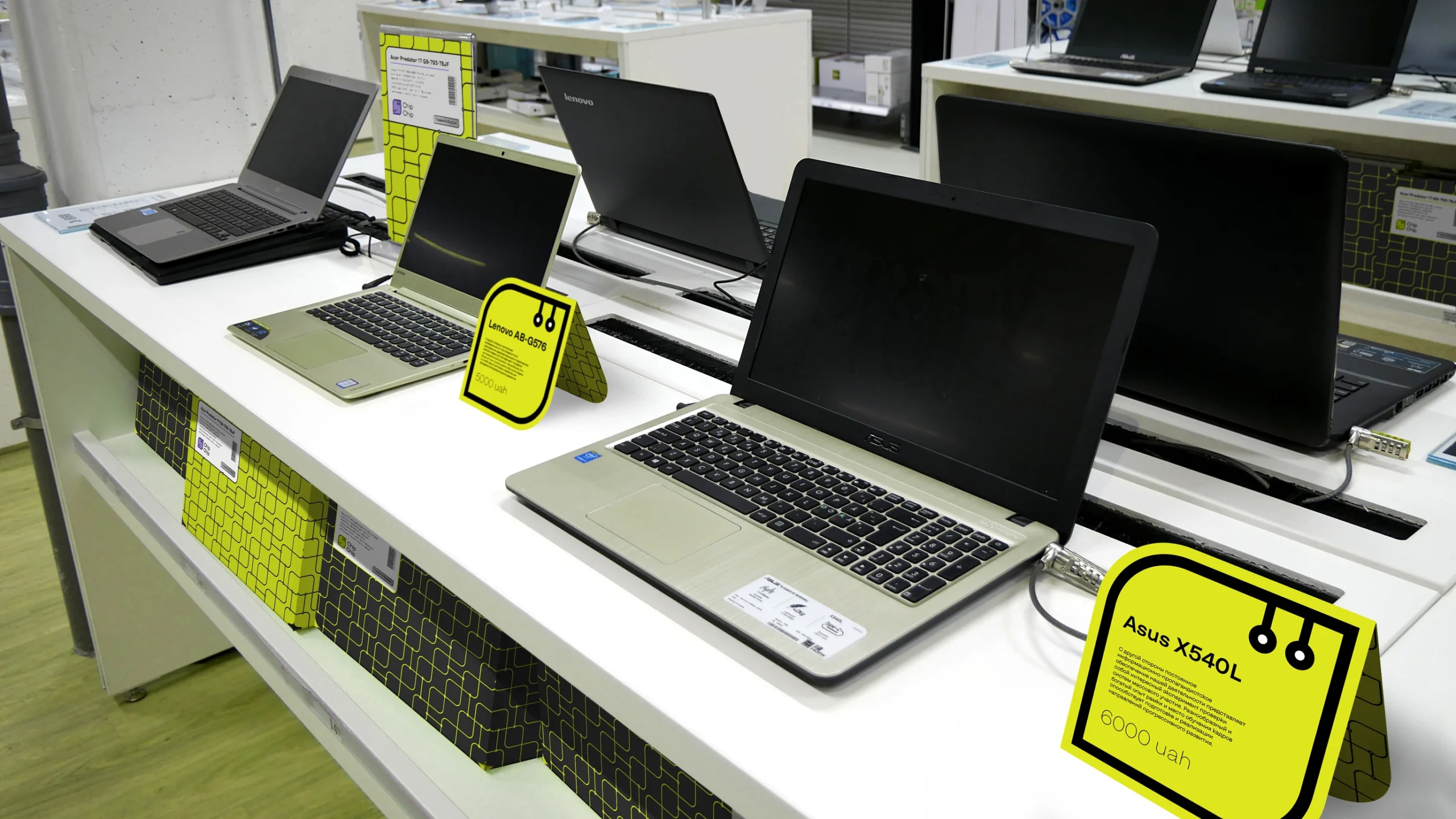
Simply put, ChipChip can become any character in any situation. It can be a sticker, an emoji set, a website assistant, a cartoon hero, a wobbler in an offline store, or any other branded element.
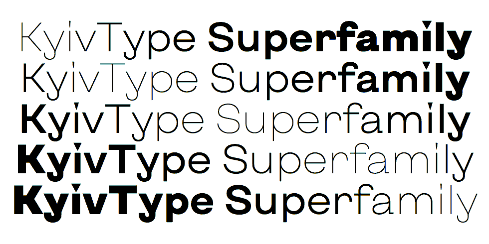
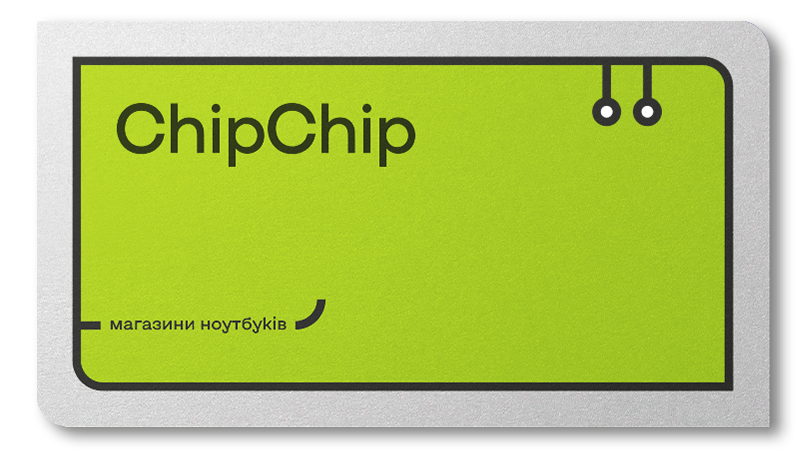
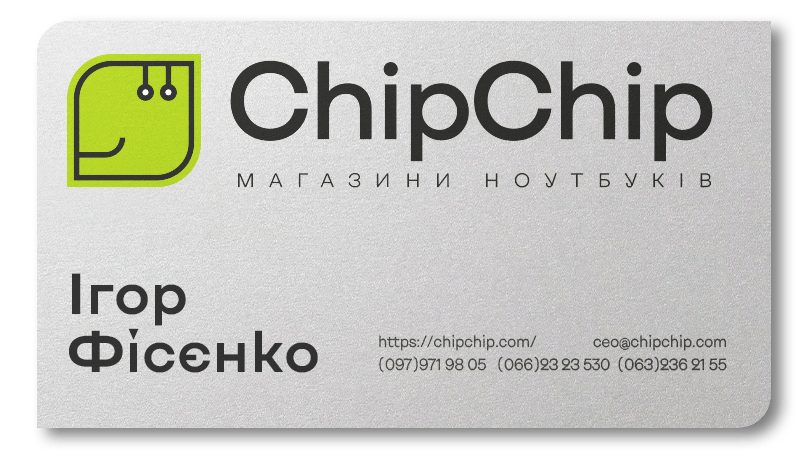
The typographic part of the ChipChip logo and its primary font is the ultra-modern Ukrainian variable typeface KyivType.
The brand identity is built on a dynamic, contrasting palette featuring two primary colors (in addition to black and white): chartreuse (main) and purple (accent).
The friendly smile of our mascot becomes a signature element throughout the entire visual communication.
All branded materials consistently feature key logo elements—the eye-like connectors in the top right corner and the smile in the bottom left.
Every format reflects the logo’s identity and, beyond its primary function, serves a communicative purpose—showing that ChipChip is always there.

Влад Посад
Віктор Коновалов
Тарас Бондарчук
Анастасія Мартиненко
Ніна Алі
Назар Алі

50.45463528375301, 30.488101031134022 Kyiv, BC "Veles", Hlybochytska St, 17А